Create a Campaign
dotdigital Engagement Cloud includes a large selection of professionally-designed email and newsletter templates for a variety of promotions and events. You can use any of the prepared templates, or design your own.
As you become familiar with dotdigital, take advantage of the wealth of information that is available to you at all times. Help resources include online chat, suggested articles that relate to your current activity, training videos, and the Developer hub.
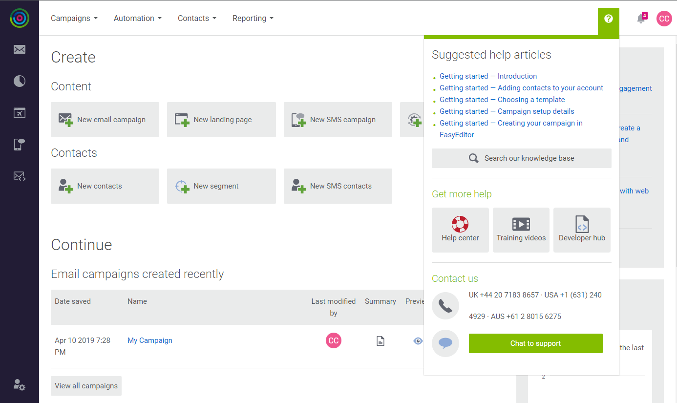 Help Resources
In the following example, you will rework a prepared template for the Magento Luma demo store, and become familiar with different types of content building blocks and editing techniques.
Step 1: Create a Campaign
-
Do one of the following;
- On the Create page, click the New email campaign tile.
- In the main menu under Campaigns, choose New Campaign.
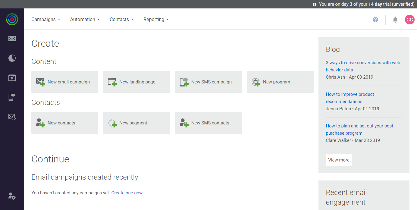 Create New Email Campaign
 -
On the Free Templates tab of the Choose a Template page, scroll down to find the template you want to use. Then, do the following:
-
Hover over the thumbnail image, to show the Select and Preview buttons. Then, do the following:
-
Click Preview (
 ) to see a mockup of the template.
 -
Click Select to choose the template for your campaign.
-
-
When prompted, enter the Campaign name, and accept the default Campaign location. Then, click Continue.
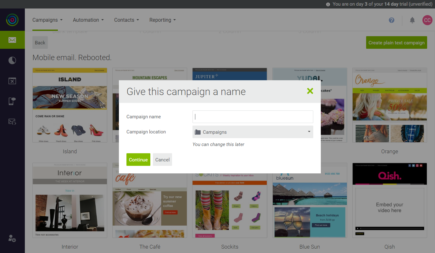 Campaign Name and Location
 -
For an overview of the process, click setting up your campaign in the message at the top of the page.
-
Under Campaign Details, complete the fields for the header information of the campaign email. To learn more, see the field descriptions.
-
Scroll down to see a Preview of the message. Then, click Save & continue.
-
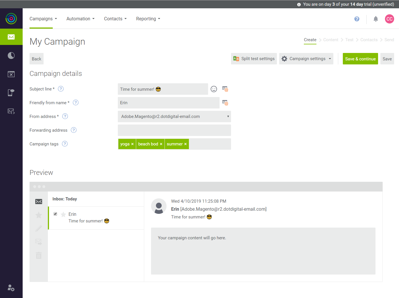 Preview
Step 2: Add Your Campaign Content
Before you get started, it’s important to know that you can save your work at any time. If you log out and continue your work later, you can find the most recently saved version of your campaign in the menu under Campaigns > My Campaigns. To continue editing, find your campaign in the list, and click its name.
The content editor uses building blocks to represent each type of content that can be added to the template. The Build tab of the sidebar on the left displays the selection of building blocks that you can drag and drop into position. For this example, we will replace the sample content in the template with content of our own.
The following instructions walk you through each section of the template, and introduce editing and formatting tools, and techniques.
Complete the Preheader (Optional)
The space above the header can be used to enter a brief message. You can either click the text box and enter the text that you want to appear above the header, or delete the placeholder text.
 Preheader Text
Upload Your Logo
-
On the Build tab, scroll down and expand the Images section.
-
To upload your logo, click Manage. Then, click here to upload the image.
-
Choose the image that you want to upload.
Similar to the Magento Media Storage, the Image Manager is used to organize images that are available in your dotdigital account.
It is recommended to limit the combined size of all images in a campaign to less than 100kb.
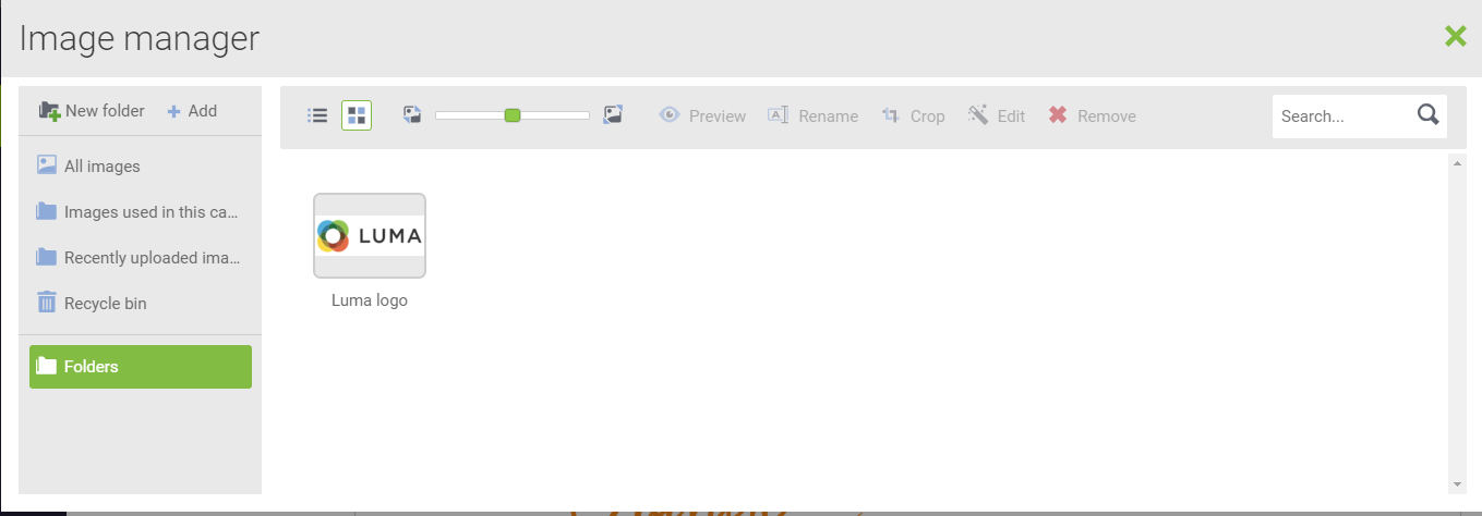 Image Manager
 -
To organize your images, click New folder in the upper-left corner. Then, enter a name for the untitled folder.
The new folder is nested below the original parent folder.
You can create as many folders as you need, and organize them any way you want. Over time you will upload many images to your account, so it is important to organize them in a way that makes them easy to find.
-
In the sidebar, click the parent folder that contains the logo that you uploaded. Then, drag the image to the new folder and click Close (
 ) in the upper-right corner to return to the content editor.
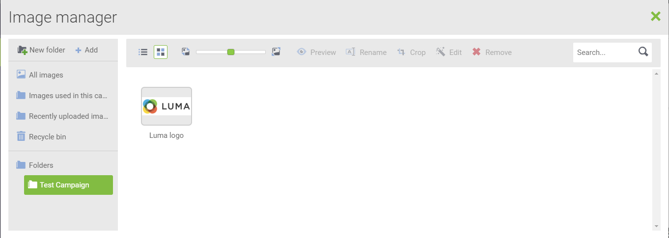 New Folder
The logo that you uploaded appears in the sidebar, where it can be dragged into position.
-
Drag your logo to the header to replace the placeholder image in the template.
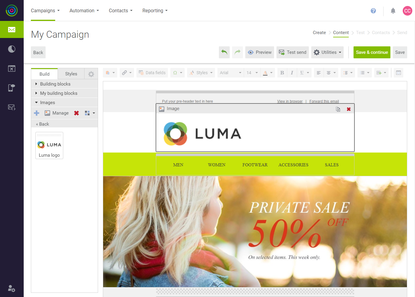 Drag Image to Template
Edit and Format Text
The next section of the template represents your store’s menu. However, it is actually a building block with a multi-column layout, similar to a table. The text in each cell can be edited and formatted separately. The Columns building block iin the sidebar can be used in many ways to control the text layout.
-
Click the menu area to see the multi-column layout.
The Columns building block is located in the sidebar under Layout.

-
Click each cell and enter the menu options for your store. Then, use the toolbar to change the font, size, and style of the text, as needed.
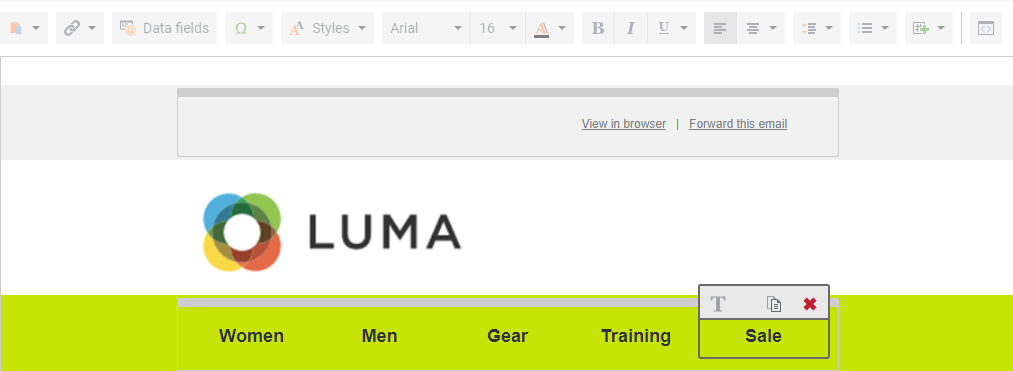
Add Links
To link each menu option in the template to your store, do the following:
-
Open your store in another window and click the first menu option. Then, copy the full URL.
-
In the template, select the text for the first menu option. Then in the toolbar, click the Hyperlink tool.
-
In the Link (URL) field, paste the link that you copied from your store.
-
Enter the Link title. Then, enter the Link name for tracking.
-
When complete, click Insert.
-
Repeat these steps to link each menu option to your store.
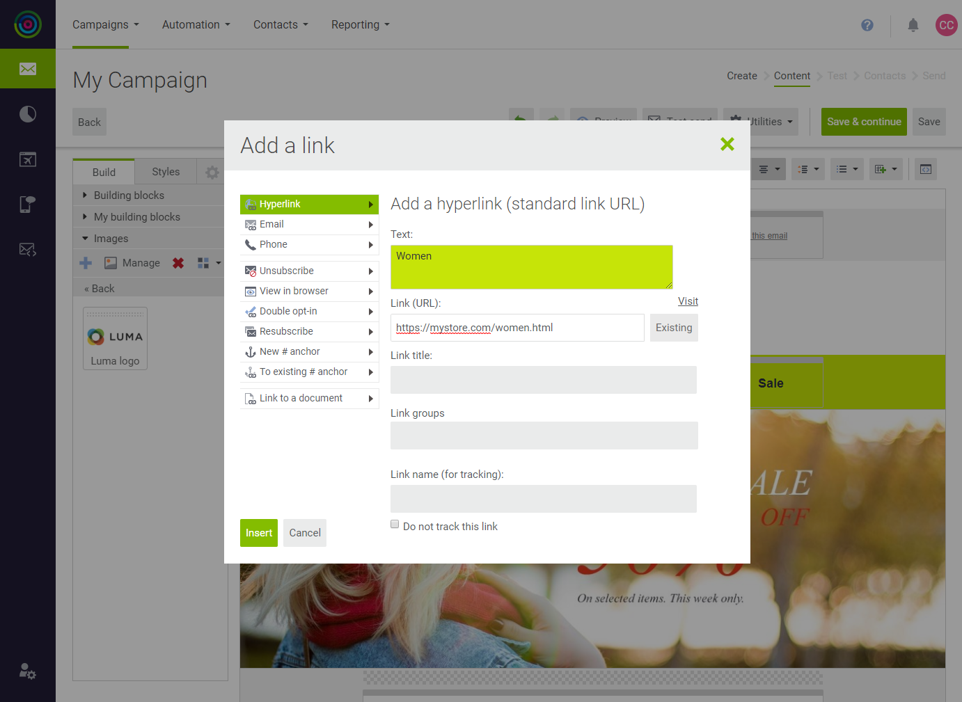 Add a Link
Change the Background Color
-
In the sidebar, choose the Styles tab.
Notice that Background layers is set to
Element table. In the underlying HTML of the template, the menu background is actually part of a table. -
In the template, hover over the menu background to highlight the entire row.
-
In the sidebar under the color picker, enter the hexadecimal code for the background color of your store’s menu.
In the Magento Luma store, the background color of the menu is
#f0f0f0. -
Click Save colour to save the color in the My colors section of the sidebar.
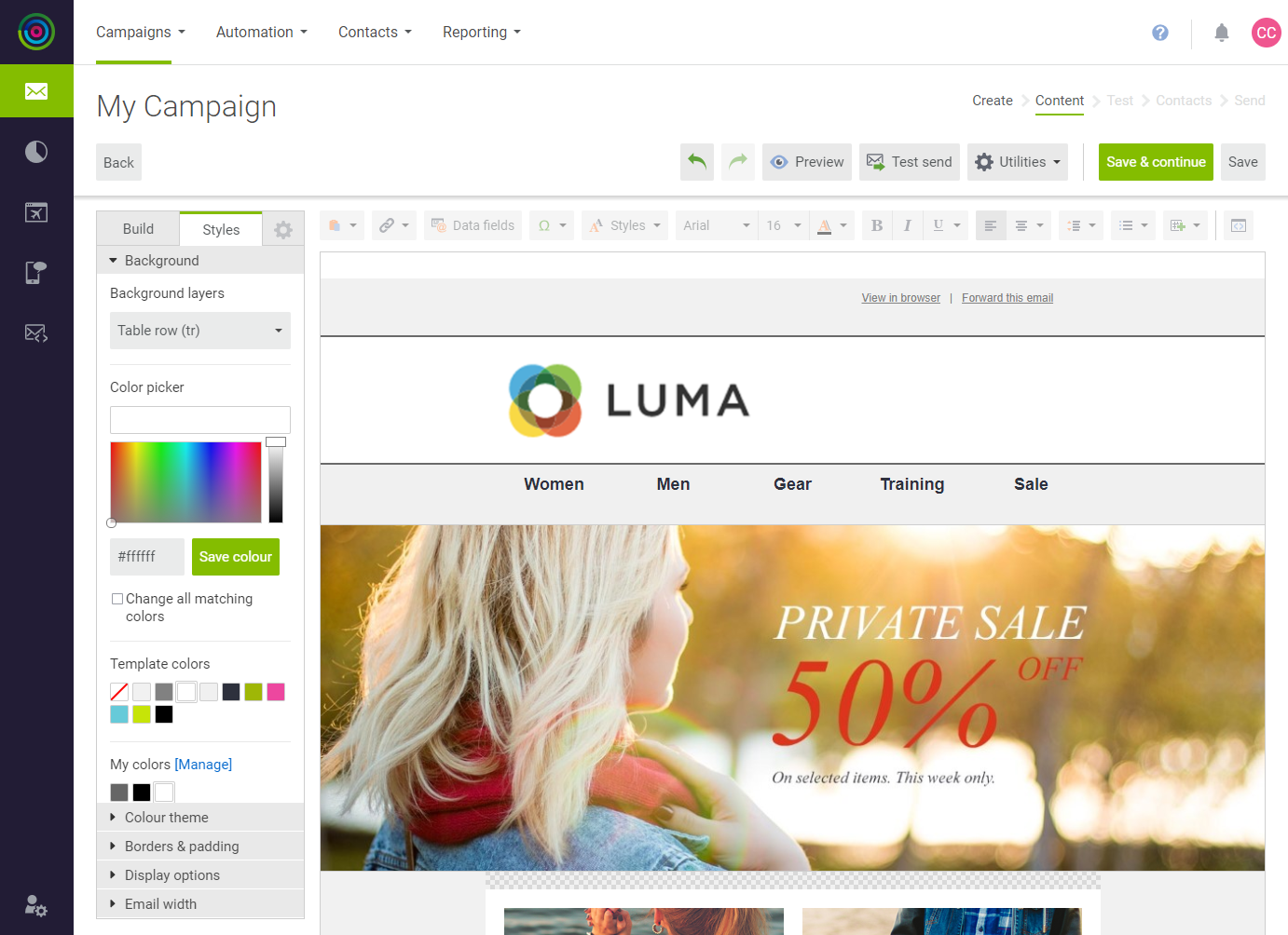 Background Color
Replace the Banner
-
On the Build tab of the sidebar, under Images, click Add Image ( + ).
-
Choose the banner image that you want to upload.
After a moment, the image appears in the sidebar.
-
From the sidebar, drag the new banner to replace the placeholder image.
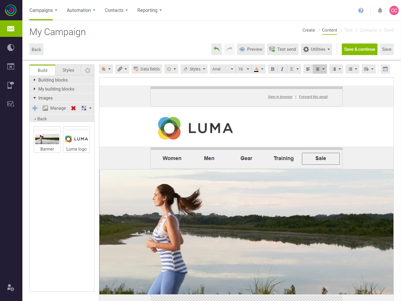 Banner
Add Featured Products
dotdigital Engagement Cloud gives you the ability to dynamically incorporate data from your store into a template. However, for this simple example, product data is added as static images with links to your store. Although this template includes two rows of products, only one row is included to reduce the number of images. The Shop Now block was also removed from the template, because it did not introduce any new editing techniques.
-
Upload the image for each featured product.
-
Edit the text, as needed, for each featured product.
The price can be updated as any other text field. To change the currency, simply type a dollar sign, or any other currency symbol that you need.
-
To update the product buttons, click the button to display its settings in the sidebar.
-
Paste the Button URL for the corresponding product detail page. Then, update the color and format of the button as needed.
-
Repeat these steps for each product button.
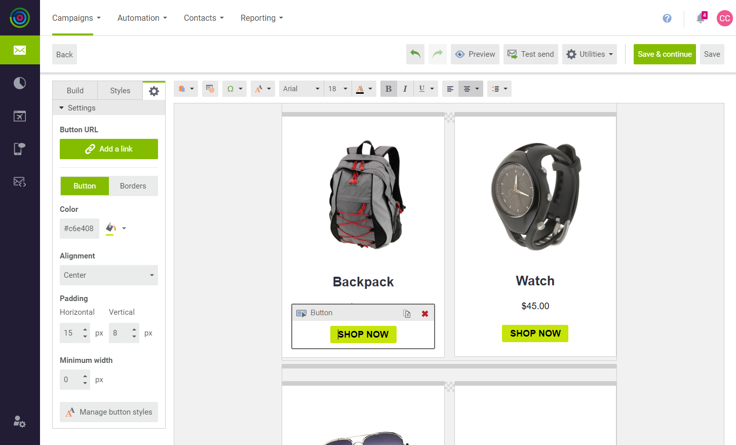 Button Settings
Delete Blocks
To simplify this example, only one product block is needed from the template. You can delete the other two blocks that feature products from the catalog.
-
Find the block with the Shop Women and Shop Men tiles.
-
Hover over the outer container. Then in the upper-right corner, click Delete (
 ).
).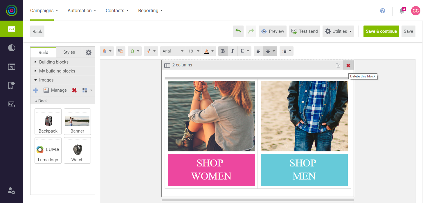 Delete Block
 -
Delete the second product block, so only the one that you updated remains.
Add Social Media Links
-
Scroll down to the Sharing block with the social media placeholders.
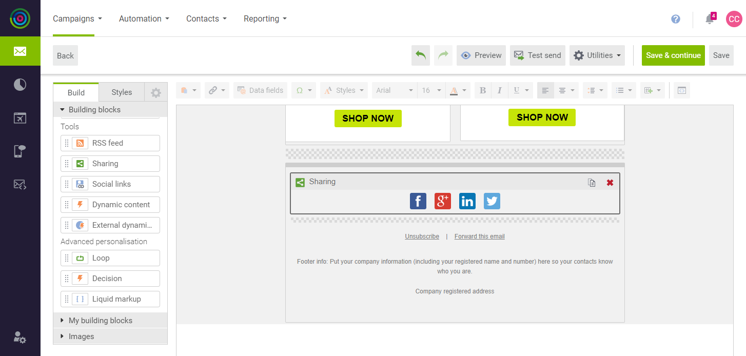 Social Media Building Block
 -
In the building blocks sidebar under Tools, drag the Social links building block into position below the Sharing block with the placeholders.
An empty social links block appears below the placeholder.
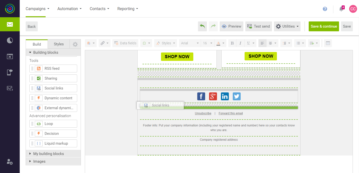 Drag Social Media Building Block
 -
Click the empty building block to open the Social links settings.
-
Select the checkbox of each social link that you want to include in the template.
-
For each social link, paste the URL of your company profile page.
-
When complete, click Apply.
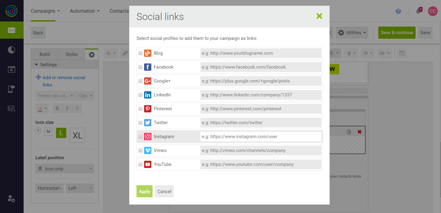 Social Links
 -
To adjust the format and spacing of the buttons, click anywhere in the social links building block.
You can experiment with these settings to adjust the size and format of the buttons. To make your buttons look like the template, do the following:
-
In the sidebar under Label position, set Horizontal alignment to
Center. -
Under Spacing, set Horizontal to
15pxand Vertical toNone.
-
-
To delete the placeholder social media links, click Close (
 ) in the upper-right corner.
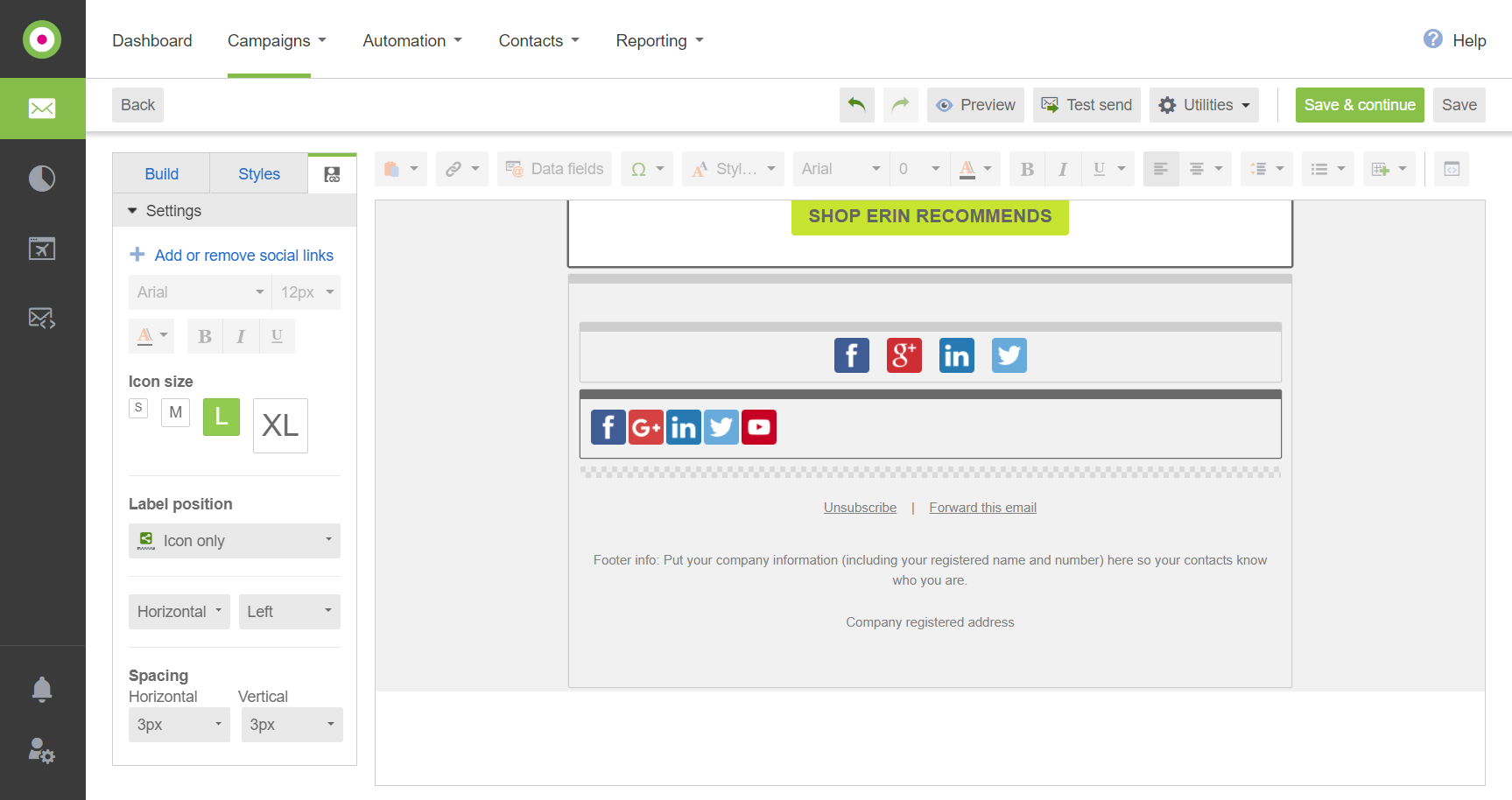 Formatting the Social Media Links
Complete the Footer
The information at the bottom of the template is important, and in many countries is required by law. You must provide a mechanism for recipients to unsubscribe, and clearly identify the sender of the email.
-
Do not change the Unsubscribe and Forward this email links, because they contain code that manages each operation. However, you can format the text any way you like.
 Unsubscribe / Forward This Email
 -
Click the Footer info text block and enter your company information, including your registration number, if applicable.
This lets the recipients know who has sent the email.
 Footer Info
 -
Click the Company registered address text block, and complete the information.
In this example, we added a link to the Contact Us page on our site.
 Company Registered Address
 -
When complete, click Save.
The template is now fully customized for your store.
Step 3: Send a Test
-
To test your campaign, click Test send in the template header.
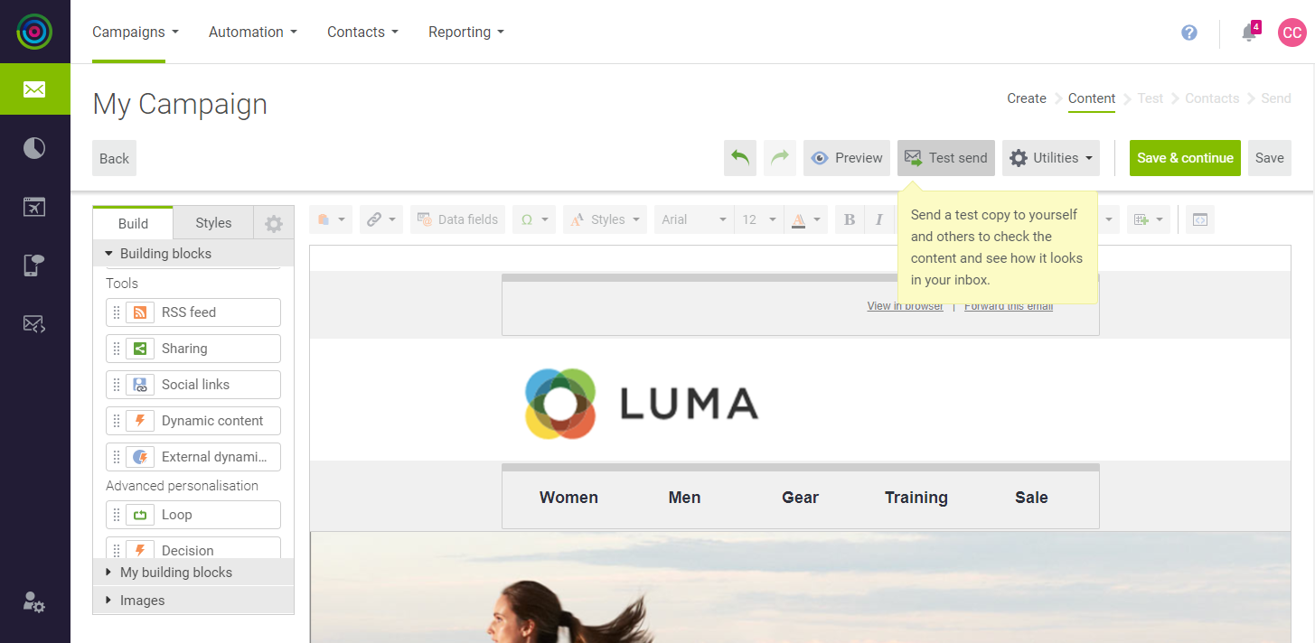 Test Send
 -
Select the type of output you want to send from the following:
HTML and plain textHTML onlyPlain text only
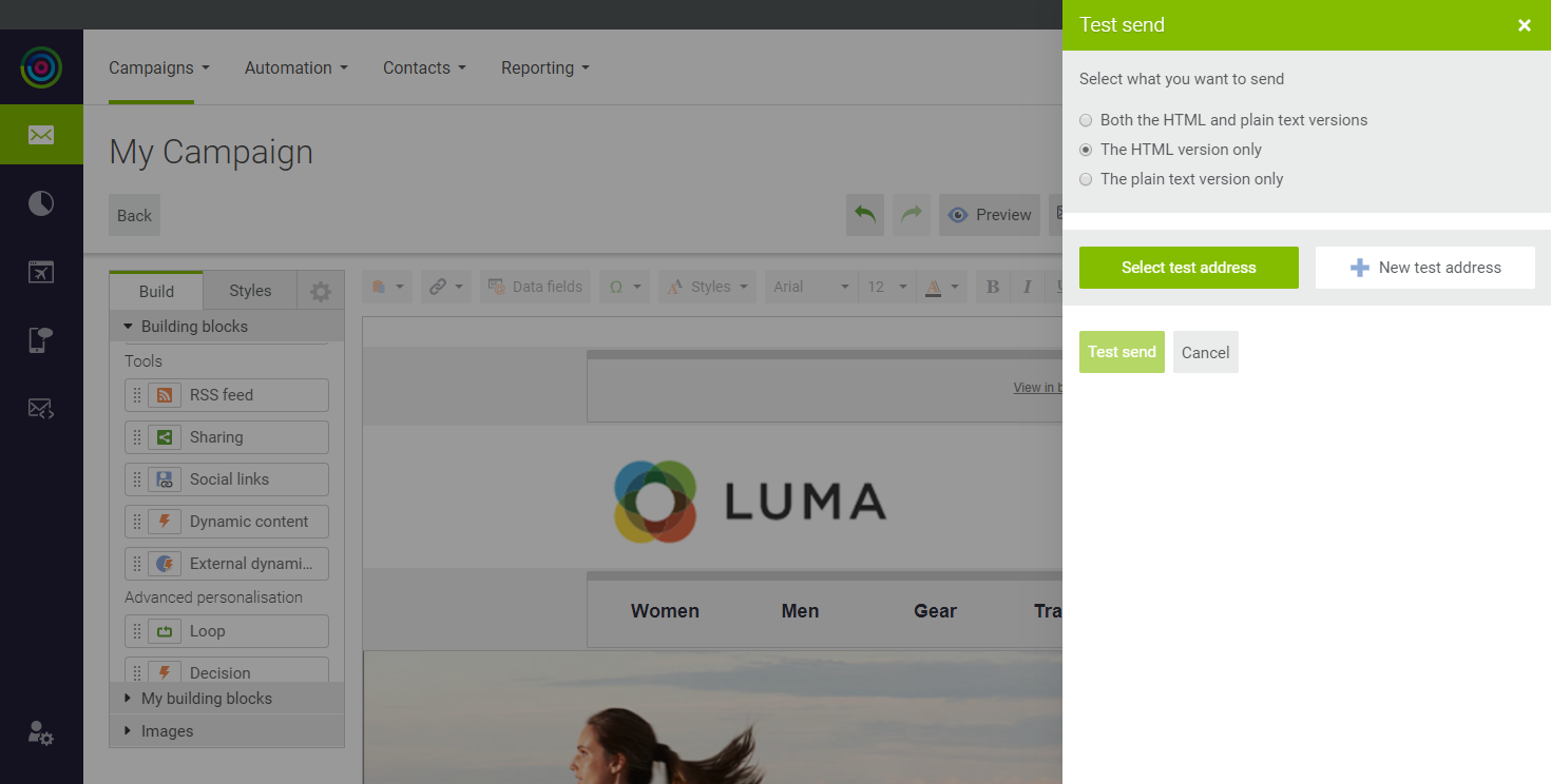 Test Send Options
 -
To send the test to the address that is associated with your account, click Select Test Address.
-
To send the test to more addresses, do the following:
-
Click New Test Address.
-
Enter the Email address, First name and Last name of the recipient.
-
Click Create.
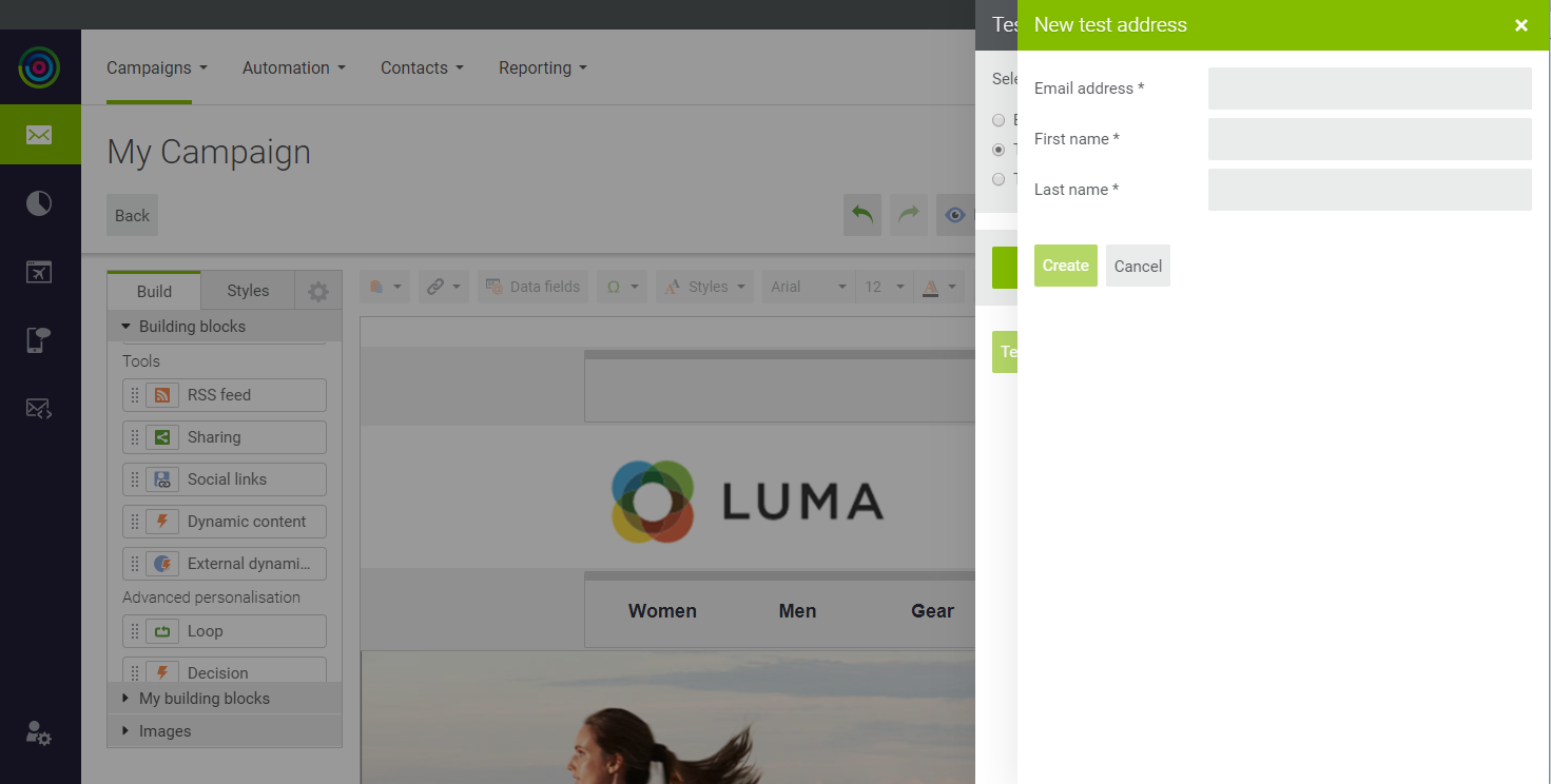 Test Send New Address
 -
Repeat these steps to add as many recipients as you want.
-
-
When you are ready to send the test campaign, click Test Send. If prompted, click Save and send.
-
Check your email to see how it looks.
Step 4: Review the Summary Report
The Summary Report validates the campaign, lists any errors that are found, and suggests areas for improvement. In addition to the Summary Report, the Reports menu has a selection of Marketing Automation reports.
-
On the Campaigns menu, choose My Campaigns.
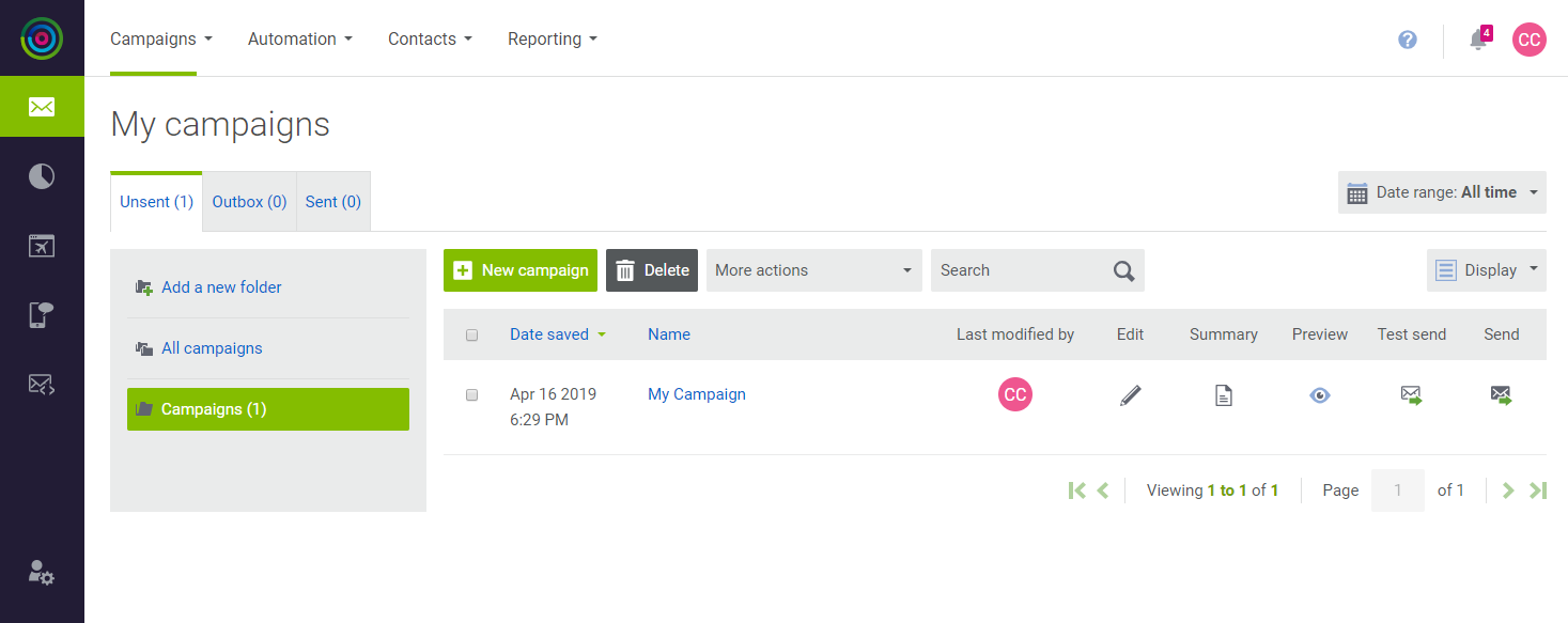 My Campaigns
 -
In the record for your test campaign, click Summary (
 ) to view the summary report.
Look for the red text in the report. They are tips and recommendations for things you can do to improve your campaign.
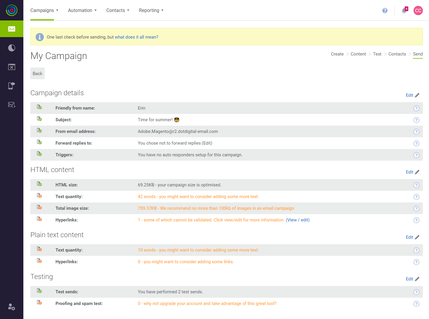 Campaign Summary Report
Step 5: Add a Personal Note
In this step, we’ll add a personal note with a link, and then do another test run.
-
On the Build tab of the sidebar under Building blocks, drag a Text block to the top of the template.
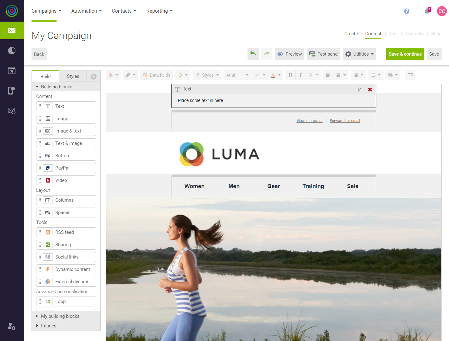 Text Block for Personal Note
-
Enter the word
Hito begin the greeting, followed by a blank space. -
In the toolbar at the top of the template, click Data Fields.
-
In the list of data fields, choose First name.
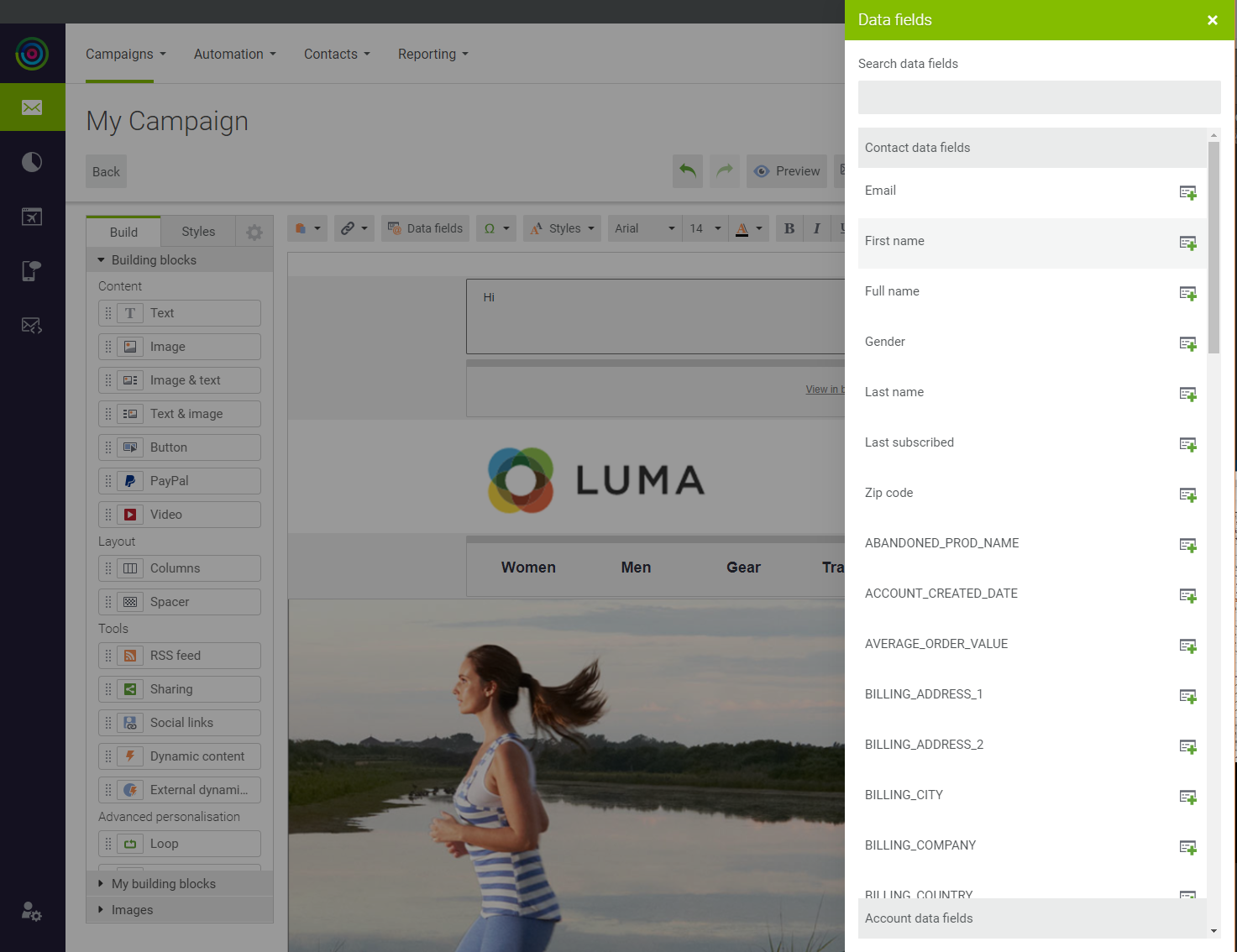 Data Fields
 -
Write a note to accompany the campaign.
-
-
When complete, Save your work.
 Personalized Greeting
Step 6: Preview the Campaign
-
In the button bar at the top of the workspace, click Preview.
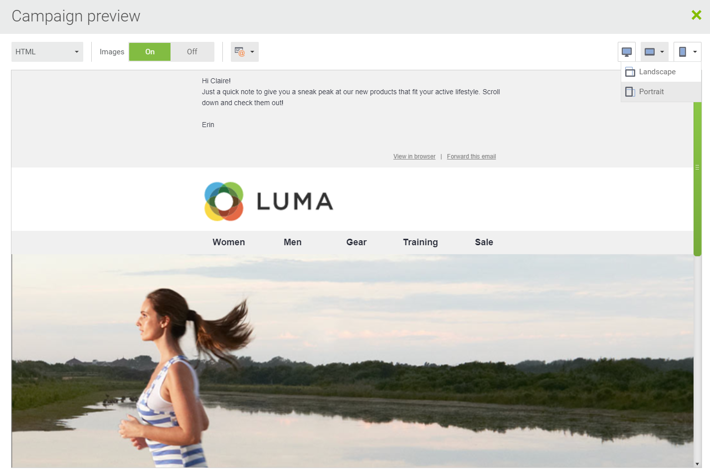 Desktop Preview
 -
In the upper-right corner of the preview window, click Phone (
 ) and choose Portrait to see how the message looks on a mobile device.
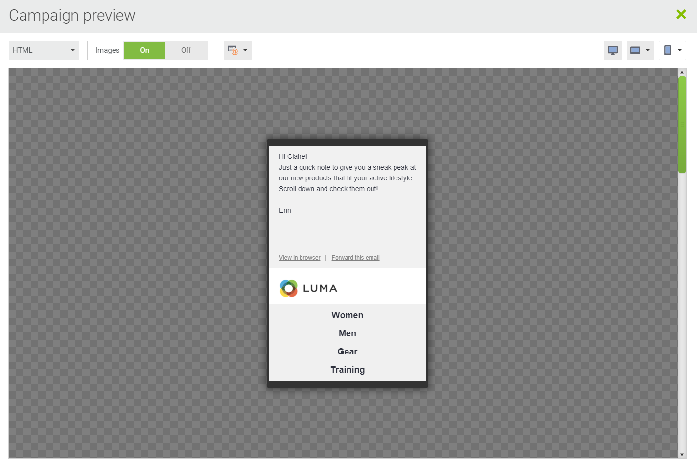 Phone Preview
 -
In the lower-left corner of the preview window, click Close.
You have created your first campaign.
Field Descriptions
| Subject line | The subject line is what the recipient sees in their Inbox summary. Options: Emoji - To insert an emoji, click the emoji icon to the right of the field. Data Field - To include a data field, click the field chooser to the right of the field. |
| Friendly from name | Replaces the full email address in the Inbox. To include a custom data field, use the field picker to the right of the field. Option: Data Field - To include a data field, click the field chooser to the right of the field. |
| From address | The address of the sender of the email. |
| Forwarding address | To forward the message to additional email addresses, separate each with a comma. Option: Data Field - To forward the message to an email address in a data field, enclose the field name in ampersands. ( @...@) |
| Campaign Tags | Tags are used to filter campaigns for reports. To add another tag, press the Tab key. |