Tutorial 1: Simple Page
In this three-part tutorial, you will become familiar with the Page Builder workspace, while creating a simple page that illustrates how easy it is to create content-rich pages of your own design.
 Simple Page example
Before you begin
Before starting this tutorial, we recommend that you increase the Admin Session Lifetime to prevent the session from timing out while you work.
Verify the required Content Management configuration settings:
-
WYSIWYG Editor is enabled, and TinyMCE 4 is selected as the default in the WYSIWYG Options configuration.
-
Page Builder is enabled in the Advanced Content Tools configuration.
Download the image assets that are needed to complete the example page
-
Download the
simple-page-assetsfile and save the file to your local system. -
Navigate to the downloaded file and extract the zipped files.
On a Windows system, right-click and choose Extract All files. Then, choose the destination folder and click Extract.
On a Mac system, you can simply double-click the zip file and the move the extracted files to the destination folder.
The folder contains the following image files:
 Page Builder tutorial files - simple page assets
Follow parts 1, 2, and 3 of this tutorial in order.
Part 1: Full-Bleed Row with Banner
In this part of the Simple Page tutorial, you will create a new page that has a full-bleed row and banner. The row has different background images for desktop and mobile devices.
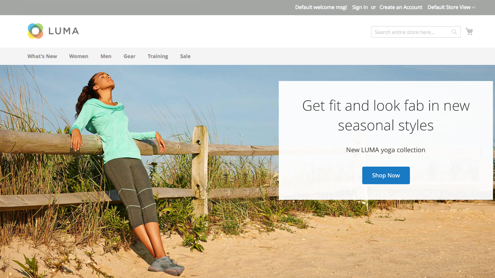 Page Builder - full bleed row with banner
Step 1: Create a new page
-
On the Admin sidebar, go to Content > Elements > Pages.
-
In the upper-right corner, click Add New Page and do the following:
-
To prevent this page from being published in your store, set Enable Page to
No. -
For Page Title, enter
Simple Page.
 New page - basic page settings
 -
-
Expand
 the Design section.
Notice that Layout is set to
Page -- Full Widthby default. In addition to the five standard layout options, Page Builder adds full-width layouts for pages, categories, and products. -
If the sample data is available, set New Theme to
Magento Luma. Otherwise, you can choose another available theme or leave it blank to use the default theme.The New Theme setting can be used to override the default theme and to apply a different theme to the page.
The Full Width layout can be used only with a compatible theme.
 New page - design settings
 -
In the upper-right corner, click Save.
When the page is saved, the name Simple Page appears in the upper-left corner of the page.
Step 2: Format the row
-
Expand
 the Content section and take note of the following workspace features:
The Content Heading field is optional. It is by default, formatted as a heading level 1 (H1) according to the theme. For the purpose of this tutorial, the Content Heading is left blank.
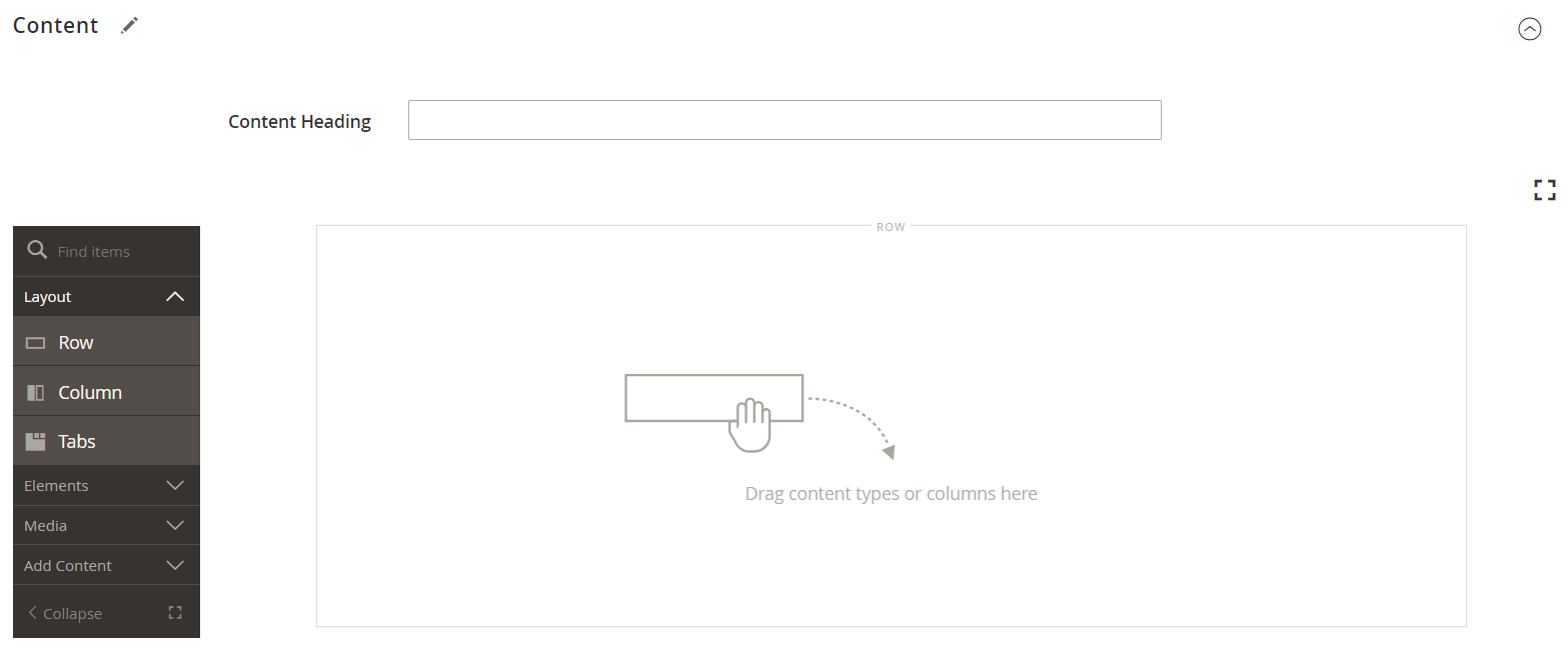 Page content - stage with empty row
 -
Hover over the empty row to display the toolbox.
Each content container has a toolbox with a similar set of options.
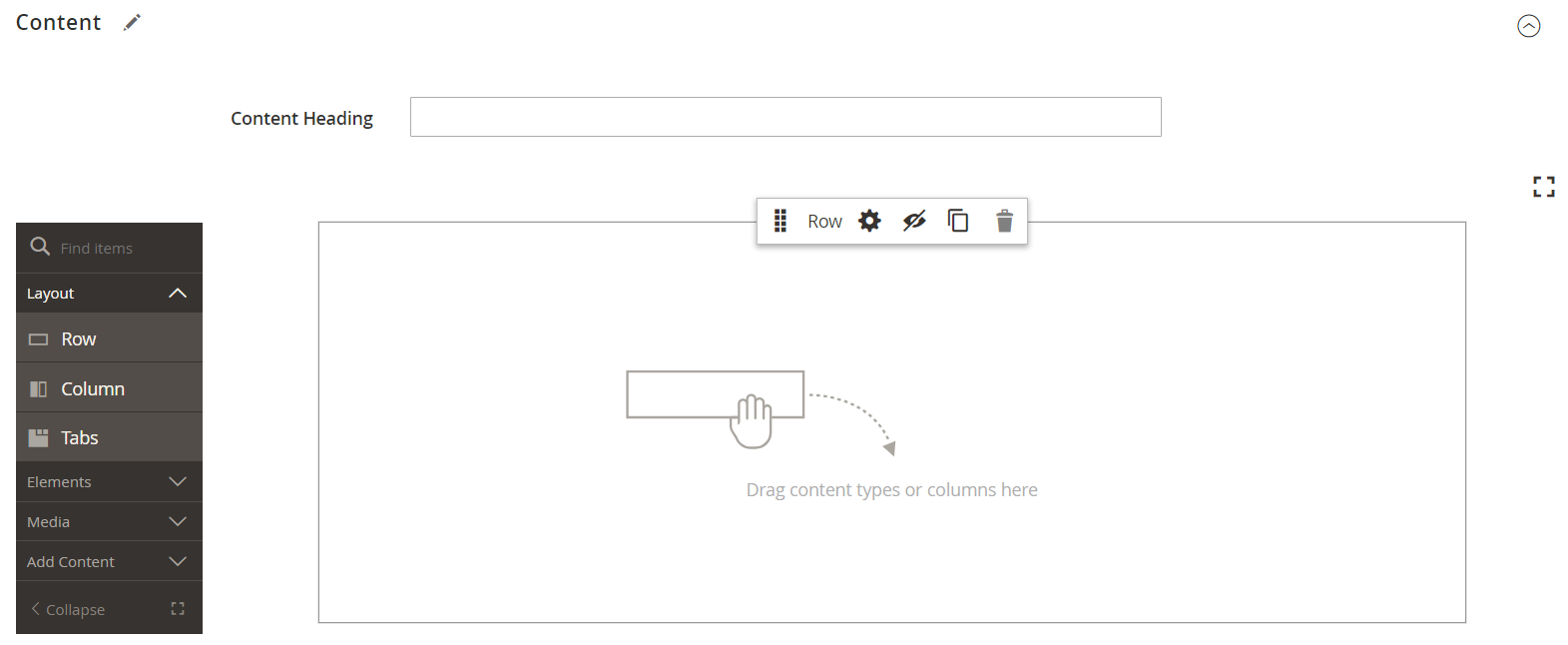 Page content - row toolbox
 -
In the Row toolbox, choose the Settings (
 ) icon.
 -
Under Appearance, choose Full Bleed.
The Full Bleed appearance setting extends the left and right borders of the content area of the row and background to the full width of the page.
 Row settings - full bleed
 -
Scroll down to the Advanced section and set all Margins and Padding settings to
0.This setting ensures that the banner extends the full width of the row.
 Row settings - margins and padding
 -
Scroll up to the top of the page and click Save in the upper-right corner to save the settings and return to the Page Builder workspace.
-
In the upper-right corner, click Save to continue.
Step 3: Add a banner
Page Builder has a new content type called Banner, which is featured in this step. What was previously the Banner option in the Content menu is now a Dynamic Block.
-
Expand
 the Content section.
 -
In the Page Builder panel, expand Media and drag a Banner placeholder to the stage.
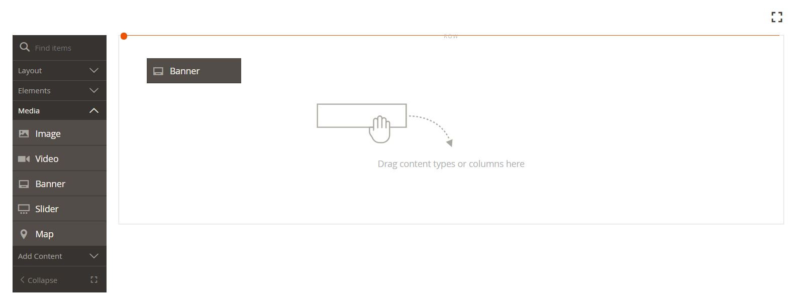 Dragging a banner content type to the stage
 -
Hover over the banner container to display the toolbox.
The stage now has two content containers, each with a separate toolbox. Because the banner is nested inside the row, make sure that you are working in the correct toolbox.
In addition to the toolbox, the Upload Image and Select from Gallery buttons are included so you can make quick changes to the banner directly from the stage.
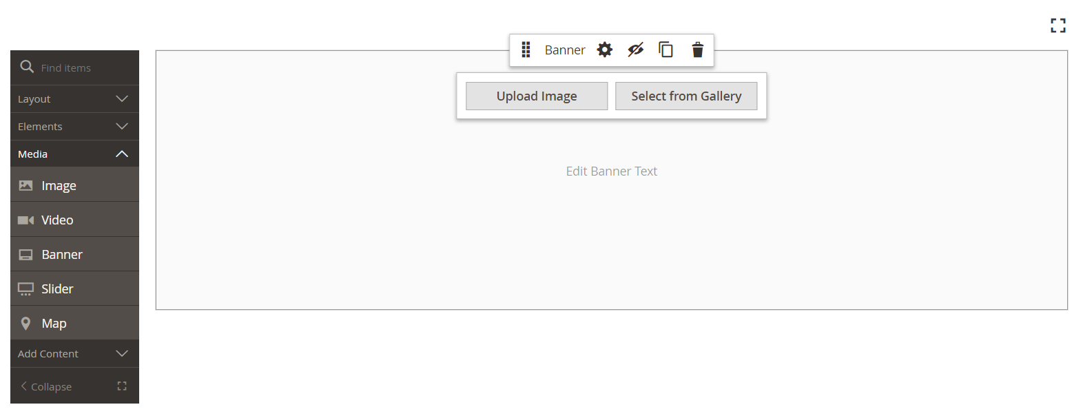 Banner toolbox
 -
In the Banner toolbox, choose the Settings (
 ) icon.
 -
Under Appearance, choose Collage Right.
The Collage Right setting positions content on the right side of the banner.
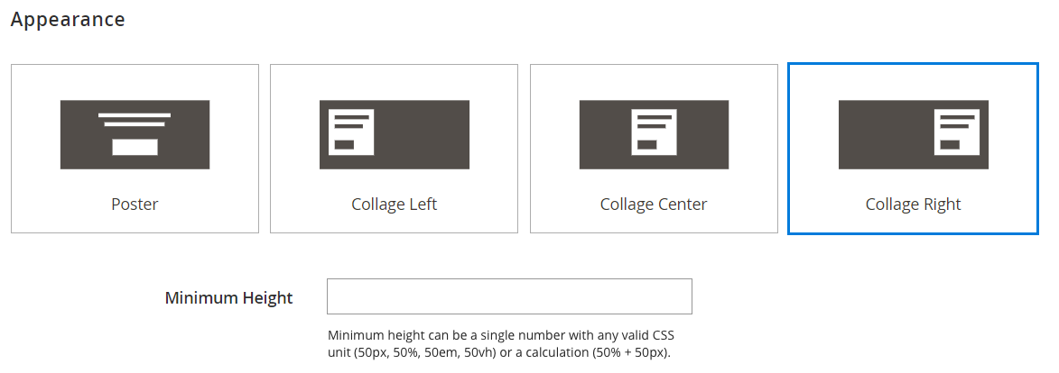 Banner appearance - collage right
 -
Scroll down to the Background section and set the background image for the banner:
-
For Background Image, click Upload.
 Banner background - upload image
Navigate to the directory where you saved the extracted simple page assets and choose the
wide-banner-background.jpgfile. Selecting the sample banner image file
The image is uploaded and a thumbnail of the uploaded image appears. The file name, image dimensions, and file size are noted below.
 Uploaded background image in the media gallery
 -
For Background Mobile Image, click Upload.
In the same file directory, choose the
wide-banner-background-mobile.jpgfile.The mobile background image is used for mobile devices, and also whenever a desktop browser window is resized to the width of a mobile device.
 Selecting the sample banner image file for mobile
 -
Scroll back to the top of the page and click Save to save the settings and return to the Page Builder workspace.
The background appears on the stage and extends the full width of the row.
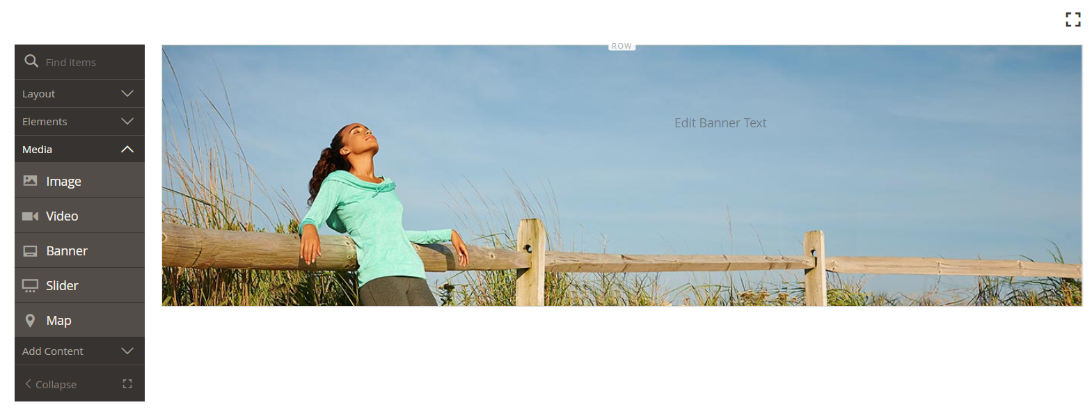 Banner with background image
Notice the placeholder text that appears on the right side of the row. The position of this text reflects the Collage Right appearance setting.
-
-
Click the placeholder text, and enter the following message as two lines:
Get fit and look fab in new seasonal styles.New LUMA yoga collectionThe editor toolbar appears above the text box. Text can be entered and formatted either directly from the stage, or by choosing Settings in the banner toolbox.
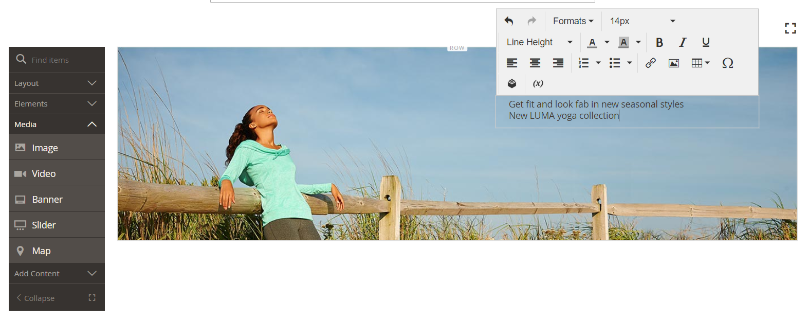 Editing banner content from the stage
 -
Apply formatting to the text:
-
Select the first line of text. Then, on the editor toolbar under Formats, choose
Heading 2.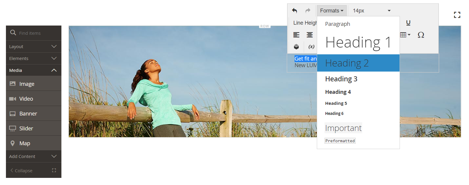 Applying the Heading 2 format
 -
Select the second line of text. Then, on the editor toolbar under Formats, choose
Paragraph.
The format settings apply the styles from the style sheet that is associated with the current theme.
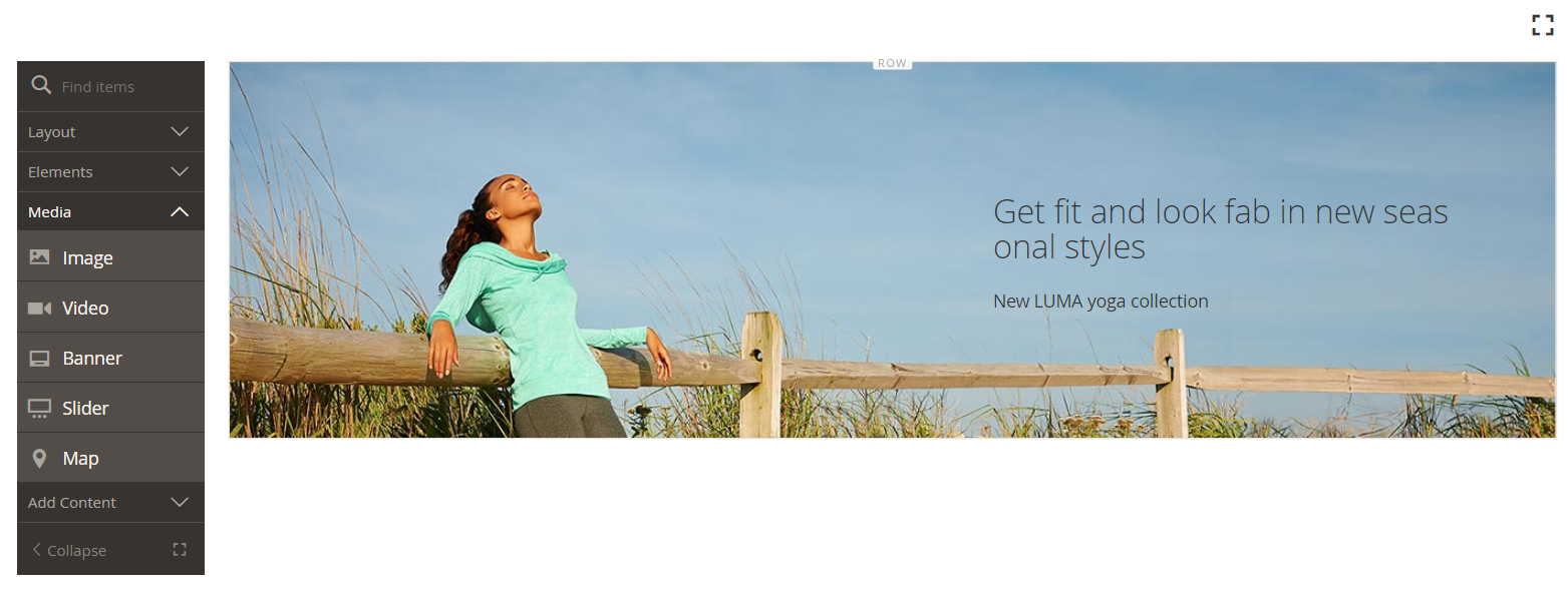 Banner in the content stage with formatted text
 -
-
Hover to display the Banner toolbox, choose the Settings (
 ) icon again, then scroll to the Content section.
Notice that your text is displayed in the Message Text box. Text can be entered and edited either from the stage or from the Content section of the banner settings.
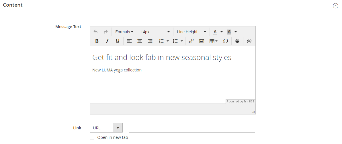 Banner settings - message text
 -
Continuing in the Content section, set the banner link and button:
-
Find the Link option below the banner message.
By default, this is set to
URL. -
To link the banner to the appropriate category of products, set Link to
Category. Then, click Select to show the category tree and chooseWhat's New.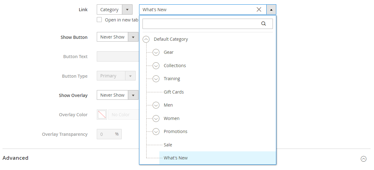 Banner content - link to category
 -
Set Show Button to
Always. -
For Button Text, enter
Shop Nowas the text that appears on the button. -
Accept the
Primarydefault Button Type.The button style from the current theme determines the button format.
-
-
Set the banner overlay:
You can use an overlay to apply a background color to the active content area that is defined by the Appearance setting. The banner background image continues to be visible for the full width of the banner.
-
Set Show Overlay to
Always. -
For Overlay Color, do one of the following:
- Click the color square and choose the white swatch.
- Click in the No Color text box and enter
Whiteor the hexadecimal value#ffffff.
Then, click Apply.
 Banner settings - button overlay color
 -
In the upper-right corner, click Save to save the settings and return to the Page Builder workspace.
The button appears below the banner message on the stage.
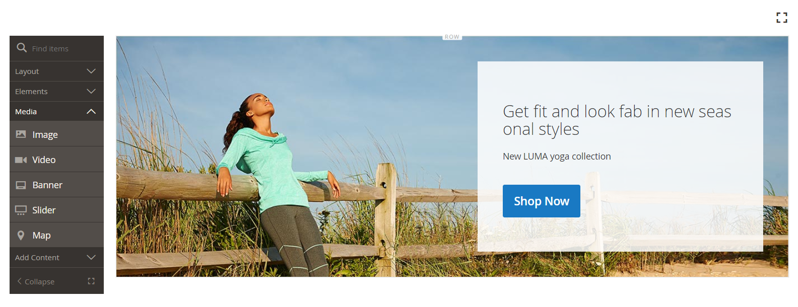 Banner in the content stage with text message and button
-
-
In the upper-right corner of the stage, click the Fullscreen (
 ) icon.
Fullscreen mode includes the Page Builder panel and the stage, and shows how the page looks from the storefront.
 Page Builder content stage fullscreen mode
To return to the Content section of the page, click Close (
 ) in the upper-right corner of the stage.
You can toggle between the two workspace modes any time you want.
-
In the upper-right corner, click the Save arrow and choose Save & Close.
 Choosing the Save & Close option
 -
When prompted, click the Cache Management link in the message at the top of the page and refresh any invalid cache.
Congratulations! You have completed Part 1 of the Simple Page tutorial. Keep the work that you created, so you can refer to it later.
Part 2: Contained row with two equal columns
In this part of the tutorial, you will add a new row to the page, and divide the row into two equal columns. Then, you will add a linked image to each column. In the instructions, each new row is added before the first row to make the Page Builder panel line up with the stage. At the end of the tutorial, you will rearrange the rows so they match the Simple Page example.
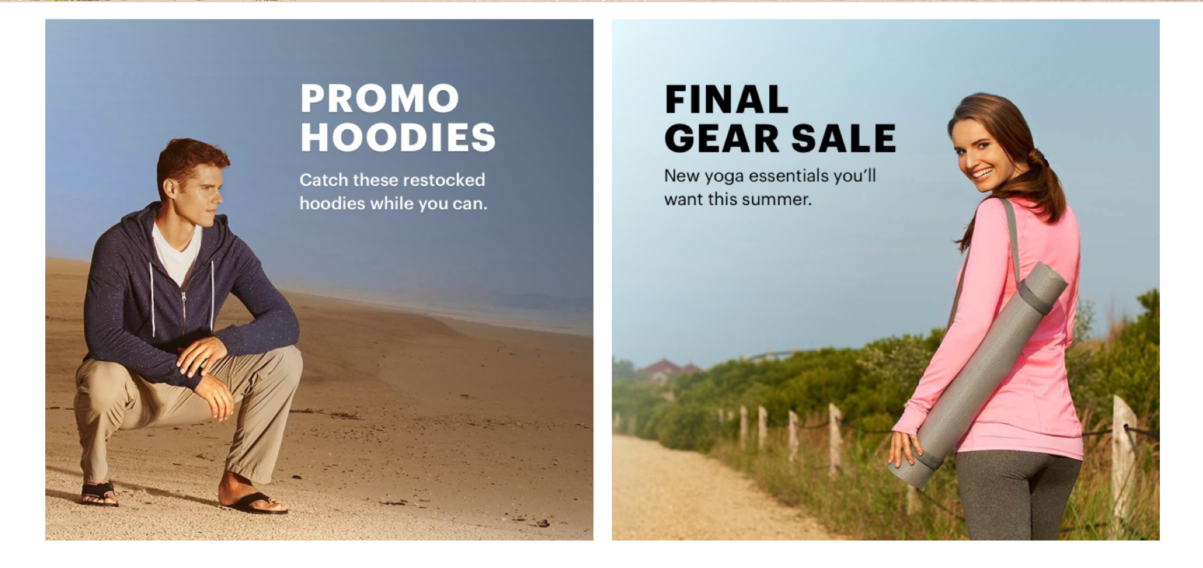 Example page using contained row with two equal columns
Step 1: Add a new row
-
In the Pages grid, find the Simple Page that you created in the first part of this tutorial and select Edit in the Action column.
-
Expand
 the Content section.
 -
In the Page Builder panel under Layout, drag a Row placeholder to the stage and place it above the banner.
The red guideline marks the boundary between the two rows.
 Adding a new row above the banner
 -
Hover over the new row to display the toolbox and choose the Settings (
 ) icon.
 Row toolbox
 -
Under Appearance, accept the Contained default setting.
This setting limits the content area of the row to the width of the page as defined by the theme.
 Keeping the default Contained appearance setting
 -
In the upper-right corner, click Save to save the settings and return to the Page Builder workspace.
Step 2: Add a column
-
In the Page Builder panel under Layout, drag a Column placeholder to the new row.
 Dragging a column content type to the stage
The row is now divided into two columns of equal width. Each column is a separate container for content with its own dedicated toolbox of options.
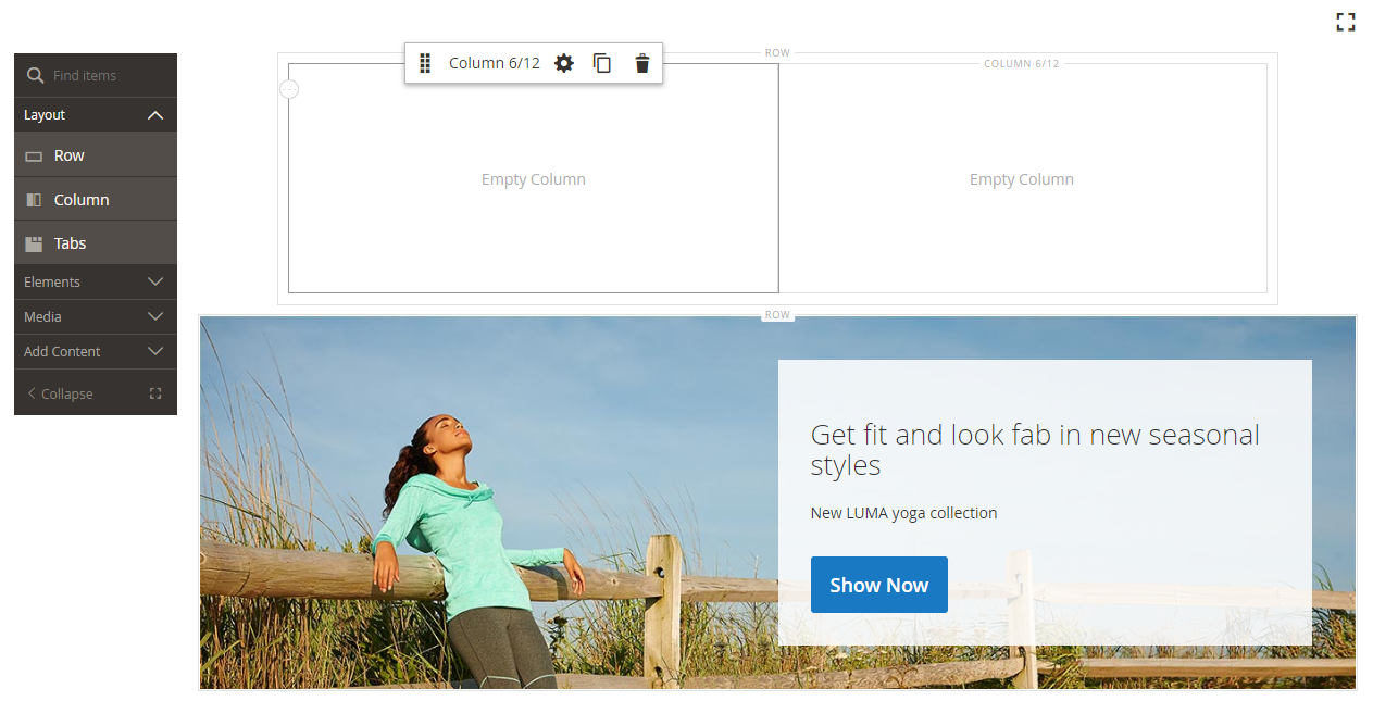 Row with two columns of equal width
 -
In the upper-left corner of the first column, click the circular Grid control (
 ) to show the grid guidelines.
The grid ensures that content is aligned consistently, and will render correctly on both desktop and mobile devices. For information about configuring the grid size, see the Configure Page Builder section in the Page Builder Setup topic.
The numbers in parentheses (6/12) in the top border of each column container indicate the number of grid divisions in each column, and the total number of divisions in the row.
 Displaying grid size details for the column
Step 3: Add images with links
In this step, you will learn how to upload an image to the banner.
-
In the Page Builder panel, expand the Media section and drag an Image placeholder to the first column.
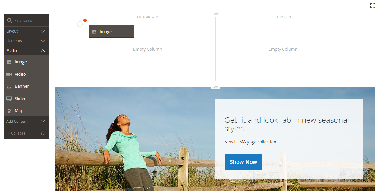 Dragging the image content type to first column
 -
Insert the sample image into the placeholder.
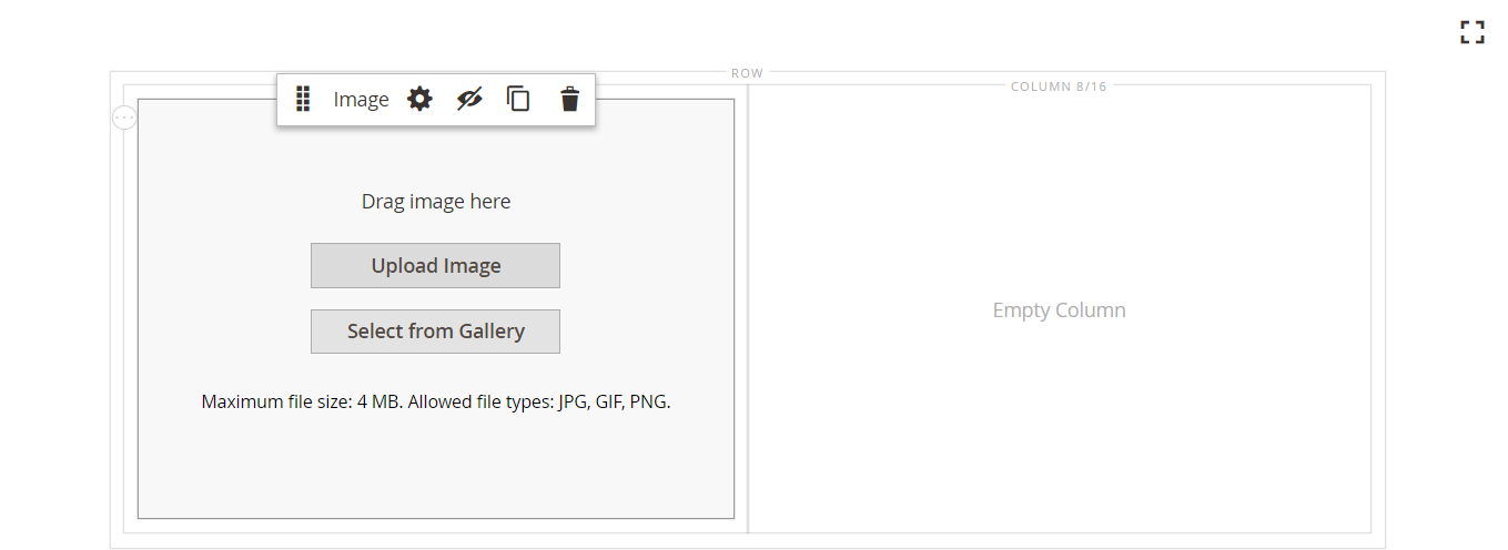 Image placeholder
For am image that is located on your system, you can choose either of these methods:
-
Upload the image file: In the first column, click Upload Image. Then, navigate to the directory where you saved the extracted simple page assets and choose the
small-banner-1.jpgfile.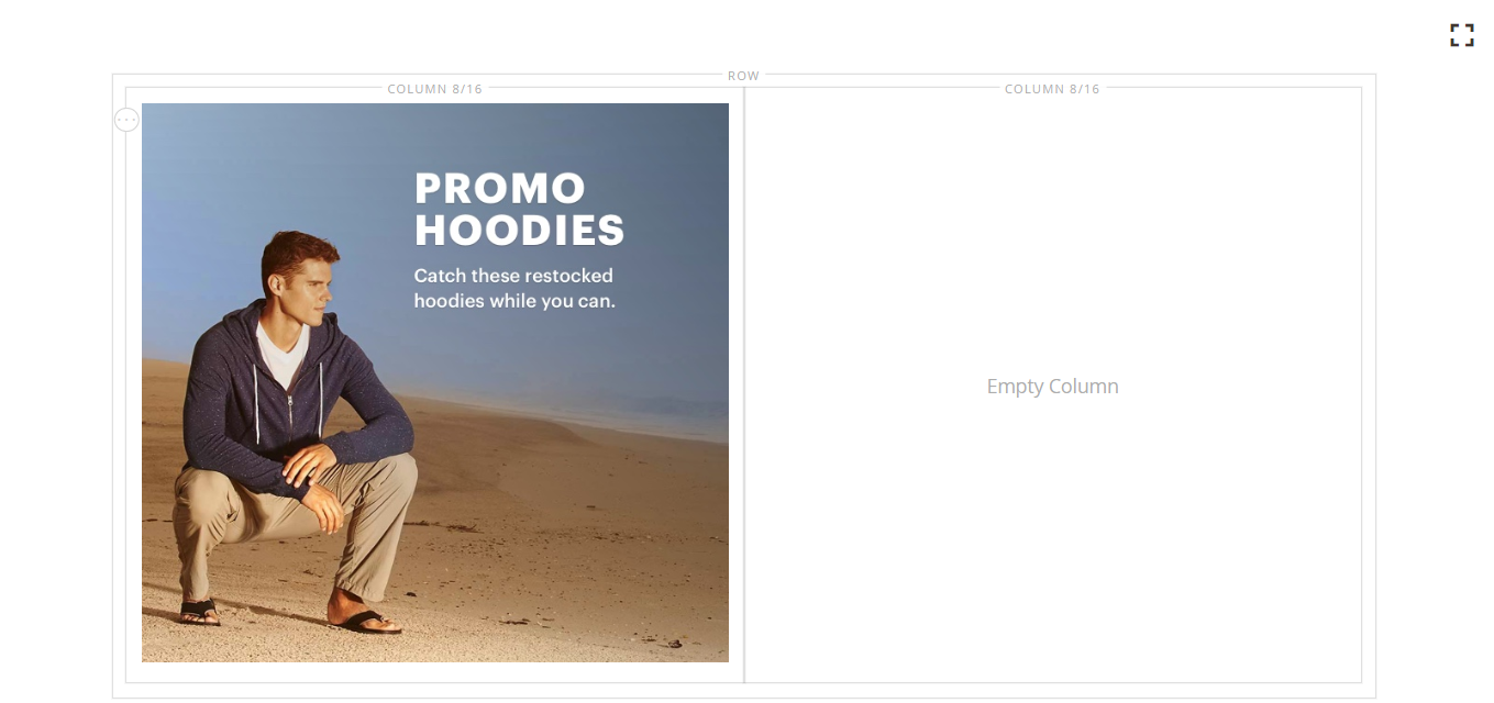 Uploaded image added to the first column
Repeat this action to add the
small-banner-2.jpgfile to the second column. -
Drag the image file: On your desktop, open the simple page assets folder and position it alongside the Magento Admin browser window where you are working with the Page Builder stage. Then, drag the file
small-banner-1.jpgfrom the simple page assets folder, and drop it in the first column.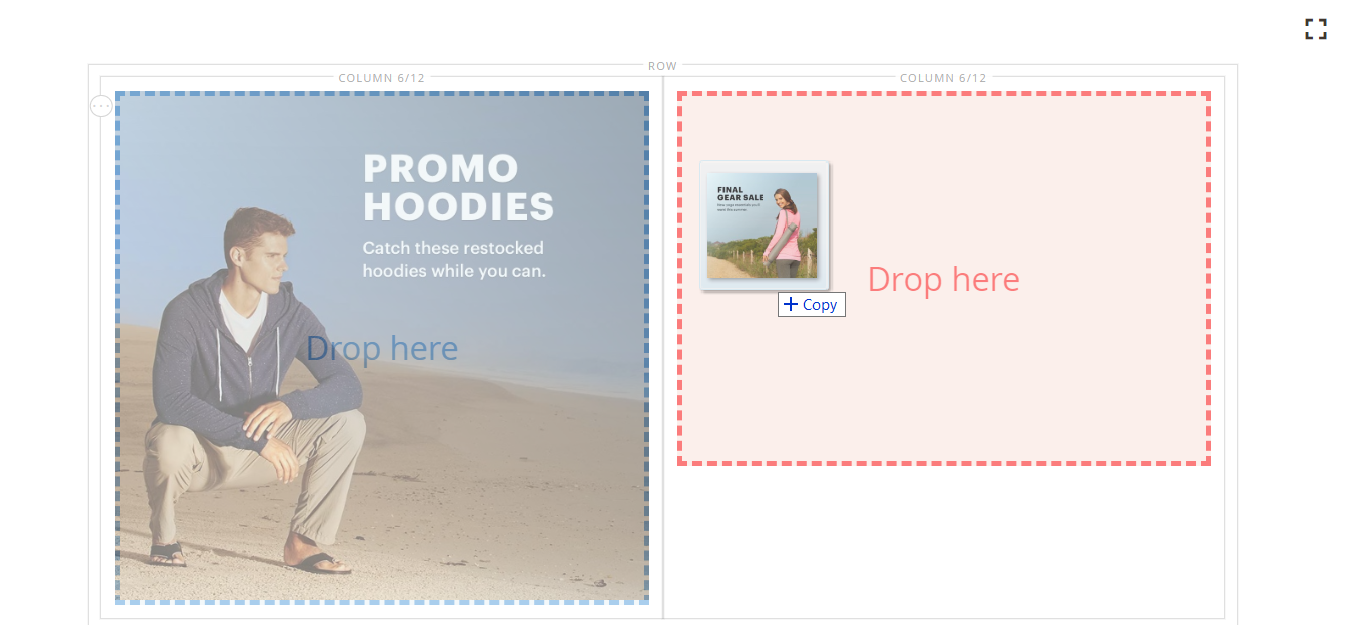 Dragging the image onto the second column
Repeat this action to add the
small-banner-2.jpgfile to the second column.
-
-
Determine which page from your catalog you want to link to each image.
-
Hover over the image in the first column to display the toolbox and choose the Settings (
 ) icon.
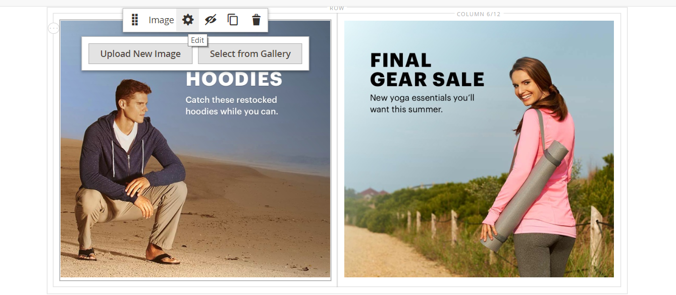 Image toolbox
 -
Link the image to a category:
-
Repeat the previous step to link the image in the second column to the Gear category.
-
In the upper-right corner, click the Save arrow and choose Save & Close.
 Choosing the Save & Close option
 -
When prompted, click the Cache Management link in the message at the top of the page and refresh any invalid cache.
Congratulations! You have completed Part 2 of the Simple Page tutorial. Keep the work that you created, so you can refer to it later.
Part 3: Full-width row with unequal columns
The final row on this page features content from a product review. You will add a full-width row and divide it into two columns of different widths. A background image is added to the first column, with a matching background color that is applied to the row for a unified effect.
 Example full width row with columns of different widths
Step 1: Add a new row
-
In the Pages grid, find the Simple Page that you created in the first part of this tutorial and select Edit in the Action column.
-
Expand
 the Content section.
 -
In the Page Builder panel under Layout, drag a Row placeholder to the stage and place it above the row that was created in the second part of this tutorial.
A red guideline marks the boundary between the two rows.
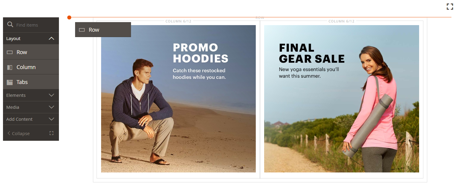 Adding a new row
 -
Hover over the new row to display the toolbox and choose the Settings (
 ) icon.
 Row toolbox
 -
On the Edit Row page under Appearance, choose Full Width.
This setting limits the content area to the maximum page width that is defined by the theme. The background color and/or image are not limited, and extend the full width of the row.
 Selecting the Full Width appearance
 -
In the Background section, enter
#f1f1f1as the Background Color. Setting the background color
 -
Scroll down to the Advanced section and set all Margins & Padding values to
0. Setting the margins and padding
 -
Scroll back to the top of the page and click Save to save the settings and return to the Page Builder workspace.
The background color of the row is now a pale beige.
 Row with the background color in the stage
Step 2: Add columns of different widths
-
In the Page Builder panel under Layout, drag a Column placeholder to the top row on the stage.
 Dragging a column to the stage
 -
Drag the right border of the first column to the “four of twelve” (
4/12) position on the grid.The size of the second column adjusts to “eight of twelve” (
8/12). Resizing the first column
 -
Hover over first column container to display the toolbox and choose the Settings (
 icon.
icon. -
Scroll down to the Advanced section and set all Margins & Padding values to
0. Setting the margins and padding
 -
Scroll back to the top of the page and click Save to save the settings and return to the Page Builder workspace.
Step 3: Add an image to the first column
-
In the Page Builder panel, expand Media and drag an Image content type to the first column.
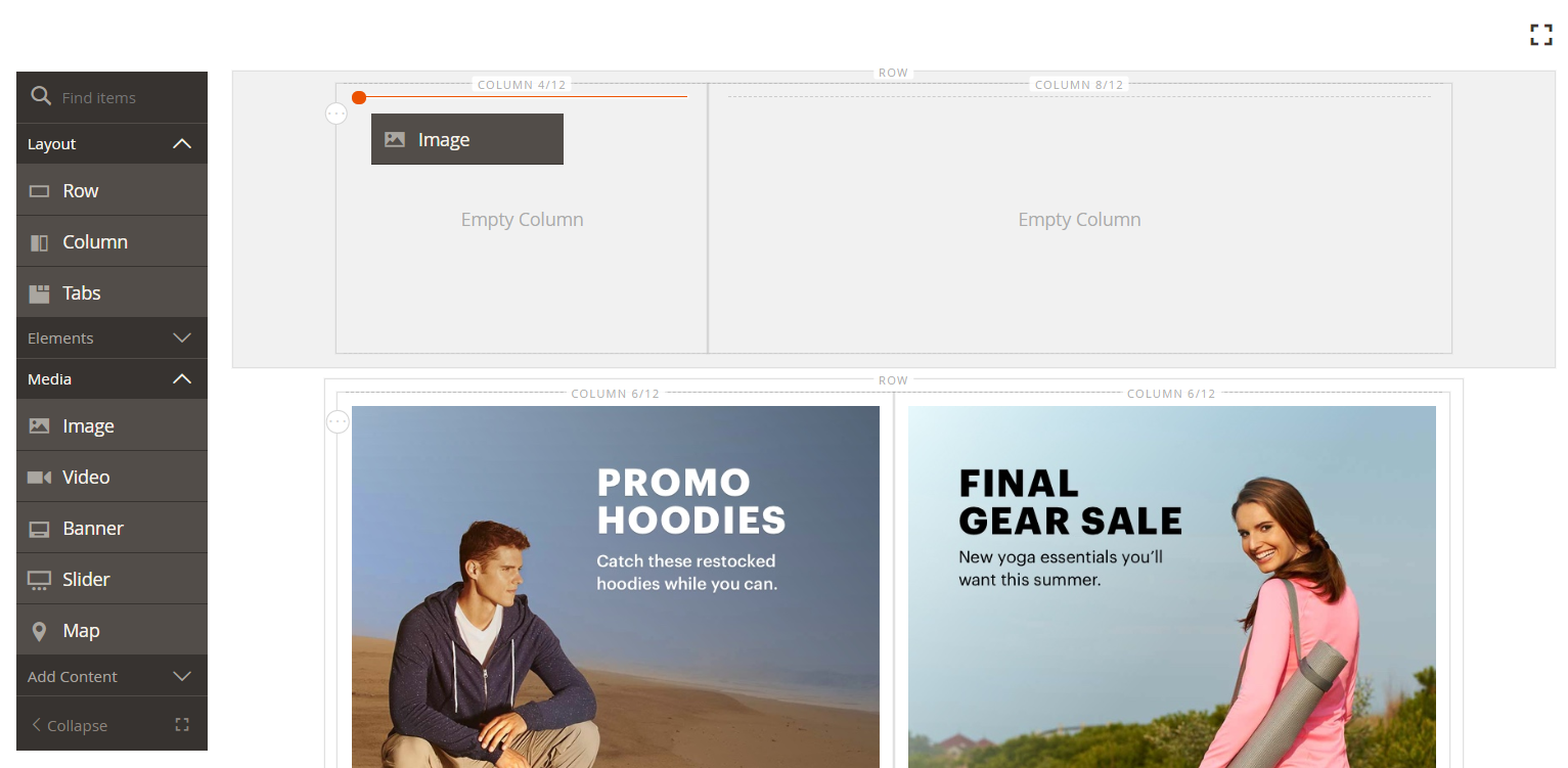 Dragging an image content type to the first column
 -
In the image placeholder, click Upload Image.
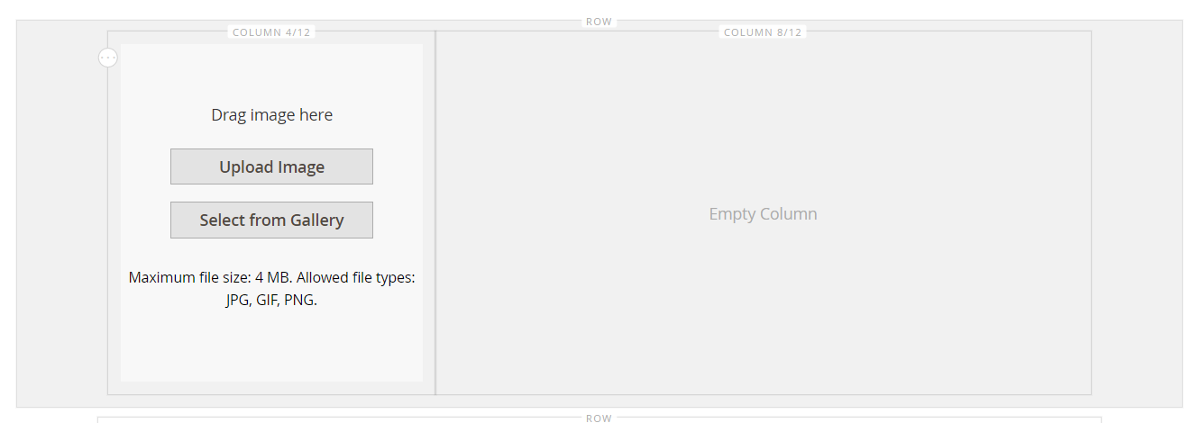 Upload Image
 -
Navigate to the directory where you saved the extracted simple page assets and choose the
review-image.jpgfile.The uploaded image appears in the first column, and blends seamlessly with the background color of the row.
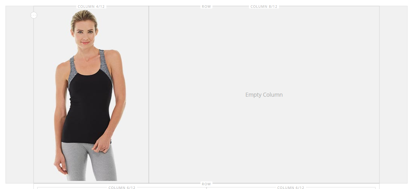 Uploaded image added to the column
 -
In the upper-right corner, click Save.
Step 4: Add review content to the second column
The second column of the row will contain content from a customer review, including the five-star rating image and formatted text message.
-
If necessary, expand
 the Content section and scroll down to the Page Builder workspace.
 -
In the Page Builder panel, expand the Elements section. Then, drag the Text content type to the second column.
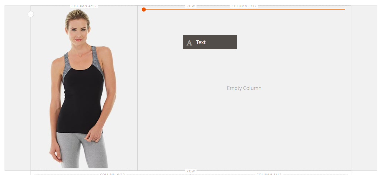 Dragging the text content type to the stage
 -
In the editor toolbar, click the Insert Image (
 ) icon and do the following:
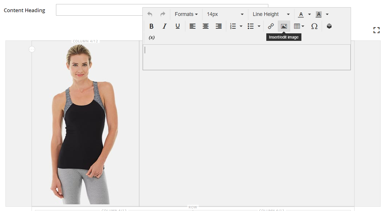 Inserting an image in the text
-
In the Insert/edit image dialog, click the Find (
 ) icon next to the Source field.
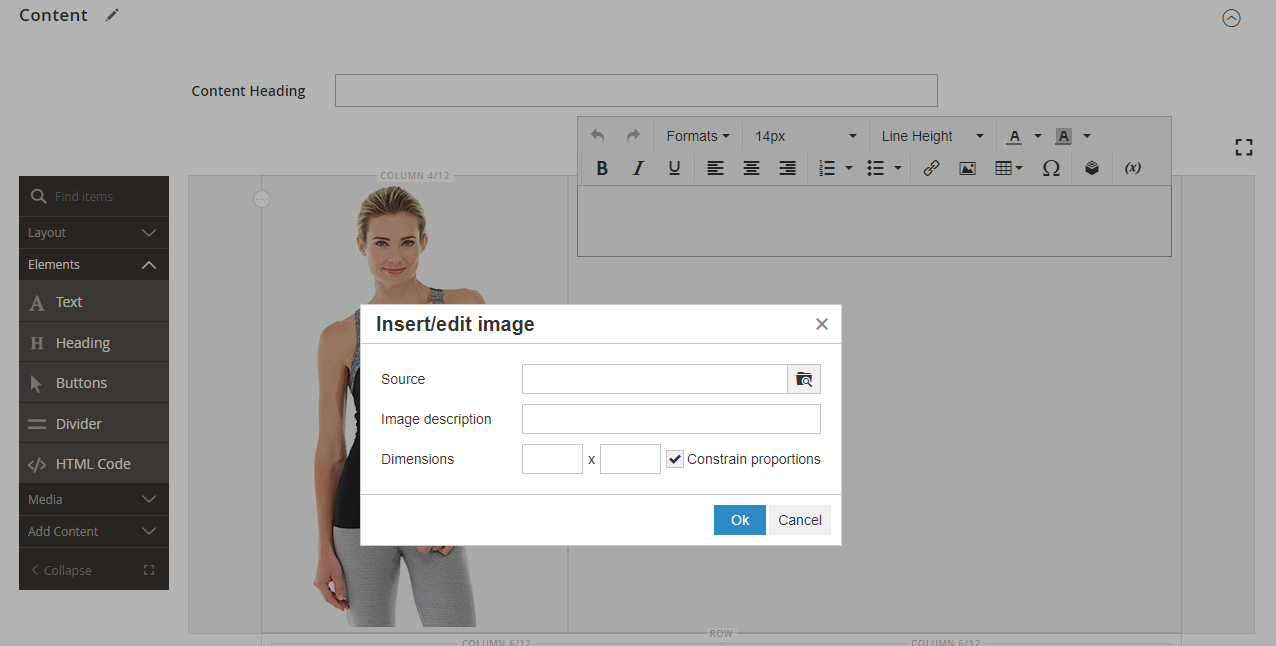 Insert/edit image dialog
 -
On the Select Images page, click Choose Files.
-
In the folder where you saved the simple page assets, choose
rating.png. -
Back on the page, double-click the image tile to select it and insert its URL into the Source field.
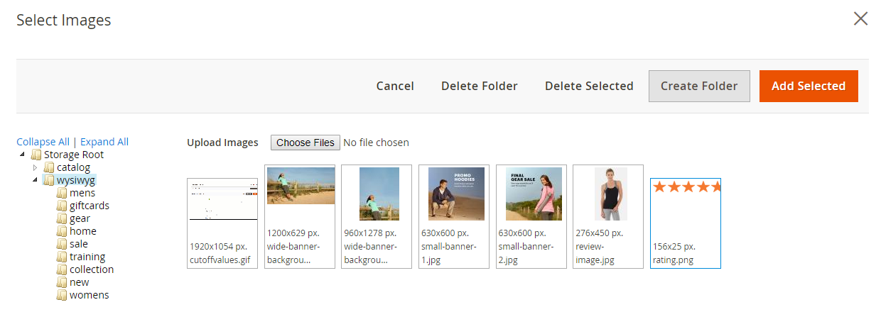 Choosing the image on the page
 -
For Image Description, enter
5-Star Ratingand click OK to insert the image into the column. -
In the editor toolbar, click Align Center (
 ) to center the image in the column.
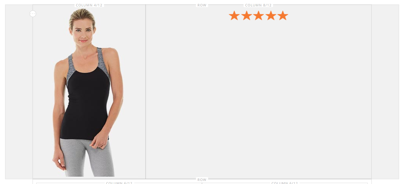 Centered Image
-
-
Position the insertion point just after the five-star image, press Enter/Return key to start a new line, and enter the following text.
Awesome Tank! </ br> I’m a long distance runner and it keeps me pretty comfortable, although these companies always act like their shirts are magical and really it’s just pretty basic stuff. Still it’s a great shirt and I would recommend it.</ br> Antonia Racer Tank – Reviewed by Allyson The text is centered as you type.
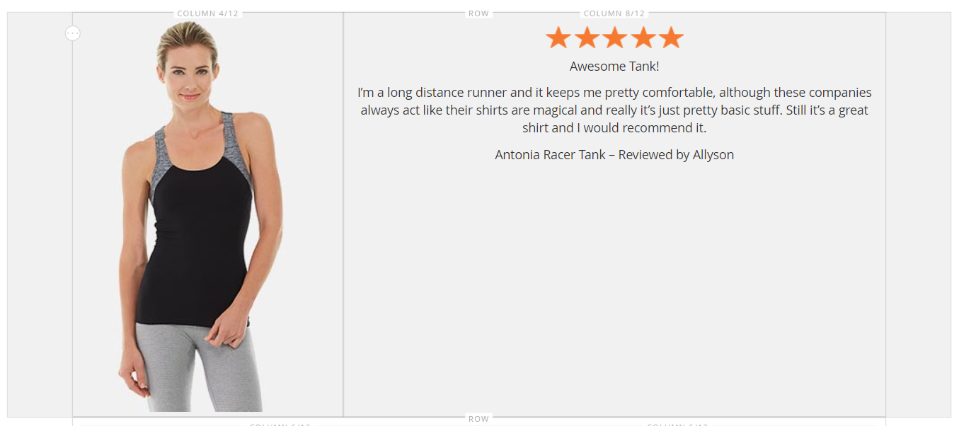 Review text centered in the column
 -
Format the text:
-
Click anywhere in the first line of text and on the editor toolbar under Formats, choose
Heading 2. -
Select the remaining text and on the editor toolbar under Formats, choose
Paragraph.
The text is formatted according to the style sheet that is associated with the theme.
-
-
Get the dimensions of the image so that you can center the content vertically in the column:
-
Hover over the image in the first column to display the toolbox and choose the Settings (
 ) icon.
 -
Below the thumbnail of the image, take note of the dimensions of the image.
 Image dimensions displayed below the thumbnail
 -
In the upper-right corner, click Close.
-
-
Center the content vertically in the second column:
-
Hover over the second column to display the toolbox and choose the Settings (
 ) icon.
Make sure to select the column container rather than the Text container to display the correct toolbox.
-
For Minimum Height, enter
450as the height in pixels for the image in the first column. -
Set Vertical Alignment to
Center.
 Setting the minimum height and vertical alignment
 -
-
Scroll down to the Advanced section and set all Margins and Padding values to zero (
0). Setting the margins and padding
 -
Scroll back to the top of the page and in in the upper-right corner, click Save to save the settings and return to the Page Builder workspace.
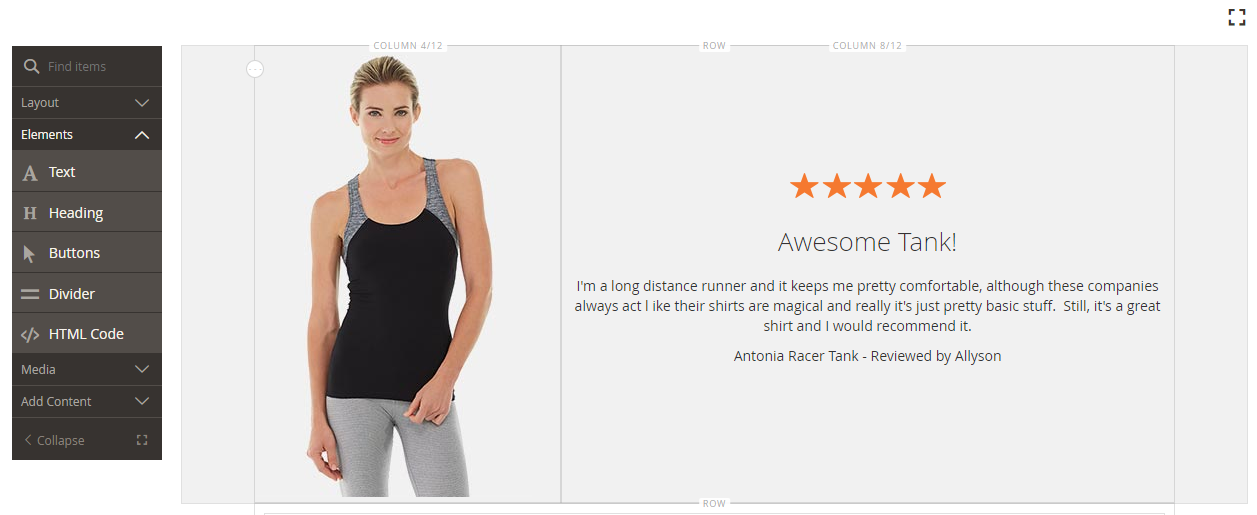 Row with review content on the stage
Step 5: Insert a catalog product link
-
Select the
Antonia Racer Tanktext and click the Insert Link ( ) icon in the editor toolbar.
 -
In the Insert link dialog, specify the link to the catalog product:
-
Enter the product URL.
You can enter either a relative or fully-qualified URL. The following relative link is entered for this example:
../antonia-racer-tank.html -
(Optional) For Title, enter the product name.
The Title link attribute is used by some browsers as a tooltip.
-
When complete, click OK to save the link and return to the Page Builder workspace.
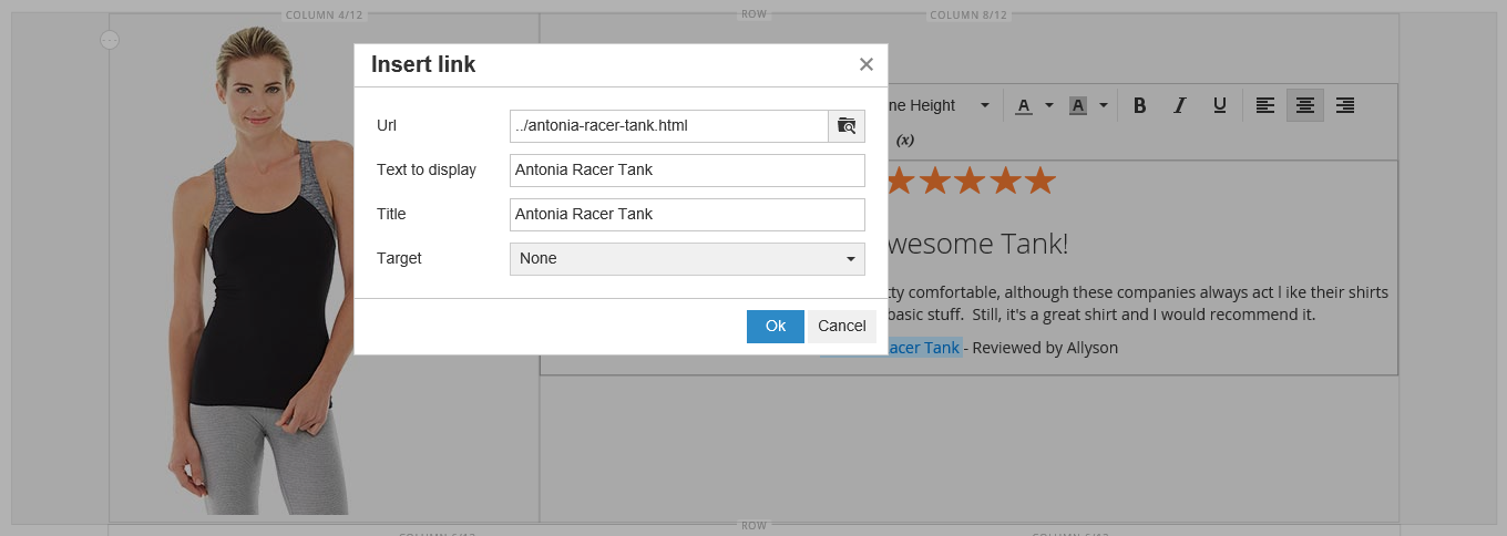 Inserting a link in the text
The linked text is now highlighted in the banner.
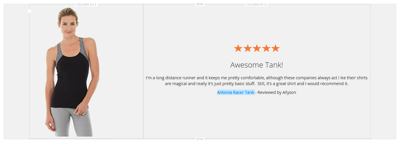 Banner with linked text
-
-
In the upper-right corner, click Save.
Step 6: Rearrange the rows
With all three rows complete, the final step is to rearrange the rows to match the original Simple Page example. To match the original example, the first row must be moved to the bottom, and the last row must be moved to the top.
-
If necessary,
 the Content section and scroll down to the Page Builder workspace.
 -
Hover over the first row on the stage to display the toolbox and choose the Move (
 ) icon.
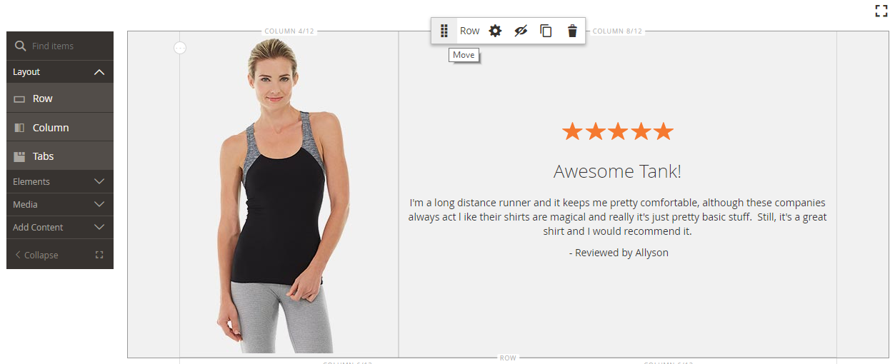 Move
Move -
Hold down the mouse button as you verify that all content in the row is selected and drag the row into position below the red guideline at the bottom of the page.
If you accidentally move only part of the content — such as the image — simply move the content back where it belongs, and try again.
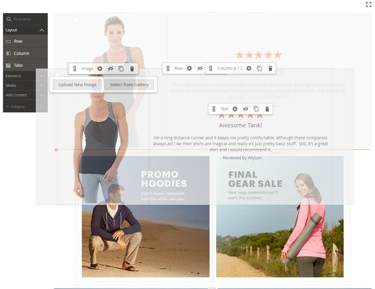 Moving a row on the stage
 -
Repeat this process to move the first row to the second position.
The order of the rows on your page now matches the Simple Page example.
-
If you are working in Fullscreen mode, click the Close (
 ) icon in the upper-right corner to return to the Page Builder workspace.
 -
In the upper-right corner, click the Save arrow and choose Save & Close.
 Choosing the Save & Close option
Congratulations! You have completed Part 3 of the Simple Page tutorial. Keep the work that you created, so you can refer to it later.
Wen you are ready, proceed to Tutorial 2: Blocks