Elements - Divider
Use the Divider content type to add a rule as a visual break between sections of content on the stage. You can specify the line color, thickness, and width of the divider. You can also control the alignment, set the margins and padding, and format of the container border. By default, the divider is a hairline rule that extends the full width of the container, with allowance for padding.
 Default divider in a container without a border
Although most divider containers are invisible, the following example displays the container with a red dashed border so you can see the relationship between the divider, the padding, and the container. You can adjust the padding at the top and bottom of the divider to control the spacing between elements.
 Divider with padding in container with dashed border
Divider toolbox
| Tool | Icon | Description |
|---|---|---|
| Move | Moves the divider container to another valid place on the page. | |
| (label) | DIVIDER | Identifies the current container as a divider element. |
| Settings | Opens the Edit Divider page, where you can change the properties of the divider and its container. | |
| Hide | Hides the divider container. | |
| Show | Shows the hidden divider container. | |
| Duplicate | Makes a copy of the divider container. | |
| Remove | Deletes the divider container and its content from the stage. |
Add a divider
-
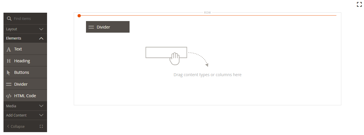
In the Page Builder panel, expand Elements and drag a Divider placeholder to a row, column, or tab set on the stage.
Use the red guideline for reference as you position the divider either before or after another content container on the stage.
 Dragging a divider to the stage
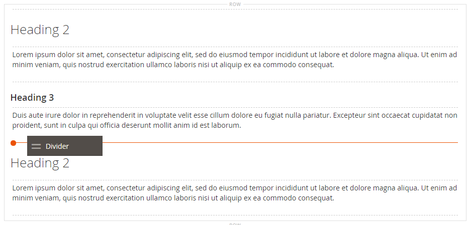
In the following example, the divider marks the beginning of a new section of text.
 Divider separating sections of text
 -
Follow the next procedure to specify the settings of the new divider.
Change the divider settings
-
Hover over the divider container to display the toolbox and choose the Settings (
 ) icon.
 Divider toolbox
 -
Change the divider Line Color using one of the following methods:
- Enter a valid HTML color name. For example,
Teal. - Enter the hexadecimal color value. For example,
#008080.
When complete, click Apply.
 Setting the line color
 - Enter a valid HTML color name. For example,
-
Enter the Line Thickness in pixels.
-
Enter the Line Width followed by either
pxor%to indicate the unit of measurement. Setting line color, thickness, and width
 -
Update the Advanced settings as needed.
-
Choose the the Alignment to control the positioning of the divider within the parent container:
Default Applies the alignment default setting that is specified in the style sheet of the current theme. Left Aligns the list along the left border of the parent container, with allowance for any padding that is specified. Center Aligns the list in the center of the parent container, with allowance for any padding that is specified. Right Aligns the block along the right border of the parent container, with allowance for any padding that is specified. In the following example, the options are set to use a center alignment for the divider.
 Divider with a center alignment
 -
Set the Border style applied to all four sides of the divider container:
Default Applies the default border style that is specified by the associated style sheet. None Does not provide any visible indication of the container borders. Dotted The container border appears as a dotted line. Dashed The container border appears as a dashed line. Solid The container border appears as a solid line. Double The container border appears as a double line. Groove The container border appears as a grooved line. Ridge The container border appears as a ridged line. Inset The container border appears as a inset line. Outset The container border appears as a outset line. -
If you set a border style other than
None, complete the border display options:-
Border Color - Specify the color by choosing a swatch, clicking the color picker, or by entering a valid color name or equivalent hexadecimal value.
-
Border Width - Enter the number of pixels for the border line width.
-
Border Radius - Enter the number of pixels to define the size of the radius that is used to round each corner of the border.
-
-
(Optional) Specify the names of CSS classes from the current style sheet to apply to the container.
Separate multiple class names with a space.
-
Enter values, in pixels, for the Margins and Padding to determine the outer margins and inner padding of the divider container.
Enter the corresponding values in the diagram.
Margins The amount of blank space that is applied to the outside edge of all sides of the container. Options: Top / Right / Bottom / Left Padding The amount of blank space that is applied to the inside edge of all sides of the container. Options: Top / Right / Bottom / Left
-
-
When complete, click Save and return to the Page Builder workspace.
 Divider centered in a row
 -
In the upper-right corner, click Save for the page.
Duplicate a divider
For a formatted divider with specific settings, it is more efficient to make a duplicate, rather than start over with a new placeholder.
-
Hover over the divider container to display the toolbox and choose the Duplicate (
 ) icon.
The duplicate divider container appears just below the original.
 Duplicated divider
 -
Hover over the new divider container to display the toolbox and choose the Move (
 ) icon.
 Moving a divider
 -
Select and drag the divider until the red guideline marks the new position.
The top and bottom borders of each container appear as dashed lines while the divider is moved.
 Moving the duplicated divider into position
 -
In the upper-right corner of the page, click Save.