Elements - Heading
Heading levels establish a hierarchy that organizes content, and helps search engines index each page. Use the Heading content type in the Page Builder workspace to add a text container with a heading level from H1 to H6 to the stage. Headings are formatted according to the style sheet that is associated with the current theme.
The Content Heading field in the Content section can be used to add an H1 heading to the top of the page. However, the field is a legacy from previous versions of Magento and is provided to support older content. Because this field does not take advantage of Page Builder’s advanced features, we recommend that you leave the Content Heading field blank and use the Page Builder Heading content type to add headings of any level to the page.
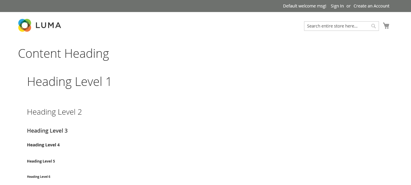
The following example shows how the Content Heading and the Heading content type appear when formatted by the Luma theme.
 Content Heading and heading Levels on the storefront
You can drag a heading from the Elements section of the Page Builder panel to a row, column, or tab set on the stage. The heading level and alignment can be controlled from the editor toolbar on the stage, or by using the Settings ( ![]() ) control.
) control.
Heading editor
 Heading editor with toolbar
Heading container toolbox
As with all content containers, the toolbox appears when you hover over the container.
 Heading container toolbox
| Tool | Icon | Description |
|---|---|---|
| Move | Moves the heading container to another valid place on the page. | |
| (label) | Heading | Identifies the current container as a heading. |
| Settings | Opens the Edit Heading page, where you can change the properties of the container. | |
| Hide | Hides the heading container. | |
| Show | Shows the hidden heading container. | |
| Duplicate | Makes a copy of the heading container. | |
| Remove | Deletes the heading container and its content from the stage. |
Add a heading
-
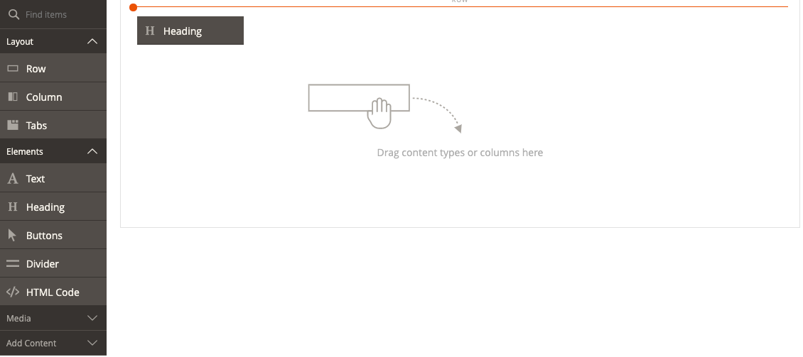
In the Page Builder panel, expand Elements and drag a Heading placeholder to a row, column, or tab set on the stage.
 Dragging a heading to the stage
 -
In the editor, enter the heading text over the
Edit Heading Textplaceholder.By default, the heading text is assigned a level two (H2) heading type.
 Placeholder in the heading editor
 -
In the toolbar, choose the appropriate heading type between H1 and H6.
-
Change the alignment, if needed.
-
When complete, click Save in the upper-right corner.
Edit header settings
-
Hover over the heading container to display the toolbox and choose the Settings (
 ) icon.
 Heading toolbox
 -
Update the heading content (Heading Type and Heading Text) if needed.
This is also available to update in the heading editor.
-
Update the Advanced settings as needed.
-
Choose an Alignment to control the positioning of the heading within the parent container:
Default Applies the alignment default setting that is specified in the style sheet of the current theme. Left Aligns the list along the left border of the parent container, with allowance for any padding that is specified. Center Aligns the list in the center of the parent container, with allowance for any padding that is specified. Right Aligns the block along the right border of the parent container, with allowance for any padding that is specified. -
Set the Border style applied to all four sides of the heading container:
Default Applies the default border style that is specified by the associated style sheet. None Does not provide any visible indication of the container borders. Dotted The container border appears as a dotted line. Dashed The container border appears as a dashed line. Solid The container border appears as a solid line. Double The container border appears as a double line. Groove The container border appears as a grooved line. Ridge The container border appears as a ridged line. Inset The container border appears as a inset line. Outset The container border appears as a outset line. -
If you set a border style other than
None, complete the border display options:-
Border Color - Specify the color by choosing a swatch, clicking the color picker, or by entering a valid color name or equivalent hexadecimal value.
-
Border Width - Enter the number of pixels for the border line width.
-
Border Radius - Enter the number of pixels to define the size of the radius that is used to round each corner of the border.
-
-
(Optional) Specify the names of CSS classes from the current style sheet to apply to the container.
Separate multiple class names with a space.
-
Enter values, in pixels, for the Margins and Padding to determine the outer margins and inner padding of the heading container.
Enter the corresponding values in the diagram.
Margins The amount of blank space that is applied to the outside edge of all sides of the container. Options: Top / Right / Bottom / Left Padding The amount of blank space that is applied to the inside edge of all sides of the container. Options: Top / Right / Bottom / Left
-
-
When complete, click Save and return to the Page Builder workspace.
-
Click Save to save the page.
Duplicate a heading
For a formatted heading with specific settings, it is more efficient to duplicate the heading, rather than start over with a new placeholder.
-
Hover over the heading container to display the toolbox and choose the Duplicate (
 ) icon.
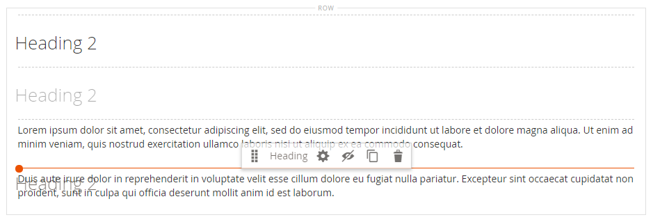
The duplicate appears just below the original.
 Duplicating a heading container
 -
Hover over the new heading container to display the toolbox and choose the Move (
 ) icon.
 Moving a heading
 -
Select and drag the heading until the red guideline marks the new position.
The top and bottom borders of each container appear as dashed lines while the heading is moved.
 Moving the duplicated heading into position
 -
If you need to change the heading level, click the heading text and choose the new level in the editor toolbar.
 Choosing a new heading Level