Media - Image
Use the Image content type in the Page Builder workspace to add a JPG, GIF, or PNG image to the stage. In addition to the default desktop image, you can specify a secondary image for mobile devices. You can also add a caption that appears below the image and link the image to any URL, product, category, or page.
You can use the Adobe Stock Integration to find and save an appropriate asset from among the millions provided by Adobe Stock. See Using Adobe Stock Images for details about how to search, refine, and save Adobe Stock assets into your gallery.
 Image in a column
Image toolbox
The image toolbox appears when you hover over the image container.
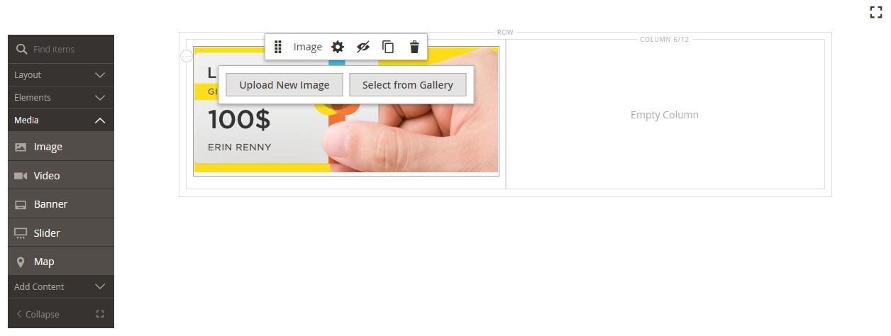 Image toolbox
| Tool | Icon | Description |
|---|---|---|
| Move | Moves the image to another position on the stage. | |
| (label) | Image | Identifies the current content container as an image. Hover over the image container to see the toolbox. |
| Settings | Opens the Edit Image page, where you can change the properties of the image and container. | |
| Hide | Hides the current image. | |
| Show | Shows the hidden image. | |
| Duplicate | Makes a copy of the image. | |
| Remove | Deletes the image from the stage. | |
| Upload New Image | Uploads an image from your local file system to the gallery. | |
| Select from Gallery | Chooses an existing image from the gallery. |
Add an image
-
In the Page Builder panel, expand Media and drag an Image placeholder to the target container.
You can add an image to a row, column, or tab. In the following example, the image is dragged to an empty column.
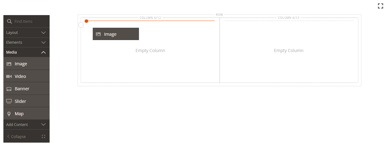 Dragging an image content type to the stage
 -
Use one of the following methods to add the image asset:
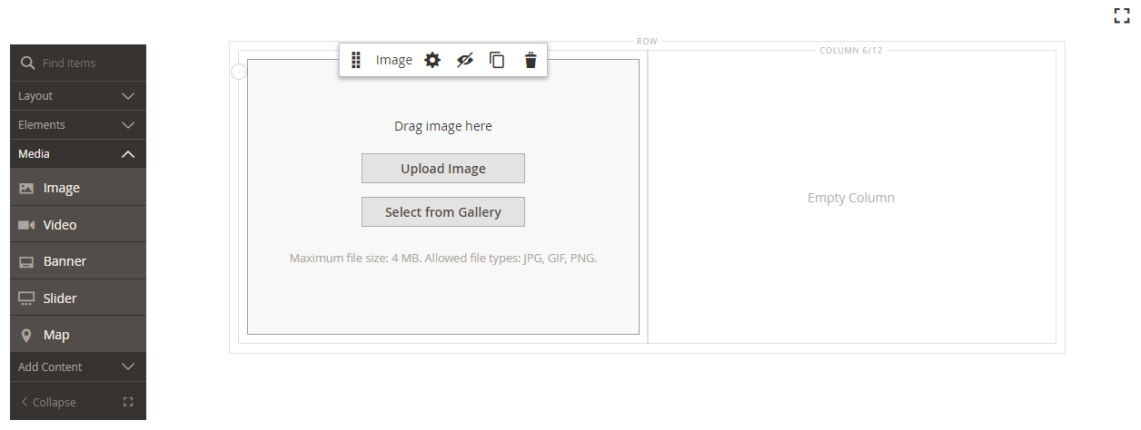 Upload Image or Select from Gallery tools on the stage
The maximum file size is 4 MB. Supported file types are JPG, GIF, and PNG.
-
Upload a new image: Use this method to upload a new image file from your system.
-
Click Upload Image.
-
Locate and choose the image to add it to the gallery and target container.
As an alternative, you can also drag an image file from your system and drop it on the Camera !Camera icon](/merchdocs-archive/user-guide/v2.3/images/images-ee/icon-pb-camera.png){: width=”25px”} icon.
-
-
Select an existing asset: Use this method to select an existing image asset from the media storage/gallery.
-
Click Select from Gallery.
-
Use the tree to navigate to the image.
-
Click the thumbnail and click Add Selected.
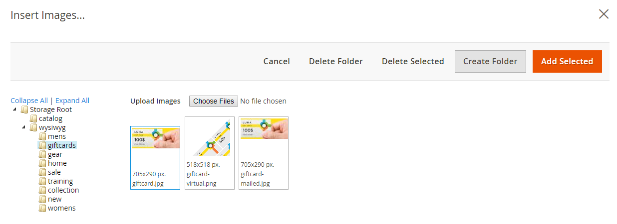 Adding a selected image
-
-
Search and select an Adobe Stock image: Use this method to find an image from Adobe Stock.
This requires an Adobe Stock integration configured for your Admin.
-
Click Search Adobe Stock and search for an image.
-
Save the preview or licensed image to the gallery.
See Using Adobe Stock Images for more information about working with Adobe Stock assets.
-
Select the asset thumbnail in the gallery and click Add Selected.
-
The image appears in the target container at the placeholder location. Unlike a background image, you can move the image to a different position within the current container or to a different container.
The Banner and Slider content types also include Upload Image and Select from Gallery options for adding images.
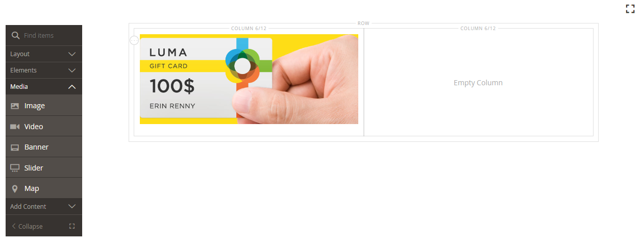 Image in a column
 -
Change image settings
-
Hover over the image container to display the tool box and choose the Settings (
 ) icon.
The file name, dimensions, and file size appear below the current image.
 Current image
 -
To change the current Image, do one of the following:
-
Upload a new image: Use this method to upload a new image file from your system.
-
Click Upload Image.
-
Locate and choose the image to add it to the gallery and target container.
-
-
Select an existing asset: Use this method to select an existing image asset from the media storage/gallery.
-
Click Select from Gallery.
-
Use the tree to navigate to the image.
-
Click the thumbnail and click Add Selected.
 Adding a selected image
-
-
Search and select an Adobe Stock image: Use this method to find an image from Adobe Stock.
This requires an Adobe Stock integration configured for your Admin.
-
Click Search Adobe Stock and search for an image.
-
Save the preview or licensed image to the gallery.
See Using Adobe Stock Images for more information about working with Adobe Stock assets.
-
Select the asset thumbnail in the gallery and click Add Selected.
-
-
-
To add a Mobile Image, use the same methods described in the previous step to select an image to be used for display on mobile devices.
 Mobile image
 -
If needed, specify a Link for the image.
The link is the destination page that appears when the customer clicks the image. You can use one of three link types:
-
URL - Links to either a relative or fully-qualified URL.
 Link to a URL
 -
Product - Identifies the destination page based on the product name or SKU. Search for the product by name based on either a partial or full name. Choose the product from the search results list.
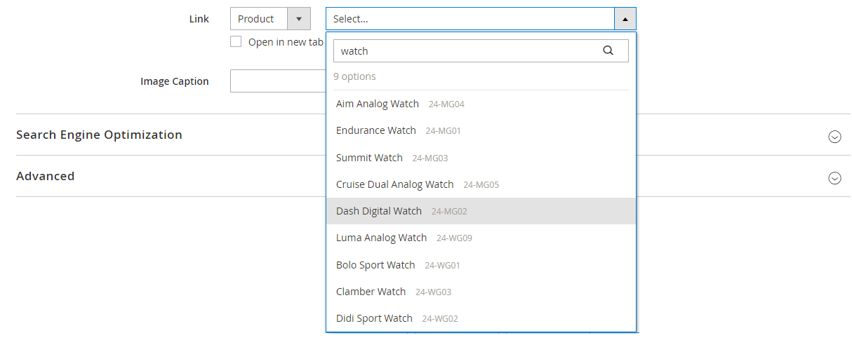 Choosing a product to link
 -
Category - Identifies the destination page as a specific category or subcategory in the category tree. Search for the category based on either a partial or full name. Choose the category from the expanded section of the displayed tree.
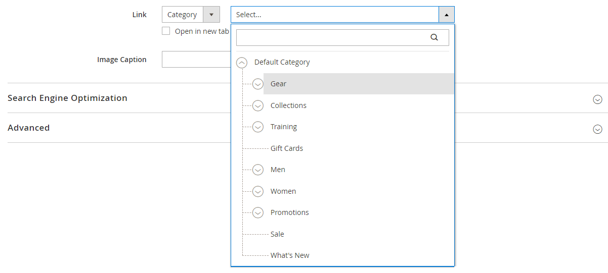 Choosing a category to link
 -
Page - Identifies the destination page as a specific content page. Search for the page based on either a partial or full name. Choose the page from the search results list.
 Choosing a page to link
If you want to prevent the visitor from navigating away from your store, select the Open in new tab checkbox. When the checkbox is cleared, the linked destination opens in the same browser tab, which could effectively navigate the visitor away from your store.
-
-
To add an Image Caption, enter the text that you want to appear below the image.
The format of the caption is determined by the stylesheet that is associated with the current theme. T
 Image caption
The caption typically appears below the image, and provides information about the image for visitors and search engines. If your site is available in multiple languages, you might use the same image, but translate the caption. In HTML, the
<figcaption>tag is a subset of the<figure>tag.<figcaption>This is the image caption</figcaption> -
Update any of the other settings as needed:
-
When complete, click Save in the upper-right corner to close the Edit Image page.
-
In the upper-right corner, click Save.
Move an image
-
Hover over the image container to display the toolbox and choose the Move (
 ) icon.
 Moving an image
 -
Select and drag the image to the new position, just below the red guideline.
 Using the red guideline to position the image
Remove an image
-
Hover over the image container to display the toolbox and choose the Remove (
 ) icon.
 -
When prompted to confirm, click OK.
Search Engine Optimization
Text for these settings is visible to search engines and improves the way the page is indexed.
-
For Alternative Text, enter the alt text that you want to be available to improve accessibility.
The use of alt text is an accessibility best practice, and in some locales is required by law. The
altattribute is a subset of the image tag.<image title="tooltip" alt="description" src="image.jpg"> -
For Title Attribute, enter the text that you want to appear as a tooltip on mouseover.
As a best practice, choose a descriptive, keyword-rich title to improve the way the image is indexed by search engines. In HTML, the titleattribute is a subset of the image tag.<image title="tooltip" alt="description" src="image.jpg">
Advanced
-
Choose an Alignment to control the horizontal positioning of the images added to the container.
Default Applies the alignment default setting that is specified in the style sheet of the current theme. Left Aligns the image content along the left border of the image container, with allowance for any padding that is specified. Center Aligns the image content in the center of the image container, with allowance for any padding that is specified. Right Aligns the image content along the right border of the image container, with allowance for any padding that is specified. -
Set the Border style applied to all four sides of the image container:
Default Applies the default border style that is specified by the associated style sheet. None Does not provide any visible indication of the container borders. Dotted The container border appears as a dotted line. Dashed The container border appears as a dashed line. Solid The container border appears as a solid line. Double The container border appears as a double line. Groove The container border appears as a grooved line. Ridge The container border appears as a ridged line. Inset The container border appears as a inset line. Outset The container border appears as a outset line. -
If you set a border style other than
None, complete the border display options:-
Border Color - Specify the color by choosing a swatch, clicking the color picker, or by entering a valid color name or equivalent hexadecimal value.
 Border Color
 -
Border Width - Enter the number of pixels for the border line width.
-
Border Radius - Enter the number of pixels to define the size of the radius that is used to round each corner of the border.
-
-
(Optional) Specify the names of CSS classes from the current style sheet to apply to the image container.
Separate multiple class names with a space.
-
Enter values, in pixels, for the Margins and Padding to specify the outer margins and inner padding of the image container.
Enter each corresponding value in the image container diagram.
Margins The amount of blank space that is applied to the outside edge of all sides of the container. Padding The amount of blank space that is applied to the inside edge of all sides of the container.