Elements - Text
Use the Text content type to add a container and text editor with a “What You See Is What You Get” view of the content to the stage. In addition, you can add links, images, variables, and widgets to the text from the editor toolbar.
 Formatted text on a banner
Text editor tools
You can access the text editor directly from the stage or from a settings page. Changes made directly to the stage are saved automatically. For more information, see Using the Editor.
 Text editor tool - TinyMCE 4
Text container toolbox
 Text container toolbox
| Tool | Icon | Description |
|---|---|---|
| Move | Moves the text container to another valid place on the page. | |
| (label) | TEXT | Identifies the current container as a text element. |
| Settings | Opens the text container properties in edit mode. | |
| Hide | Hides the text container. | |
| Show | Shows the hidden text container. | |
| Duplicate | Makes a copy of the text container. | |
| Remove | Deletes the text container and its content from the stage. |
Add text
-
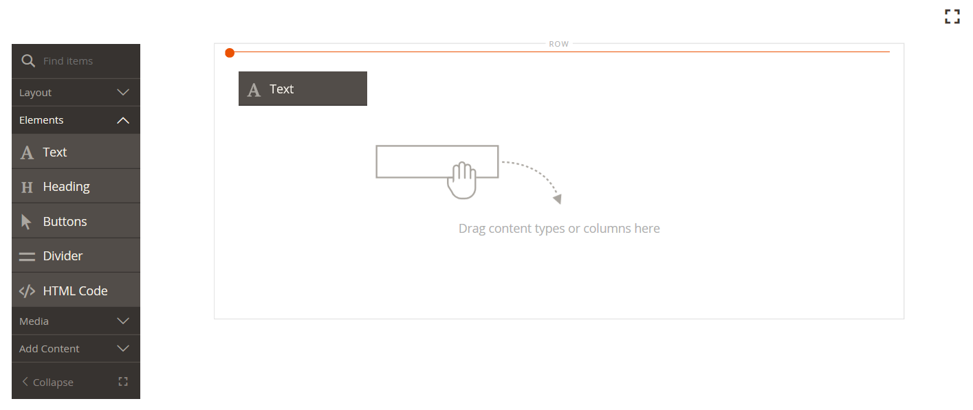
In the Page Builder panel, expand Elements and drag a Text placeholder to a row, column, or tab set on the stage.
 Dragging a text placeholder to the stage
 -
Use the editor to enter and format text, as needed.
For more information, see Using the Editor.
 Text editor with content
 -
When complete, click Save.
Create a link
The Insert Link button in the editor makes it easy to add a hyperlink to an image in the gallery. However, it can also be used to create an inline link in text, provided that you have the URL in advance. Unlike the Widget button, the Insert/Edit link button is not integrated with pages, products, or categories in the store.
To create a link for a telephone number or email, see Adding Custom Variables.
-
In the storefront, navigate to the page that is to be the target destination for the link and copy the link information.
You can use either the fully qualified URL or a relative URL that omits the reference to your store domain.
Full URL https://mystore.com/women/tops-women/tees-women.html Relative URL ../women/tops-women/tees-women.html -
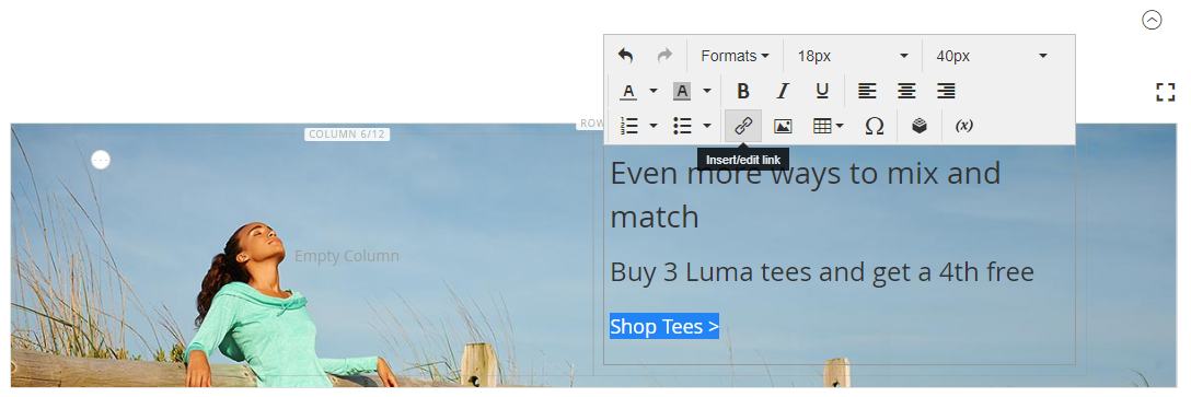
Select the text in the editor space and click Insert/edit link (
 ) on the editor toolbar.
 Adding a link to formatted text
 -
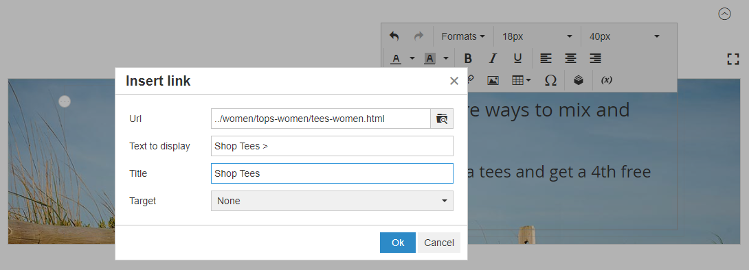
For Url, enter the relative link that you prepared.
-
Set Target to
None.This setting opens the page in the same browser window, rather than opening a new tab.
-
For Title, enter
Shop Tees.The
Titlelink attribute is used by some browsers as a tooltip. -
Click OK to save the link and return to the Page Builder workspace.
 Link detail
Insert an image
-
Place the cursor in the text where you want to insert the image.
-
Click Insert/edit image (
 ) on the editor toolbar.
 -
For Source, click the search icon to use the media storage for locating and selecting an image.
-
For Image description, enter descriptive text for the image.
This populates the
altlink attribute for the image and is used by some browsers for accessibility. -
Enter the with and height Dimensions, in pixels, for rendering the image on the page.
Keep the Constrain proportions checkbox selected to automatically maintain the aspect ratio for the image.
-
Click OK to insert the image and then return to the Page Builder workspace.
Change text settings
-
Hover over the text container to display the toolbox and choose the Settings (
 ) icon.
Because the text container is tightly nested inside another container, make sure that you have the correct toolbox.
-
Update the content as needed.
-
Update the Advanced settings as needed.
-
Choose an Alignment to control the positioning of the text within the parent container:
Default Applies the alignment default setting that is specified in the style sheet of the current theme. Left Aligns the list along the left border of the parent container, with allowance for any padding that is specified. Center Aligns the list in the center of the parent container, with allowance for any padding that is specified. Right Aligns the block along the right border of the parent container, with allowance for any padding that is specified. -
Set the Border style applied to all four sides of the text container:
Default Applies the default border style that is specified by the associated style sheet. None Does not provide any visible indication of the container borders. Dotted The container border appears as a dotted line. Dashed The container border appears as a dashed line. Solid The container border appears as a solid line. Double The container border appears as a double line. Groove The container border appears as a grooved line. Ridge The container border appears as a ridged line. Inset The container border appears as a inset line. Outset The container border appears as a outset line. -
If you set a border style other than
None, complete the border display options:-
Border Color - Specify the color by choosing a swatch, clicking the color picker, or by entering a valid color name or equivalent hexadecimal value.
-
Border Width - Enter the number of pixels for the border line width.
-
Border Radius - Enter the number of pixels to define the size of the radius that is used to round each corner of the border.
-
-
(Optional) Specify the names of CSS classes from the current style sheet to apply to the container.
Separate multiple class names with a space.
-
Enter values, in pixels, for the Margins and Padding to determine the outer margins and inner padding of the text container.
Enter the corresponding values in the diagram.
Margins The amount of blank space that is applied to the outside edge of all sides of the container. Options: Top / Right / Bottom / Left Padding The amount of blank space that is applied to the inside edge of all sides of the container. Options: Top / Right / Bottom / Left
-
-
When complete, click Save and return to the Page Builder workspace.
-
Click Save to save the page.