Add Content - Block
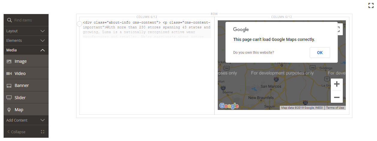
Use the Block content type to add an existing, active block to the stage. In the following example, the first column contains the HTML Code for the page. The second column contains a block with a Google map.
 Block with map on the sample About Us Page
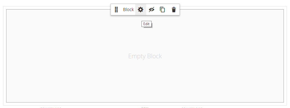
Block toolbox
| Tool | Icon | Description |
|---|---|---|
| Move | Moves the block container and its content to another position on the stage. | |
| Settings | Opens the Edit Block page, where you can choose the block, and change the properties of the container. | |
| Hide | Hides the current block container and its content. | |
| Show | Shows the hidden block container and its content. | |
| Duplicate | Makes a copy of the block container and its content. | |
| Remove | Deletes the block container and its content from the stage. |
Add an existing block
-
Navigate to the Page Builder workspace on the target page, block, dynamic block, product, or category.
-
In the Page Builder panel, expand Add Content and drag a Block placeholder to the stage.
 Dragging a block onto the stage
 -
Hover over the empty block container to display the toolbox and choose the Settings (
 ) icon.
 -
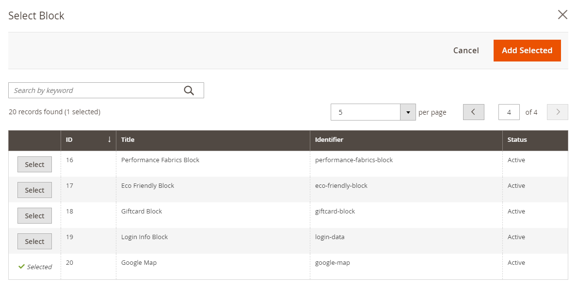
Click Select Block.
 Selecting a block
 -
In the row of the block that you want to add, click Select in the last column.
 Selected block
The name of the selected block appears on the page.
 Block name
 -
Complete the remaining settings as needed, using the field descriptions at the end of this page for reference.
-
When complete, click Save to return to the Page Builder workspace.
-
On the Save menu in the upper-right corner, click Save.
Advanced Settings
-
Choose an Alignment to control the positioning of the block within the parent container:
Default Applies the alignment default setting that is specified in the style sheet of the current theme. Left Aligns the list along the left border of the parent container, with allowance for any padding that is specified. Center Aligns the list in the center of the parent container, with allowance for any padding that is specified. Right Aligns the block along the right border of the parent container, with allowance for any padding that is specified. -
Set a Border style to be applied to all four sides of the block container:
Default Applies the default border style that is specified by the associated style sheet. None Does not provide any visible indication of the container borders. Dotted The container border appears as a dotted line. Dashed The container border appears as a dashed line. Solid The container border appears as a solid line. Double The container border appears as a double line. Groove The container border appears as a grooved line. Ridge The container border appears as a ridged line. Inset The container border appears as a inset line. Outset The container border appears as a outset line. -
If you set a border style other than
None, complete the border display options:-
Border Color - Specify the color by choosing a swatch, clicking the color picker, or by entering a valid color name or equivalent hexadecimal value.
-
Border Width - Enter the number of pixels for the border line width.
-
Border Radius - Enter the number of pixels to define the size of the radius that is used to round each corner of the border.
-
-
(Optional) Specify the names of CSS classes from the current style sheet to apply to the container.
Separate multiple class names with a space.
-
Enter values, in pixels, for the Margins and Padding to determine the outer margins and inner padding of the block container.
Enter the corresponding values in the diagram.
Margins The amount of blank space that is applied to the outside edge of all sides of the container. Options: Top / Right / Bottom / Left Padding The amount of blank space that is applied to the inside edge of all sides of the container. Options: Top / Right / Bottom / Left
Edit block settings
-
Hover over the block container and choose Settings (
 ) in the toolbox.
 Block Toolbox
 -
To choose a different block, click Select Block.
- In the list of active blocks, click Select the block that you want to add.
- Click Add Selected.
-
Update the remaining settings as needed, using the field descriptions at the end of this page for reference.
-
When complete, click Save to return to the Page Builder workspace.
-
In the upper-right corner, click Save.
Duplicate a block
-
Hover over the block container to display the toolbox and choose the Duplicate (
 ) icon.
The duplicate appears just below the original.
-
To move the new block to a new position, hover over the container. Then, choose Move (
 ) in the toolbox.
 -
Select and drag the block until the red guideline appears at the new position.
The top and bottom borders of each container appear as dashed lines while the block is moved.
Remove a block from the stage
-
Hover over the block container to display the toolbox and choose the Remove (
 ) icon.
 -
When prompted to confirm, click OK.