Layout - Tabs
Use the Tabs content type to add a set of tabs in the Page Builder workspace. When the Tabs placeholder is dragged from the panel to the stage, a single default tab initially appears. You can add more tabs as needed to create a full set. The width of the tab set is determined by the width of its parent container and padding settings.
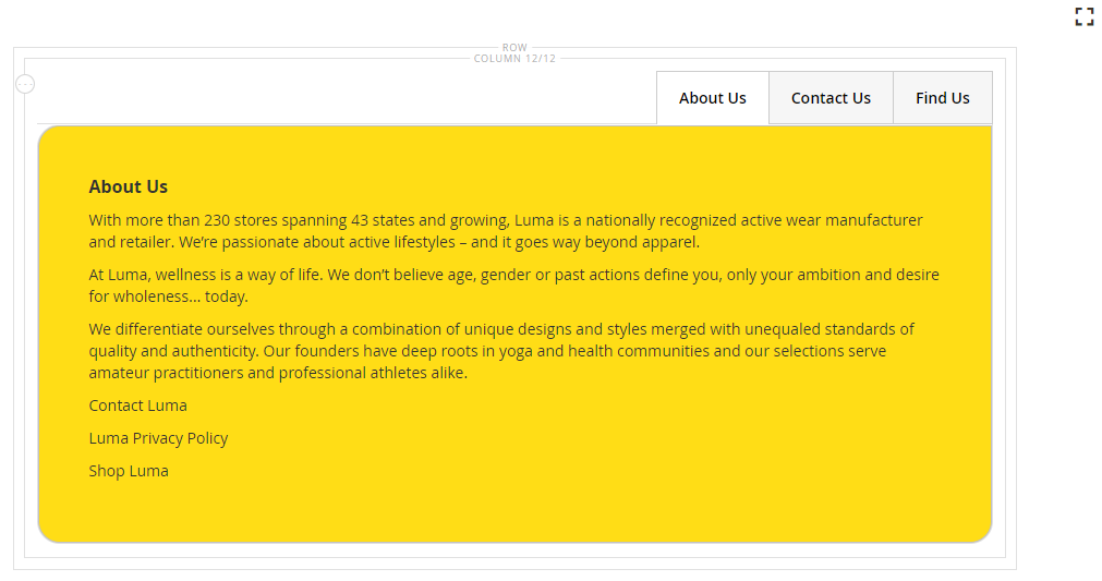 Set of tabs
Toolboxes
When you are working with the Tabs content type, you add and edit individual tabs and the tabs containers that holds one or more tabs. Each of these has its own toolbox that you use to design tabs on the Page Builder stage.
Individual tab toolbox
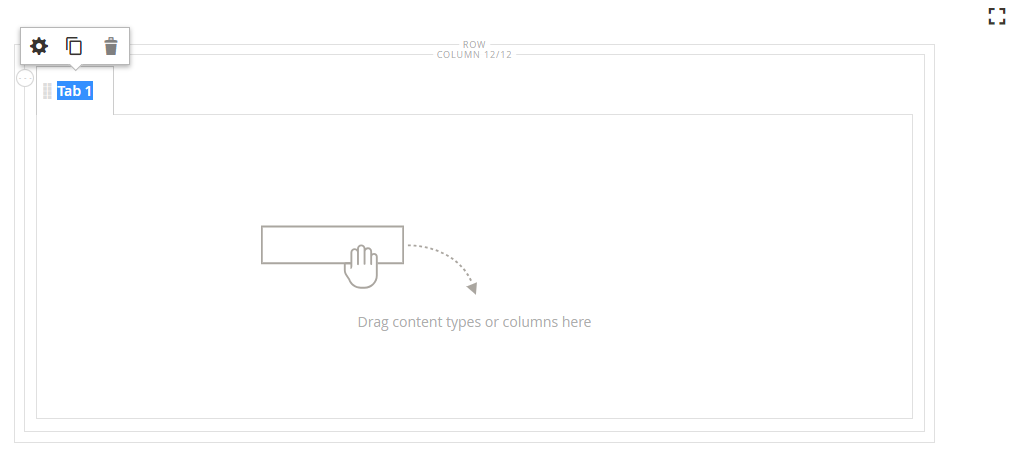 Tab toolbox
| Tool | Icon | Description |
|---|---|---|
| Move | This control next to the tab label is used to move the individual tab to another position in the tab set. | |
| Settings | Opens the Edit Tabs page, where you can change the properties of the individual tab. | |
| Duplicate | Makes a copy of the tab. | |
| Remove | Deletes the tab from the tab set. |
Tabs container toolbox
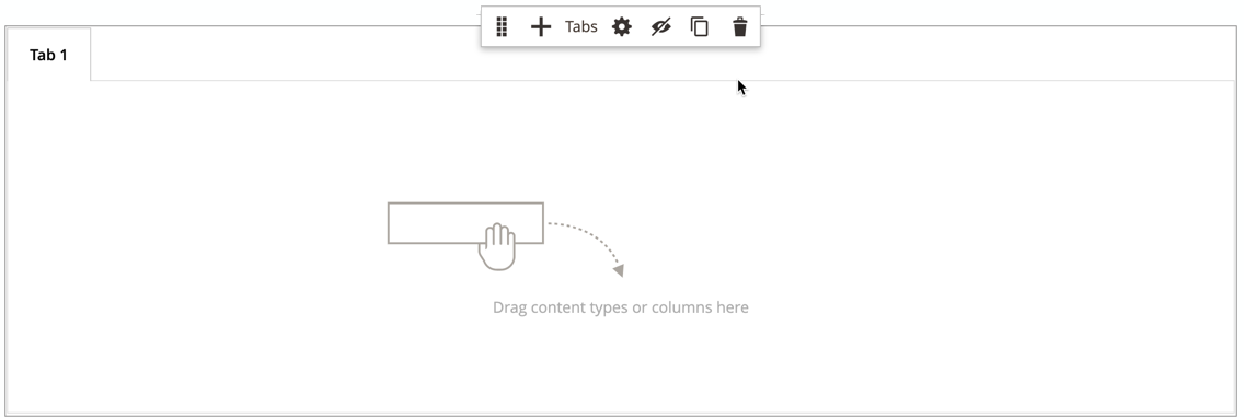 Tab container toolbox
| Tool | Icon | Description |
|---|---|---|
| Move | Moves the set of tabs to another position on the grid in the parent container. | |
| Add | Adds a new tab to the tab set. | |
| (label) | Tabs | Identifies the current container as a tab set. Hover over the top border of the container to see the toolbox. |
| Settings | Opens the Edit Tab page, where you can change the properties of the container. | |
| Hide | Hides the tab container. | |
| Show | Shows the hidden tab container. | |
| Duplicate | Makes a copy of the current tab. | |
| Remove | Deletes the current tab set from the stage. |
Add an individual tab
-
In the Page Builder panel under Layout, drag the Tabs placeholder to a row or column on the stage.
 Dragging tabs to a row
 -
Click the Tab 1 label to display the individual tab toolbox and choose the Settings (
 ) icon.
 -
Enter the Tab Name that you want to use as a label.
 Entering the tab name
 -
If needed, enter the Minimum Height for the tab.
This value can be a number with any valid CSS unit (such as
100px,50%,50em,100vh) or a calculation (such as100vh - 237px). -
Choose a Vertical Alignment setting to align any content containers that are added to the tab (Top, Center, or Bottom).
-
If needed, set the other options using the following sections as guidance:
-
In the upper-right corner, click Save.
Add a set of tabs
The following steps start with an individual tab and create a set of three tabs within a tabs container. If you do not already have an individual tab, follow the previous instructions to add an single tab to a row on the stage.
-
Hover over the tabs container to display the toolbox and choose the Add (
 ) icon.
 -
Click in the Tab 2 label to display the cursor and enter you own label for the tab.
-
Click the second tab again on the stage and choose the Duplicate (
 ) icon.
 -
Click in the YourName Copy label to display the cursor and enter you own label for the third tab.
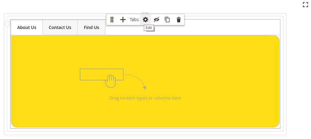 Matching set of tabs with toolbox
Move a tab within the set
-
Click the tab that you want to move.
-
Select and drag the Move (
 ) icon, which appears just before the tab label text, to a new position within the tab set.
Add content to a tab
You can any content type to a tab just as you can to a row. Use the following steps for adding a text content type as an example.
-
Click the tab where you want to add the content.
-
In the Page Builder panel, expand Elements and drag a Text placeholder to the tab.
-
Enter or paste some text in the editor and use the editor toolbar to format it as needed.
See Elements - Text for more information about working with the tex content type.
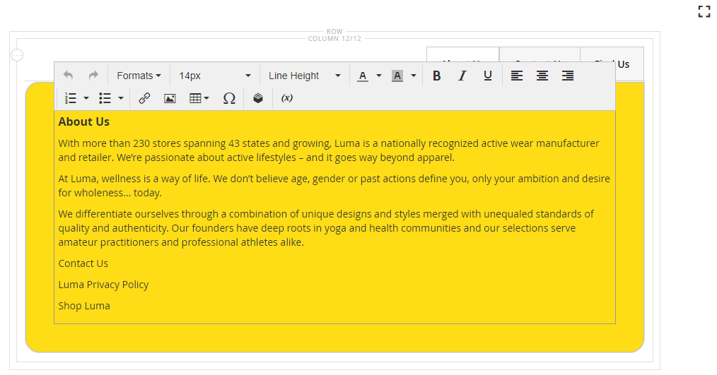 Editing text content added on the tab
 -
In the upper-right corner, click Save.
Change individual tab settings
-
Hover over an individual tab to display the toolbox and choose the Settings (
 ) icon.
 -
If needed, change any of the basic settings for the tab:
-
Tab Name - Enter revise text for the tab label. You can also modify the label directly on the stage.
-
Minimum Height - Enter as pixels if you want to override the automatic height. For example, you might set the minimum height to match the height of a background image to ensure that the full image is visible.
-
Vertical Alignment - Choose the vertical position of content containers that are added to the tab.
-
-
Change the other settings as needed using the the following sections for details.
-
When complete, click Save in the upper-right corner to close the Edit Tab page.
-
In the upper-right corner, click Save.
Background
-
Background Color - Specify the background color by choosing a swatch, clicking the color picker, or by entering a valid color name or equivalent hexadecimal value. This determines the background color of the row. You can also adjust the opacity of the color.
 No color (default)
You can enter a value in three ways:
-
A predefined color name, such as
White -
The hexadecimal color value for the color, such as
#ffffff -
The rgba value for the color, with opacity percent, such as
rgba(255, 255, 255, 0.75)
If you want to choose a color, click the swatch to the left of the No Color box.
 Choosing a color swatch
If you click the color box to open the color picker again, the box below the slider shows the current red, green, blue, and alpha values (rgba). The last number indicates the current opacity percentage as a decimal. You can use the slider to adjust the opacity, or enter the desired decimal value.
 Setting opacity
Page Builder also supports a transparency layer, or alpha channel, in background images that can be used to create backgrounds with varying degrees of opacity.
-
-
Background Image - If needed, use the provided tools to choose a background image to apply to the tab:
Upload Uploads an image file from your local computer to the gallery and then applies it as the background image for the tab. Select from Gallery Prompts you to choose an existing image from the gallery as the background image for the tab. 
Allows you to either drag the image to the camera tile or browse to the image in your local file system. -
Background Mobile Image - If needed, use the same tools to choose a different background image to be used for display on mobile devices.
-
Background Size - Set this option to determine how the background image is scaled in relation to the width of the tab:
Cover The background image covers the full width of the tab. Contain The background image is limited to the width of the tab area. Auto Applies the size from the current style sheet. -
Background Position - Set this option to determine how the background image is anchored in relation to the tab: Top Left / Top Center / Top Right / Center Left / Center / Center Right / Bottom Left / Bottom Center / Bottom Right
-
Background Attachment - Set the attachment type to determine how the background image moves in relation to the scrolling page:
Scroll The attached background image is synchronized to move down as the page scrolls. Fixed (Not available for mobile) The background image does not move as the container scrolls over the image and is fixed at the specified background position. -
Background Repeat - Set this to
Yesto repeat the background image to fill the available space in the tab.
Advanced
-
Choose an Alignment to control the horizontal alignment of content containers that are added to the tab.
Default Applies the alignment default setting that is specified in the style sheet of the current theme. Left Aligns the content containers along the left border of the tab, with allowance for any padding that is specified. Center Aligns the content container in the center of the tab, with allowance for any padding that is specified. Right Aligns the content container along the right border of the tab, with allowance for any padding that is specified. -
Set the Border style applied to all four sides of the tab container:
Default Applies the default border style that is specified by the associated style sheet. None Does not provide any visible indication of the container borders. Dotted The container border appears as a dotted line. Dashed The container border appears as a dashed line. Solid The container border appears as a solid line. Double The container border appears as a double line. Groove The container border appears as a grooved line. Ridge The container border appears as a ridged line. Inset The container border appears as a inset line. Outset The container border appears as a outset line. -
If you set a border style other than
None, complete the border display options:-
Border Color - Specify the color by choosing a swatch, clicking the color picker, or by entering a valid color name or equivalent hexadecimal value.
 Border Color
 -
Border Width - Enter the number of pixels for the border line width.
-
Border Radius - Enter the number of pixels to define the size of the radius that is used to round each corner of the border.
The row in the following example has a border radius of 15.
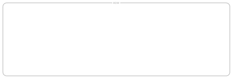 Row with border radius of 15
-
-
(Optional) Specify the names of CSS classes from the current style sheet to apply to the column container.
Separate multiple class names with a space.
-
Enter values, in pixels, for the Margins and Padding to specify the outer margins and inner padding of the column.
Enter each corresponding value in the tab container diagram.
Margins The amount of blank space that is applied to the outside edge of all sides of the container. Options: Top / Right / Bottom / Left Padding The amount of blank space that is applied to the inside edge of all sides of the container. Options: Top / Right / Bottom / Left
Change tab set settings
-
Hover over the top border of the tab set container to display the toolbox and choose the Settings (
 ) icon.
 -
If needed, change the Default Active Tab.
Choose the tab in the set that you want to be active when the page is loaded.
-
Enter the Minimum Height, in pixels, if you want to override the automatic height for the tab set.
-
Choose the Vertical Alignment to position the navigation tabs along the top of the tab set. Options: Left / Center /Right
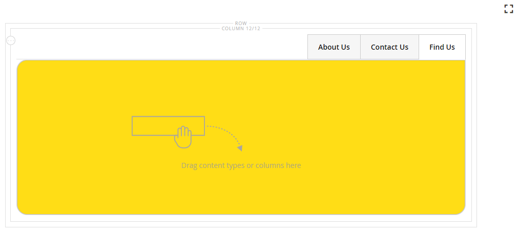 Right-aligned navigation tabs
 -
Set the Advanced options for the tab set:
-
Choose an Alignment to control the positioning of the tab set within the parent container:
Default Applies the alignment default setting that is specified in the style sheet of the current theme. Left Aligns the tab set along the left border of the parent container, with allowance for any padding that is specified. Center Aligns the tab set in the center of the parent container, with allowance for any padding that is specified. Right Aligns the tab set along the right border of the parent container, with allowance for any padding that is specified. -
Set the Border style applied to all four sides of the tabs container:
Default Applies the default border style that is specified by the associated style sheet. None Does not provide any visible indication of the container borders. Dotted The container border appears as a dotted line. Dashed The container border appears as a dashed line. Solid The container border appears as a solid line. Double The container border appears as a double line. Groove The container border appears as a grooved line. Ridge The container border appears as a ridged line. Inset The container border appears as a inset line. Outset The container border appears as a outset line. -
If you set a border style other than
None, complete the border display options:-
Border Color - Specify the color by choosing a swatch, clicking the color picker, or by entering a valid color name or equivalent hexadecimal value.
-
Border Width - Enter the number of pixels for the border line width.
-
Border Radius - Enter the number of pixels to define the size of the radius that is used to round each corner of the border.
-
-
(Optional) Specify the names of CSS classes from the current style sheet to apply to the tabs container.
Separate multiple class names with a space.
-
Enter values, in pixels, for the Margins and Padding to determine the outer margins and inner padding of the tabs container.
Enter the corresponding values in the tabs container diagram.
Margins The amount of blank space that is applied to the outside edge of all sides of the container. Options: Top / Right / Bottom / Left Padding The amount of blank space that is applied to the inside edge of all sides of the container. Options: Top / Right / Bottom / Left
-
-
When complete, click Save in the upper-right corner to close the Edit Tabs page.
-
In the upper-right corner, click Save.