Add Content - Products
Use the Products content type to add a list of products to the stage, using either a grid or carousel layout. You also can use the Add Content - Block tool to place the block on the Page Builder stage and then place a product list within the block. Or, you can add the product list directly in a row on a page.
Guidelines for using the product carousel
The product carousel provides a powerful and engaging way to show off your products. To get the most out of it, we recommend adhering to the following guidelines:
-
Use the product carousel directly within a row to ensure a responsive layout of your products. Currently, inserting a product carousel inside a column or tab will break responsiveness.
-
If you want your product carousel to auto-scroll continuously, set both Autoplay and Infinite Loop to
Yes. If Autoplay is set toYesbut Infinite Loop is set toNo, auto-scrolling will stop at the end of your products list. -
Set the Carousel Mode to
Continuousin order to highlight, center, and scroll one product at a time within the carousel. The other products will be visible in the list, but transparent in order to highlight the centered product.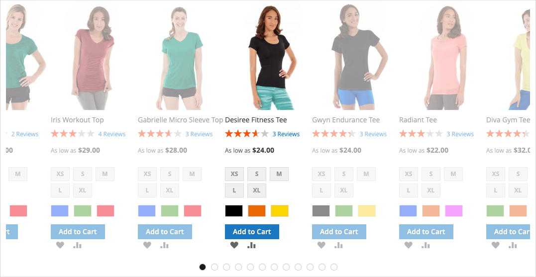 Product list in continuous carousel mode
 -
Keep the Carousel Mode set to
Defaultto show and scroll up to five products at a time within the carousel.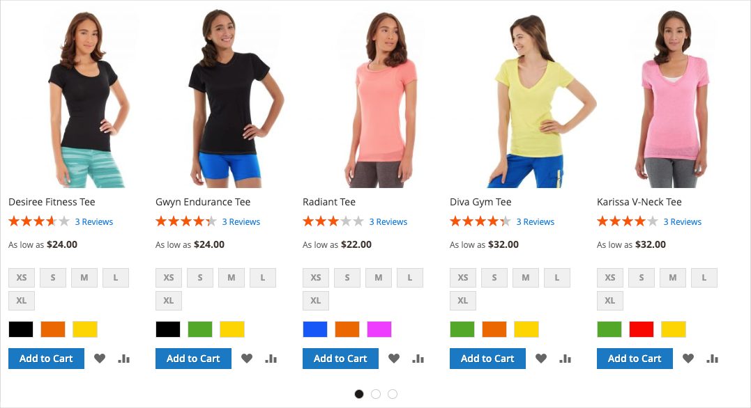 Product list in default carousel mode
The following instructions show how to add a Products list to a block. You can then use a widget to place the block at a specific location on any page in your store.
Products toolbox
| Tool | Icon | Description |
|---|---|---|
| Move | Moves the products container and its content to another position on the stage. | |
| Settings | Opens the Edit Products page, where you can choose the products list and change the properties of the container. | |
| Hide | Hides the current products container and its content. | |
| Show | Shows the hidden products container and its content. | |
| Duplicate | Makes a copy of the products container and its content. | |
| Remove | Deletes the products container and its content from the stage. |
Add a products list
-
On the Admin sidebar, go to Content > Elements > Blocks.
-
Click Add New Block.
-
Enter the Block Title and Identifier.
-
Choose the Store View where the block is to be available.
-
Scroll down to the Page Builder workspace.
-
In the Page Builder panel, expand Add Content and drag a Products placeholder to the stage.
 Adding the Products content type
Configure the products list container
Hover over the empty Products container to display the toolbox and click the Settings (![]() ) icon.
) icon.
 Products toolbox
Complete the Settings according to the following sections:
Appearance
-
Choose one of the appearance types to determine how the products list is displayed on the page:
Product Grid Displays the products within a grid that shows five products per row (by default), with as many rows as needed to display the number entered in the Number of Products to Display setting. Product Carousel Displays the products within a carousel (also known as a slider). The carousel shows up to five products per slide.
Responsiveness Alert: When you select this appearance, it is best to add the Products content type directly to a row where it is responsive, showing fewer products per side on smaller screens. If you add it to any other content type (such as a column or tab), the carousel always shows five products per slide, regardless of the screen size. Setting the product appearance
If you choose the product carousel, you must also configure the Carousel Settings.
-
For Select Products By, choose the method for product selection:
You can select your products by category, SKU, or condition. These options are mutually exclusive. For example, you cannot select the Category option, use the Category selector, then switch over to the Condition option to add some conditions. Your products will only be selected based on what you set for one of these three options.
-
Category - Choose this option to display products using a selected category.
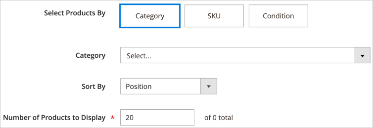 Selecting products by category
When selected, this option provides a Category selector. Click the arrow and drill down to choose the category of products to display. For example, in the Magento sample data, drilling in and selecting the Women > Tops > Tees displays all products for that category.
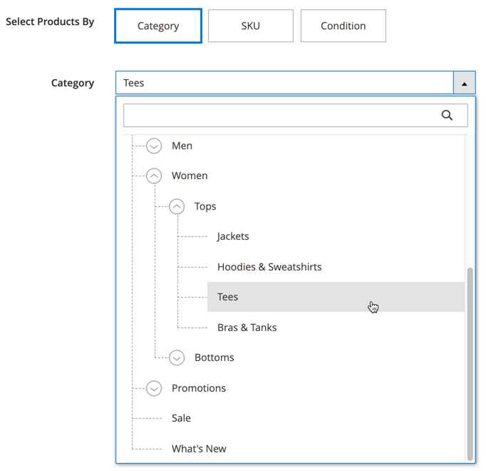 Selecting the women’s tees category
 -
SKU - Choose this option to display products using one or more SKUs
When selected, this option provides a Product SKUs text box where you must enter a comma-separated list of SKUs to display.
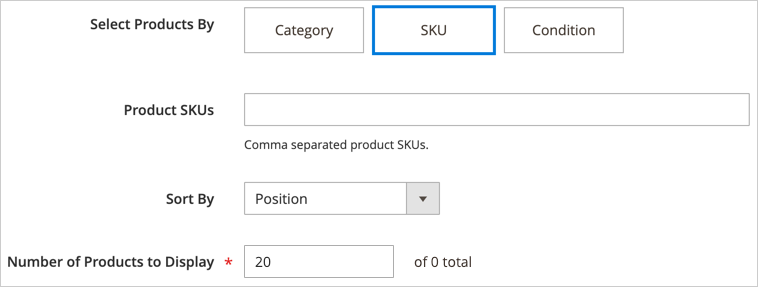 Selecting products by SKU
 -
Condition - Choose this option to display products according to one or more conditions that you define.
When selected, there are tools available to add conditions to your products selection. For example, you could select only products with a Gender set to Unisex.
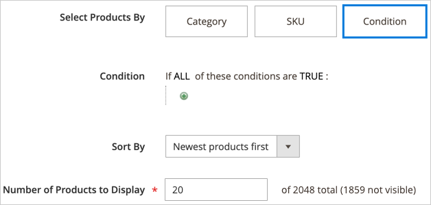 Selecting products by condition
Selecting the Category or SKU option provides an additional Sort By option of
Position. With this sort option, the products will appear in the same order that they appear in your catalog.For the Category option, sorting by position displays the products in the same order that they appear in your catalog. For the SKU option, sorting by position displays the products in the order that you enter them in the Product SKUs textbox.
-
-
For Sort By, choose the sort order for the products in the list:
Position (for Category and SKU options only) When you select the Category option, the Position displays products in the same order as their position in the catalog. When you select the SKU option, the Position displays products in the same order as the SKUs within the Product SKUs textbox. Newest products first Sorts products by the date they were added to the catalog, displaying the products with the most recent entry dates first. Oldest products first Sorts products by the date they were added to the catalog, displaying the products with the oldest entry dates first. Name: A - Z Sorts products in alphabetical order. Name: Z - A Sorts products in reverse alphabetical order. SKU: ascending Sorts products by SKU in alphanumeric order. SKU: descending Sorts products by SKU in reverse alphanumeric order. Stock: low stock first Sorts products from the lowest to the highest available stock. Stock: high stock first Sorts products from the highest to the lowest available stock. Price: high to low Sorts products from highest to lowest price. Price: low to high Sorts products from lowest to highest price. 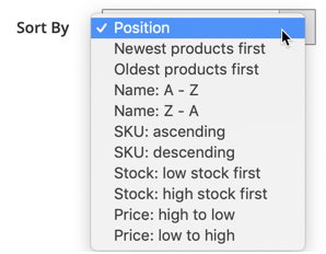 Choosing the product sorting option
 -
Enter the Number of Products to Display in the carousel or grid.
Values can be from
1to999. The default is5for a grid and20for a carousel.Some products in the Category, SKU, or Condition settings may not appear in your products grid or carousel. For example, disabled products, products marked as not visible, out-of-stock products, and products assigned to another website will not be displayed.
Carousel Settings
-
Choose the Carousel Mode to determine how the products are displayed within the carousel.
Default The carousel displays five products per slide by default and responsively reduces that number as needed. Continuous The carousel displays five products per slide by default (with an additional half of a product on the right and left), but centers and scrolls one product at a time in an infinite loop. Products to the right and left of the centered product are dimmed so that the center product is highlighted. If you switch between these two modes, the other carousel settings are retained, with the exception of the Infinite Loop setting, which is always set to
Yesin Continuous mode and the field is disabled.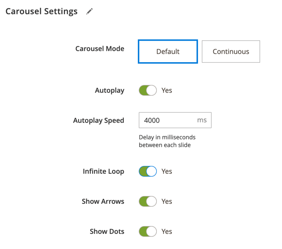 Carousel Settings
 -
If needed, set the Autoplay option to
Yes.When autoplay is enabled, the carousel begins scrolling automatically when the page loads. If you leave the default setting (
No), the customer must click the slide navigation (dots or arrows) to display each slide in sequence.If you enable this feature, enter Autoplay Speed to specify the delay in milliseconds between each slide. The default value is
4000ms (4 seconds). -
If needed, set the Infinite Loop option to
Yes.When infinite loop is enabled, the slide show replays indefinitely while the page is open. If you leave the default setting (
No), the slide show plays only once.Be aware that if you set Infinite Loop to
Noand Autoplay set toYes, the autoplay will stop at the end of the number of products to be displayed. -
If needed, set the Show Arrows option to
Yes.When this is enabled, each slide includes next and previous navigation arrows on the left and right side. If you leave the default setting (
No), the slides do not display navigation arrows. -
If needed, set the Show Dots option to
No.When set to the default setting (
Yes), navigation dots appear at the bottom of the carousel slider. If you disable this setting, the carousel slider does not display navigation dots.
Advanced
-
Choose the the Alignment to control the positioning of the Products list within the parent container:
Default Applies the alignment default setting that is specified in the style sheet of the current theme. Left Aligns the list along the left border of the parent container, with allowance for any padding that is specified. Center Aligns the list in the center of the parent container, with allowance for any padding that is specified. Right Aligns the block along the right border of the parent container, with allowance for any padding that is specified. -
Set the Border style applied to all four sides of the Products container:
Default Applies the default border style that is specified by the associated style sheet. None Does not provide any visible indication of the container borders. Dotted The container border appears as a dotted line. Dashed The container border appears as a dashed line. Solid The container border appears as a solid line. Double The container border appears as a double line. Groove The container border appears as a grooved line. Ridge The container border appears as a ridged line. Inset The container border appears as a inset line. Outset The container border appears as a outset line. -
If you set a border style other than
None, complete the border display options:-
Border Color - Specify the color by choosing a swatch, clicking the color picker, or by entering a valid color name or equivalent hexadecimal value.
-
Border Width - Enter the number of pixels for the border line width.
-
Border Radius - Enter the number of pixels to define the size of the radius that is used to round each corner of the border.
-
-
(Optional) Specify the names of CSS classes from the current style sheet to apply to the container.
Separate multiple class names with a space.
-
Enter values, in pixels, for the Margins and Padding to determine the outer margins and inner padding of the Products container.
Enter the corresponding values in the diagram.
Margins The amount of blank space that is applied to the outside edge of all sides of the container. Options: Top / Right / Bottom / Left Padding The amount of blank space that is applied to the inside edge of all sides of the container. Options: Top / Right / Bottom / Left
Save and preview on the stage
-
In the upper-right corner, click Save to return to the Page Builder workspace.
If you configured a product carousel, it should look similar to the following example:
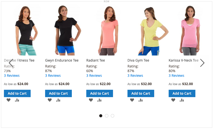 Products carousel on the stage
 -
In the upper-right corner of the page, click Save to save the changes to the block.
You can now use a widget to place this block wherever you want it to appear in the store. Or, you can use Add Content - Block to add the block to an existing page, tab, or block.