Media - Slider
Use the Slider content type in the Page Builder workspace to add a slideshow of images to the stage. You can upload new images or choose existing images from the gallery or product catalog. A slider can be set to play automatically or be controlled manually with navigation buttons. To associate the slider with a specific promotion, see Dynamic Block.
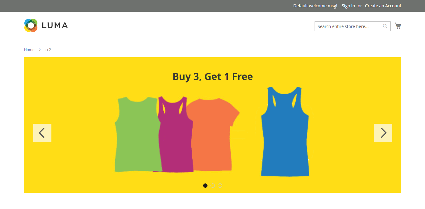 Media slider on the storefront
Toolboxes
When you are working with the Slider content type, you add and edit individual slides and the slider container that holds one or more slides. Each of these has its own toolbox that you use to design slides on the Page Builder stage.
Individual slide toolbox
 Individual slide toolbox
| Tool | Icon | Description |
|---|---|---|
| Move | Moves the slide to another position on the slider. | |
| (label) | Slide # | Identifies the number of the current slide. |
| Settings | Opens the Edit Slide page, where you can change the properties of the current slide. | |
| Duplicate | Makes a copy of the current slide. | |
| Remove | Deletes the current slide from the slider. |
Slider toolbox
| Tool | Icon | Description |
|---|---|---|
| Move | Moves the slider to another position on the stage. | |
| (label) | Slider | Identifies the slider container. |
| Settings | Opens the Edit Slider page, where you can change the properties of the video and container. | |
| Hide | Hides the current slider. | |
| Show | Shows the hidden slider. | |
| Duplicate | Makes a copy of the slider. | |
| Remove | Deletes the the slider from the stage. |
Add an individual slide
-
Open the page, block, or dynamic block where you want to place the slider and expand the Content section.
-
In the Page Builder panel, expand Media and drag a Slider placeholder to a row, column, or tab on the stage.
In the following example, the background color of the row is yellow (
#ffd16).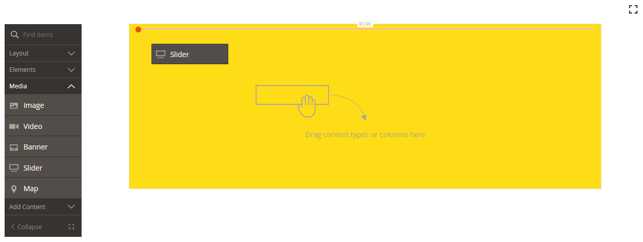 Dragging the slider to the stage
The slider container is displayed on the stage with a single, empty slide.
-
Click in the slider container to display the text editor and enter content for the first slide.
You can also include more complex banner content using the Content settings.
-
Click the navigation dot at the bottom of the slider to display the toolbox for the individual slide and choose the Settings (
 ) icon.
Sliders have two toolboxes. Be sure that you are using the slide toolbox at the bottom.
-
Complete the settings, as needed, according to following sections:
-
When complete, click Save in the upper-right corner to close the Edit Slide page.
-
In the upper-right corner, click Save.
Add more slides
The following sections describe a series of steps to start with an individual slide and create a responsive slider that features and links to specific products. If you do not already have an individual slide, follow the previous instructions to add an individual slide to the stage.
Use one or a combination of the following methods to add slides.
Method 1: Duplicate an existing slide
You can save time by duplicating a slide that has already been configured with the needed settings.
-
Click the navigation dot below the slide to display the toolbox and choose the Duplicate (
 ) icon.
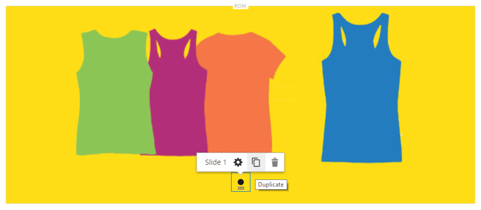 Duplicating a slide
 -
Click the navigation dot for the new slide and to display the toolbox and choose the Settings (
 ) icon.
 -
Modify the settings, as needed, according to following sections:
-
When complete, click Save in the upper-right corner to close the Edit Slide page.
-
In the upper-right corner, click Save.
Method 2: Add a New Blank Slide
-
Hover over the slider container at the top to display the toolbox and choose the Add (
 ) icon.
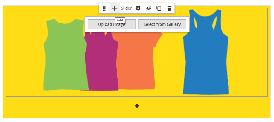 Adding a blank slide
A new blank slide with its own navigation dot and toolbox is added to the slider and displayed on the stage.
 New slide with toolbox
 -
Click the navigation dot for the new slide and to display the toolbox and choose the Settings (
 ) icon.
 -
Modify the settings, as needed, according to following sections:
-
When complete, click Save in the upper-right corner to close the Edit Slide page.
-
In the upper-right corner, click Save.
View each slide
To display each slide on the stage, click the next dot below the currently displayed slide.
 Completed slider
The slide in the preceding example has a background image, a transparent mobile image, and an inline image that was added from the text editor. This technique works well on mobile devices by turning off the background image, and displaying only the smaller inline image. The product slide in this example has the following additional settings:
| Appearance | Collage Right |
| Background Color | #ffffff (White) |
| Background Image | The image on this slide was saved from the product page, and uploaded to the gallery. |
| Mobile Background Image | The mobile background image is a transparent image that is 10 pixels square. Using a blank image for mobile effectively replaces the standard background image with an invisible image. |
| Background Size | Auto |
| Message Text | Minerva LumaTech™ V-Tee (Align center) with inserted image scaled at 40% (Align center) |
| Link | Product |
| Show Button | Always |
| Button Text | Buy Now |
| Show Overlay | Never Show |
| Alignment | Center (to align the button) |
| Border | Solid |
| Border Color | #000000 (Black) |
| Border Width | 1 px |
Change individual slide settings
-
Change the slider display on the stage to view the slide you want to change.
-
On the individual slide toolbox, choose the Settings (
 icon and complete the settings, as needed, according to following sections.
 -
In the upper-right corner, click Save to close the Edit Slide page and return to the Page Builder workspace.
-
In the upper-right corner, click the Save arrow and choose Save & Close.
 Choosing the Save & Close option
 -
When prompted, click the Cache Management link in the message at the top of the page and refresh any invalid cache.
Appearance
-
Choose one of the following slide placement types:
Poster Centers the slide content in the slider container. The overlay, if used, extends the full width of the slider. Collage Left Places slide content in a defined area on the left side of the slider container. The overlay, if used, covers only the defined area. Collage Center Places slide content in a defined area that is centered on the slider container. The overlay, if used, covers only the defined area. Collage Right Places slide content in a defined area on the right side of the slider container. The overlay, if used, covers only the defined area.  Slide positioning
 -
Enter the Slide Name.
When you are working in edit mode, the slide name appears as a tooltip above the navigation dot. The slide name is not visible from the storefront.
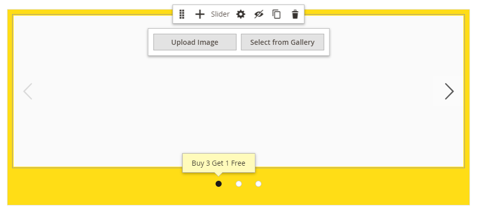 Slide name in the navigation
 -
Enter the Minimum Height for the slide.
The minimum height can be a number with any valid CSS unit (such as 100px, 50%, 50em, 100vh) or a calculation (such as 100vh - 237px).
For example, you can set the slide’s minimum height to cover the full-height of the page, then use background images and videos for compelling design options.
When the slide is set to the full-height of the page (100vh), the slider that contains the slide also stretches the full height of the page to accommodate the height of the slide.
Background
There are many options for defining the background display of a slide. You can apply a simple color or background image, as well as manage more sophisticated effects.
Background Color
Specify the background color by choosing a swatch, clicking the color picker, or by entering a valid color name or equivalent hexadecimal value. This determines the background color of the row. You can also adjust the opacity of the color.
 No color (default)
You can set the value in one of three ways:
- A predefined color name, such as
White - The hexadecimal color value for the color, such as
#ffffff - The rgba value for the color, with opacity percent, such as
rgba(255, 255, 255, 0.75)
If you want to choose a color, click the swatch to the left of the No Color box.
 Choosing a color swatch
If you click the color box to open the color picker again, the box below the slider shows the current red, green, blue, and alpha values (rgba). The last number indicates the current opacity percentage as a decimal. You can use the slider to adjust the opacity, or enter the desired decimal value.
 Setting background color opacity
Page Builder also supports a transparency layer, or alpha channel, in background images that can be used to create backgrounds with varying degrees of opacity.
Background Type
A background type can be an image or a video. Page Builder defaults to Image and shows various image settings. If you select Video, Page Builder swaps the image settings with video settings. Both background type settings are described in the following sections.
 Background type
Image type settings
If you set the Background Type to Image, use the following settings to define the background image display.
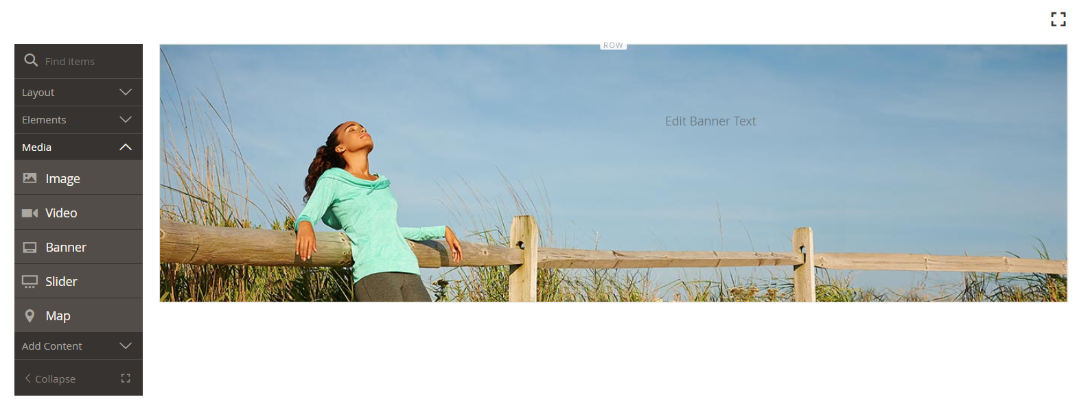 Banner with background image
-
Background Image - If needed, use the provided tools to choose a background image to apply to the banner:
Upload Uploads an image file from your local computer to the gallery and then applies it as the background image for the banner. Select from Gallery Prompts you to choose an existing image from the gallery as the background image for the banner. 
Allows you to either drag the image to the camera tile or browse to the image in your local file system. -
Background Mobile Image - If needed, use the same tools to choose a different background image to be used for display on mobile devices.
-
Background Size - Set this option to determine how the background image is scaled in relation to the width of the banner:
Cover The background image covers the full width of the banner. Contain The background image is limited to the width of the content area. Auto Applies the size from the current style sheet.  Background size
 -
Background Position - Set this option to determine how the background image is anchored in relation to the banner:
Top Left / Center / Right Center Left / Center / Right Bottom Left / Center / Right The anchor point is like a push pin that attaches the image to the banner at the specified background position.
-
Background Attachment - Set the attachment type to determine how the background image moves in relation to the scrolling page:
Scroll The attached background image is synchronized to move down as the page scrolls. Fixed (Not available for mobile) The background image does not move as the container scrolls over the image and is fixed at the specified background position.
Video type settings
If you set the Background Type to Video, use the following settings to define the background image display.
-
Video URL - Enter a valid video URL. Valid video URLs can be links to:
- YouTube videos:
https://youtu.be/CoDhMRUUjeI - Vimeo videos:
https://vimeo.com/190156113 - Valid video files (we recommend
.mp4):https://myvideos.com/spiral.mp4
 Background video URL
 - YouTube videos:
-
Overlay Color - Select a color to apply a transparent tint to the video.
-
Infinite Loop - Set this to
Noto make the video play once and stop. When this is set toYes(default), the video repeats in an infinite loop. -
Lazy Load - Set this to
Noto make the video load with the page, even when not visible. When this is set toYes(default), the video loads from the source only when visible on the screen. -
Play Only When Visible - Set this to
Noto make the video start playing immediately after it loads, regardless of whether it is visible. When this is set toYes(default), the video starts playing only when it is visible. -
Fallback Image - If needed, specify an image to display on the screen before a video loads and in the event that the video does not load for some reason.
Content
You can modify the slide content directly on the stage or when you are changing the settings. The settings provide more complex content features, such as slide links and buttons, as well as overlays. The position of the content reflects the Appearance placement setting.
Simple content on the stage
-
Click the placeholder or existing text and enter the new text that you want to appear on the slide.
The editor toolbar appears above the text box.
-
Use the editor toolbar to enter and format text, as well as insert elements, such as links, images, and widgets.
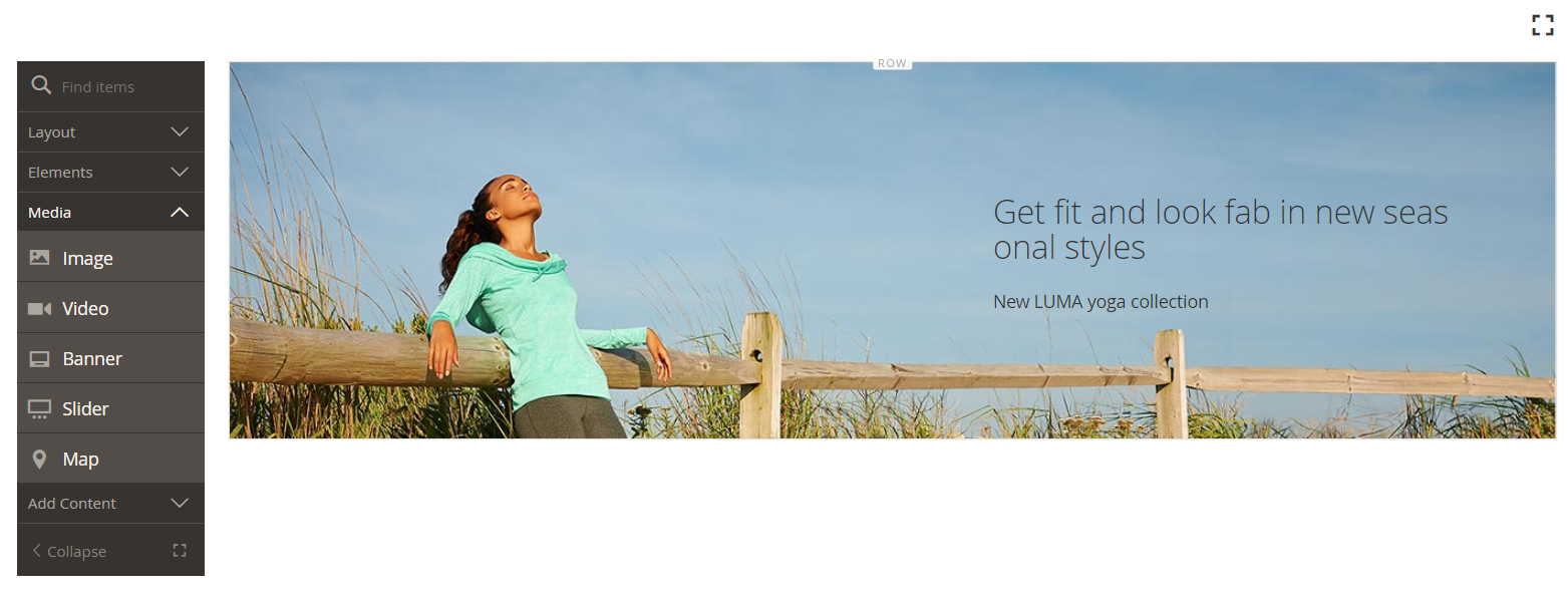 Stage with formatted text
Complex content in the settings
-
Click the navigation dot at the bottom of the slider to display the toolbox for the individual slide and choose the Settings (
 ) icon.
 -
In the Content section, enter the Message Text that you want to appear with the slide.
-
Scroll down to the Content section and use the Message Text editor to enter and format banner text.
You can also insert elements, such as text links, images, and widgets.
-
Format the text as needed using the editor toolbar.
The first slide in this example has a background image, but no message text. The
Buy 3 Get 1 Freetext above the slider is in a Text container that will be added later. -
If needed, specify a Link for the slide.
The link is the destination page that appears when the customer clicks the slide area. You can use one of three link types:
-
URL - Links to either a relative or fully-qualified URL.
 Link to a URL
 -
Product - Identifies the destination page based on the product name or SKU. Search for the product by name based on either a partial or full name. Choose the product from the search results list.
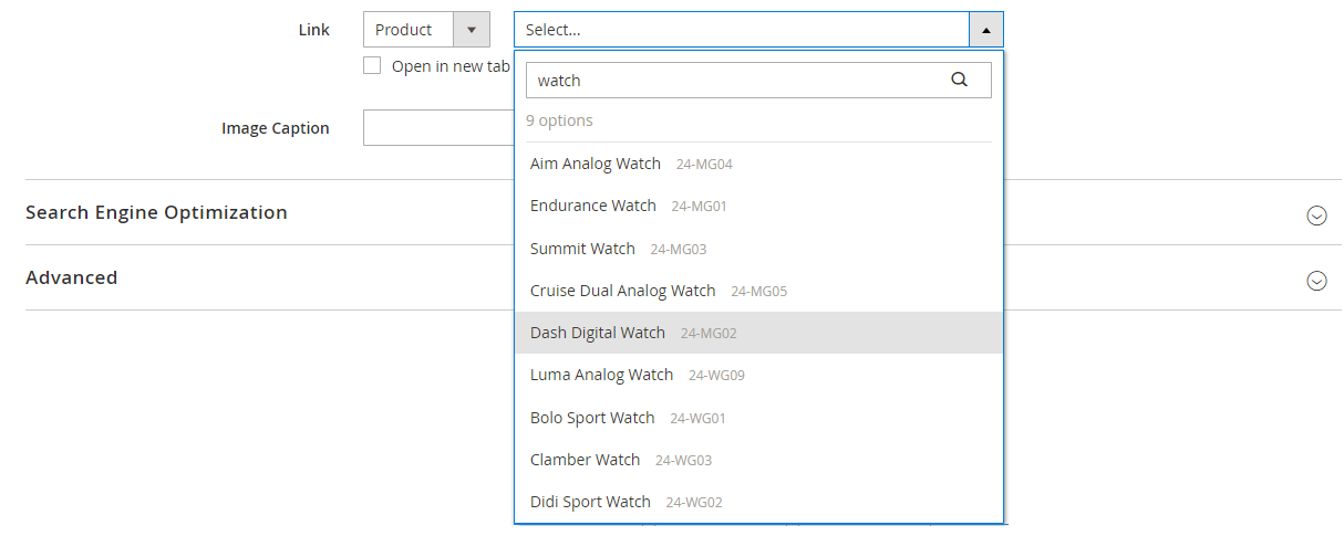 Choosing a product to link
 -
Category - Identifies the destination page as a specific category or subcategory in the category tree. Search for the category based on either a partial or full name. Choose the category from the expanded section of the displayed tree.
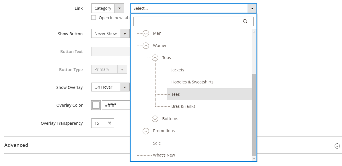 Choosing a category to link
 -
Page - Identifies the destination page as a specific content page. Search for the page based on either a partial or full name. Choose the page from the search results list.
 Choosing a page to link
If you want to prevent the visitor from navigating away from your store, select the Open in new tab checkbox. When the checkbox is cleared, the linked destination opens in the same browser tab, which could effectively navigate the visitor away from your store.
-
-
If needed, add a button to prompt customers to follow the link.
The slide Appearance position places a single link or button below the text. Complete the properties of the link or button that you want to add.
 Slide appearance - collage right
You can also use multiple buttons or links by adding a block to the banner. To avoid conflict, keep all the links or buttons in the separate block, and do not add a link or button directly to the banner.
-
Set Show Button to one of the following:
Always A button always appears on the slide. On Hover A button appears on the slide only on hover. Never Show A button never appears on the slide. -
Enter the Button Text to appear on the button.
-
Set Button Type to one of the following:
Primary Applies the primary button style from the current style sheet. Secondary Applies the secondary button style from the current style sheet, if applicable. Link Creates a hyperlink rather than a button. The button style from the current theme determines the button format. Typically, a primary button has a more prominent background color than a secondary button.
-
-
Set Show Overlay to one of the following:
Always The overlay is always visible. On Hover The overlay appears only on hover. Never Show The overlay is not visible. You can use an overlay to apply a background color to the active content area that is defined by the Appearance setting. The slide background image continues to be visible for the full width of the slide.
 Slide overlay settings
If you choose to show an overlay, set the Overlay Color:
- Click the No Color swatch, and choose a swatch.
- In the No Color field, either enter a valid color name, or hexadecimal value.
 Slide overlay color
Advanced
-
Choose the the Alignment to control the horizontal positioning of content added to the slide.
Default Applies the alignment default setting that is specified in the style sheet of the current theme. Left Aligns the content along the left border of the slide, with allowance for any padding that is specified. Center Aligns the content in the center of the slide, with allowance for any padding that is specified. Right Aligns the content along the right border of the slide, with allowance for any padding that is specified. -
Set the Border style applied to all four sides of the slide:
Default Applies the default border style that is specified by the associated style sheet. None Does not provide any visible indication of the slide borders. Dotted The container border appears as a dotted line. Dashed The container border appears as a dashed line. Solid The container border appears as a solid line. Double The container border appears as a double line. Groove The container border appears as a grooved line. Ridge The container border appears as a ridged line. Inset The container border appears as a inset line. Outset The container border appears as a outset line. -
If you set a border style other than
None, complete the border display options:-
Border Color - Specify the color by choosing a swatch, clicking the color picker, or by entering a valid color name or equivalent hexadecimal value.
 Border Color
 -
Border Width - Enter the number of pixels for the border line width.
-
Border Radius - Enter the number of pixels to define the size of the radius that is used to round each corner of the border.
-
-
(Optional) Specify the names of CSS classes from the current style sheet to apply to the slide.
Separate multiple class names with a space.
-
Enter values, in pixels, for the Margins and Padding to specify the outer margins and inner padding of the slide.
Enter each corresponding value in the slide diagram.
Margins The amount of blank space that is applied to the outside edge of all sides of the slide. Padding The amount of blank space that is applied to the inside edge of all sides of the slide.
Add a slider title
If you want a title above the slider, simply add a [Text content type] above the slider. Then, format the text as needed.
-
In the Page Builder panel, expand Elements and drag a Text placeholder to a row, column, or tab set on the stage.
As you do this, a red guideline marks the insertion point above the slider.
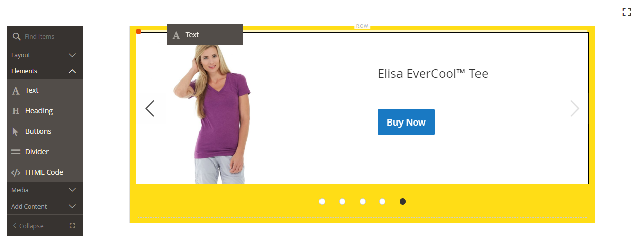 Dragging a text placeholder above a slider
 -
Use the editor to format the text as needed.
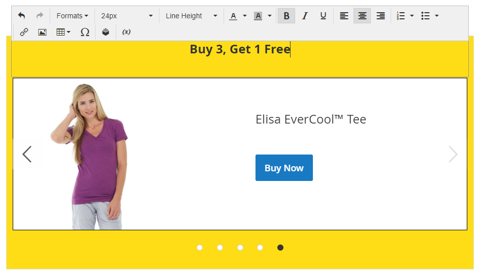 Editing the slider title text
Change slider settings
-
Hover over the slider container to show the main toolbox and choose the Settings (
 ) icon.
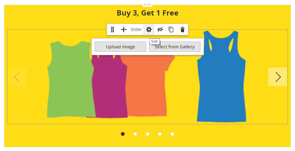 Slider toolbox
 -
Enter the Minimum Height for the slide.
The minimum height can be a number with any valid CSS unit (such as 100px, 50%, 50em, 100vh) or a calculation (such as 100vh - 237px).
For example, you can set the minimum height of a slider to stretch the full-height of the page, giving you compelling options for full-page background images and videos.
 Slider minimum height
 -
If you want the slider to begin as soon as the page loads, set Autoplay to
Yesand set Autoplay Speed to the number of milliseconds in the delay between slides.By default, the speed is set to 4000 ms, which is four seconds. If you set autoplay to
No, the first slide appears by default and the customer must click the slide navigation (dots or arrows) to display the next slide in sequence. Slider autoplay settings
 -
To smooth the transition from one slide to the next, set Fade to
Yes.With fade, the slides seem to stay in place, but the content changes smoothy from one to the next. Without fade, you see the horizontal movement from one slide to the next.
 Slider fade and infinite loop settings
 -
To make the slideshow repeat indefinitely while the page is open, set Infinite Loop to
Yes. -
To choose the type of navigation controls for the slider, do the following:
-
To include Next and Previous arrows on the left and right side of each slide, set Show Arrows to
Yes. -
To include a set of navigation dots below the slider, set Show Dots to
Yes.
 Slider show arrows and dots
 -
-
Complete the Advanced slider settings as needed.
-
In the upper-right corner, click the Save arrow and choose Save & Close to return to the Page Builder workspace.
Advanced - slider
-
Choose the the Alignment to control the positioning of the slides within the parent slider container:
Default Applies the alignment default setting that is specified in the style sheet of the current theme. Left Aligns the slides along the left border of the slider container, with allowance for any padding that is specified. Center Aligns the slides in the center of the slider container, with allowance for any padding that is specified. Right Aligns the slides along the right border of the slider container, with allowance for any padding that is specified. -
Set the Border style applied to all four sides of the slider container:
Default Applies the default border style that is specified by the associated style sheet. None Does not provide any visible indication of the container borders. Dotted The container border appears as a dotted line. Dashed The container border appears as a dashed line. Solid The container border appears as a solid line. Double The container border appears as a double line. Groove The container border appears as a grooved line. Ridge The container border appears as a ridged line. Inset The container border appears as a inset line. Outset The container border appears as a outset line. -
If you set a border style other than
None, complete the border display options:-
Border Color - Specify the color by choosing a swatch, clicking the color picker, or by entering a valid color name or equivalent hexadecimal value.
-
Border Width - Enter the number of pixels for the border line width.
-
Border Radius - Enter the number of pixels to define the size of the radius that is used to round each corner of the border.
-
-
(Optional) Specify the names of CSS classes from the current style sheet to apply to the slider container.
Separate multiple class names with a space.
-
Enter values, in pixels, for the Margins and Padding to determine the outer margins and inner padding of the slider container.
Enter the corresponding values in the diagram.
Margins The amount of blank space that is applied to the outside edge of all sides of the container. Padding The amount of blank space that is applied to the inside edge of all sides of the container.
Test the slider
-
Open the page where you have included the slider, set Enable Page to
Yes. -
In the upper-right corner, click the Save arrow and choose Save & Close.
-
Find the page in the Pages grid and select View in the Action column.
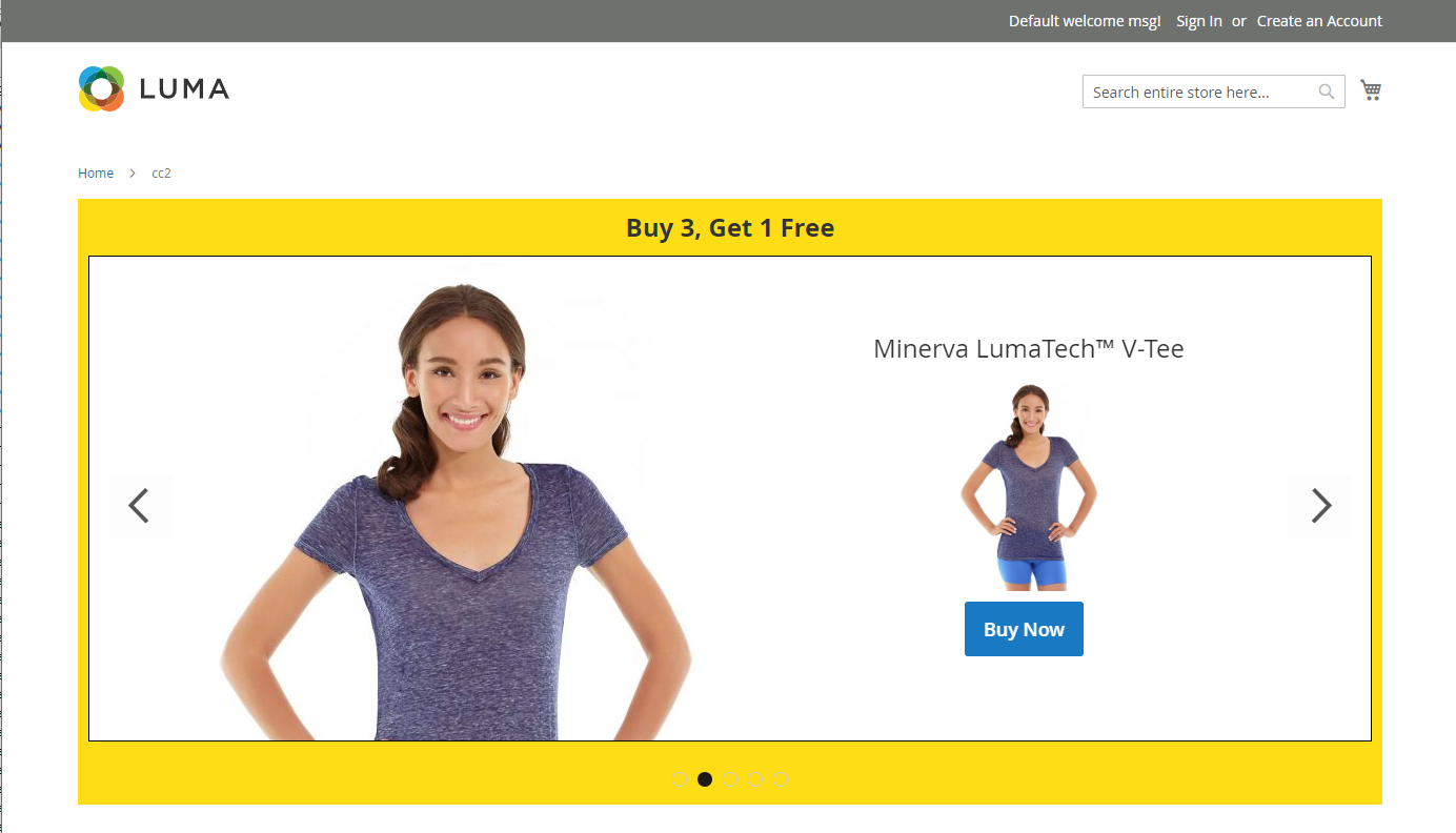 Slider preview - standard view
When you preview the slider, resize the window so you can see how it appears on a mobile device.
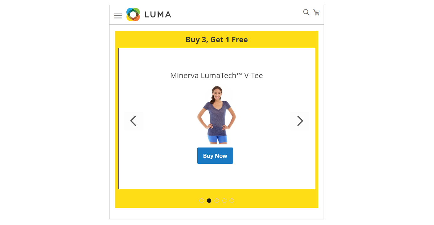 Slider preview - mobile view