Elements - Buttons
Use the Buttons content type to add either an individual button or a set of buttons to the stage. Buttons can be arranged horizontally or vertically, and added directly to rows, columns, tabs, and banners on the stage.
 Banner with a button on the storefront
Toolboxes
When you are working with the Buttons content type, you add and edit individual buttons and the buttons container that holds one or more buttons. Each of these has its own toolbox that you use to design buttons on the Page Builder stage.
Individual button toolbox
 Button toolbox
| Tool | Icon | Description |
|---|---|---|
| Settings | Opens the Edit Button page, where you can change the properties of the button. | |
| Duplicate | Makes a copy of the button. | |
| Remove | Deletes the button from the stage. |
Buttons container toolbox
 Buttons container toolbox
| Tool | Icon | Description |
|---|---|---|
| Move | Moves the button container to another valid place on the page. | |
| Add | Adds a new button to the container. | |
| (label) | Button | Identifies the current container as a button element. |
| Settings | Opens the Edit Buttons page, where you can change the properties of the container. | |
| Hide | Hides the button container. | |
| Show | Shows the hidden button container. | |
| Duplicate | Makes a copy of the button container. | |
| Remove | Deletes the button container and its content from the stage. |
Add an individual button
-
In the Page Builder panel, expand Elements and drag a Buttons placeholder to a row, column, or tab set on the stage.
 Dragging a button to the stage
 -
Hover over the button to display the toolbox and choose the Settings (
 ) icon.
 -
Enter the Button Text to be displayed on the button.
 Basic button settings
 -
Set Button Type to one of the following:
Primary Applies the primary button style from the current style sheet. Secondary Applies the secondary button style from the current style sheet if applicable. Link Creates a hyperlink rather than a button. 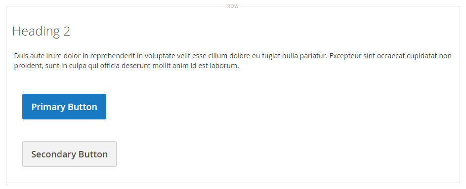 Primary and secondary button example
 -
Set the Button Link using one of the following types:
-
URL - Enter the destination URL for the link.
The URL can be either a relative link to a product or page in your store, or a fully-qualified URL.
Relative URL example ../luma-analog-watch.htmlFully-qualified URL example https://mystore.com/luma-analog-watch.htmlIf the link goes to a different website, you can keep the current page open to your store by opening the link in a new browser tab.
To prevent the visitor from navigating away from your store, select the Open in new tab checkbox.
-
Product - Enter a product name (partial or full) or SKU, then choose the product name in the list.
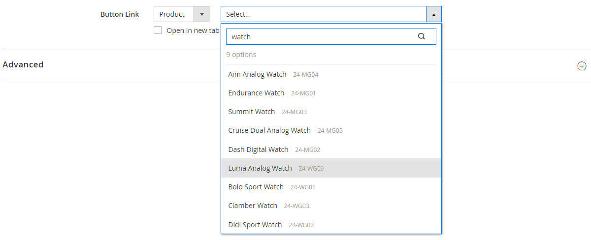 Choosing a product for the button link
 -
Category - Enter a category name (partial or full) or click in the blank field to display the category tree. Then, choose the category name in the tree.
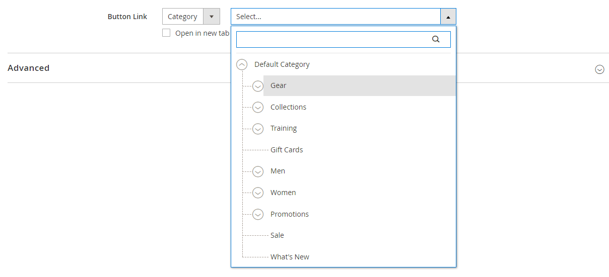 Choosing a category for the button link
 -
Page - Enter the name of a CMS page (partial or full) or click in the blank field to display the full list. Then, choose the name of the page in the search results list.
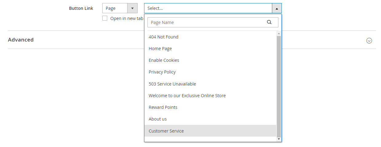 Choose CMS page for button link
-
-
Complete the advanced settings as needed.
-
When complete, click Save in the upper-right corner to close the Edit Button page.
-
In the upper-right corner, click Save.
Add a set of buttons
The following sections describe a series of steps to start with an individual button and create a set of three buttons within a button container. If you do not already have an individual button, follow the previous instructions to add an individual button to the stage.
Step 1: Create the second button
-
Hover over the button container to display the toolbox and choose the Add (
 ) icon.
 Adding another button
 -
Enter the text that you want to appear on the second button.
-
Click the new button to display its toolbox and choose the Settings (
 ) icon.
 Editing the button
 -
Set Button Type to
Secondary. -
Set up the Button Link as needed.
In the following example, the link is a relative URL that goes to the Contact Us page.
 Contact Us button settings
 -
Complete the advanced settings as needed.
-
When complete, click Save to close the Edit Button page.
Step 2: Create the third button
-
Click the second button again on the stage and choose the Duplicate (
 ) icon.
 Duplicating a button
 -
Enter the text that you want to appear on the third button.
-
Click the third button to display the toolbox and choose the Settings (
 ) icon.
 Toolbox for the third button
 -
Update the Button Link as needed.
-
In the upper-right corner, click Save to close the Edit Button page and return to the Page Builder workspace.
Step 3: Update the button container
-
Hover over the button container to display the toolbox and choose the Settings (
 ) icon.
 Buttons container toolbox
 -
Under Appearance, choose Stacked.
-
Set All Buttons are same size to
Yes. Stacked buttons of the same size
 -
Update the remaining settings as needed, using the descriptions from Change settings for a button container.
-
When complete, click Save to close the Edit Buttons page and return to the Page Builder workspace.
The complete stacked button set appears on the stage, with one primary button and two secondary buttons.
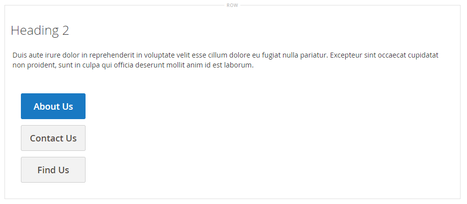 Stacked buttons on the stage
 -
In the upper-right corner, click Save.
Move a button
-
Click the button that you want to move.
-
Select and drag the Move (
 ) icon, which appears just before the button text, to a new position for the button within the button container.
 Moving a button
Change settings for a button
-
Click the button on the stage to display the toolbox and choose the Settings (
 ) icon.
 Button toolboxes
 -
Update the standard settings as needed.
-
Button Text - Enter the text to be displayed on the button. This can also be updated directly from the stage.
-
Button Type - Determines the button format.
Primary Applies the primary button style from the current style sheet. Secondary Applies the secondary button style from the current style sheet, if applicable. Link Creates a hyperlink rather than a button. -
Button Link - Determines the destination page that is served when the button is clicked.
URL Uses either a relative or fully-qualified URL to identify the destination page. Product Identifies the destination page based on the product name or SKU. The product name can be searched for based on either a partial or full name. The product is then chosen from the search results list. Category Identifies the destination page as a specific category or subcategory in the category tree. Page Identifies the destination page as a specific CMS page.
-
-
Complete the advanced settings as needed.
-
To save the settings and return to the Page Builder workspace, click Save in the upper-right corner.
Change settings for a button container
-
Hover over the button container to display the toolbox and choose the Settings (
 ) icon.
 -
Update the Appearance settings as needed.
-
Use the arrangement options to display the buttons either horizontally or vertically in the container:
Inline Arranges the buttons horizontally. Stacked Arranges the buttons vertically. -
Set the All buttons are same size option according to your preference.
When this is set to
Yes, all buttons in the container have a consistent size, based on the length of the longest button text.
-
-
Complete the Advanced settings as needed.
-
When complete, click Save to close the Edit Buttons page and return to the Page Builder workspace.
Change advanced settings
You can modify the Advanced settings for individual buttons and for the button container.
-
Choose the the Alignment to control the positioning within the parent container:
Default Applies the alignment default setting that is specified in the style sheet of the current theme. Left Aligns the content along the left border of the parent container, with allowance for any padding that is specified. Center Aligns the content in the center of the parent container, with allowance for any padding that is specified. Right Aligns the content along the right border of the parent container, with allowance for any padding that is specified. -
Set the Border style applied to all four sides of the button or buttons container:
Default Applies the default border style that is specified by the associated style sheet. None Does not provide any visible indication of the container borders. Dotted The container border appears as a dotted line. Dashed The container border appears as a dashed line. Solid The container border appears as a solid line. Double The container border appears as a double line. Groove The container border appears as a grooved line. Ridge The container border appears as a ridged line. Inset The container border appears as a inset line. Outset The container border appears as a outset line. -
If you set a border style other than
None, complete the border display options:-
Border Color - Specify the color by choosing a swatch, clicking the color picker, or by entering a valid color name or equivalent hexadecimal value.
-
Border Width - Enter the number of pixels for the border line width.
-
Border Radius - Enter the number of pixels to define the size of the radius that is used to round each corner of the border.
-
-
(Optional) Specify the names of CSS classes from the current style sheet to apply to the button or buttons container.
Separate multiple class names with a space.
-
Enter values, in pixels, for the Margins and Padding to determine the outer margins and inner padding of the button or buttons container.
Enter the corresponding values in the diagram.
Margins The amount of blank space that is applied to the outside edge of all sides of the container. Options: Top / Right / Bottom / Left Padding The amount of blank space that is applied to the inside edge of all sides of the container. Options: Top / Right / Bottom / Left