Workspace
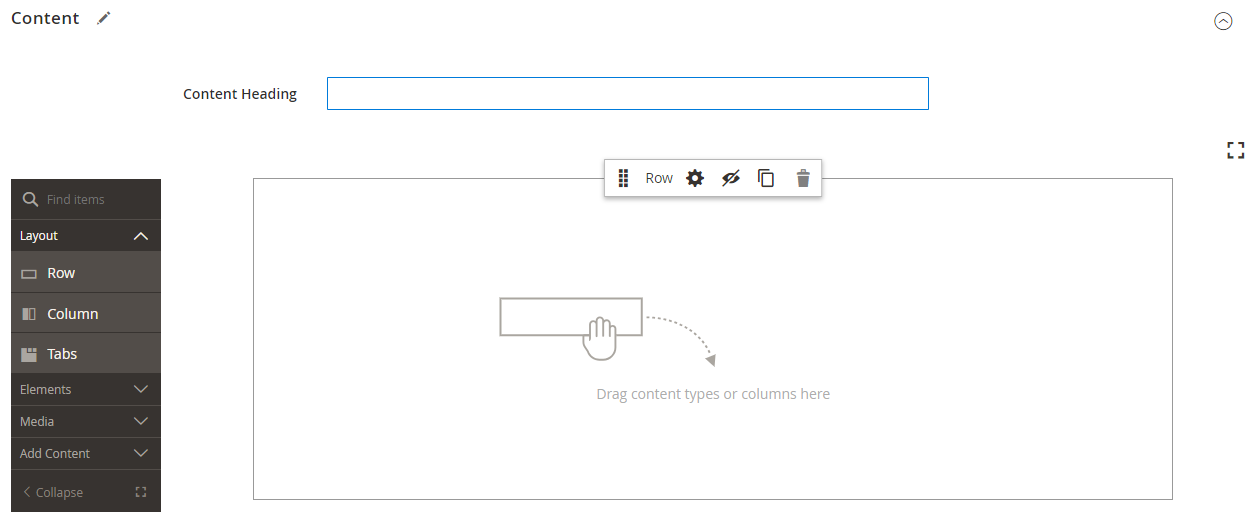
When Page Builder is enabled, the Content section and content creation process are modified to take advantage of the advanced Page Builder tools. The new content section includes a Content Heading field, the stage with an initial row and toolbox, and Page Builder panel with drag-and-drop content types.
 Content section with Page Builder workspace
Content Heading
Because search engines look for level one (H1) headings, adding a level one heading is an easy way to ensure that the page is indexed correctly.
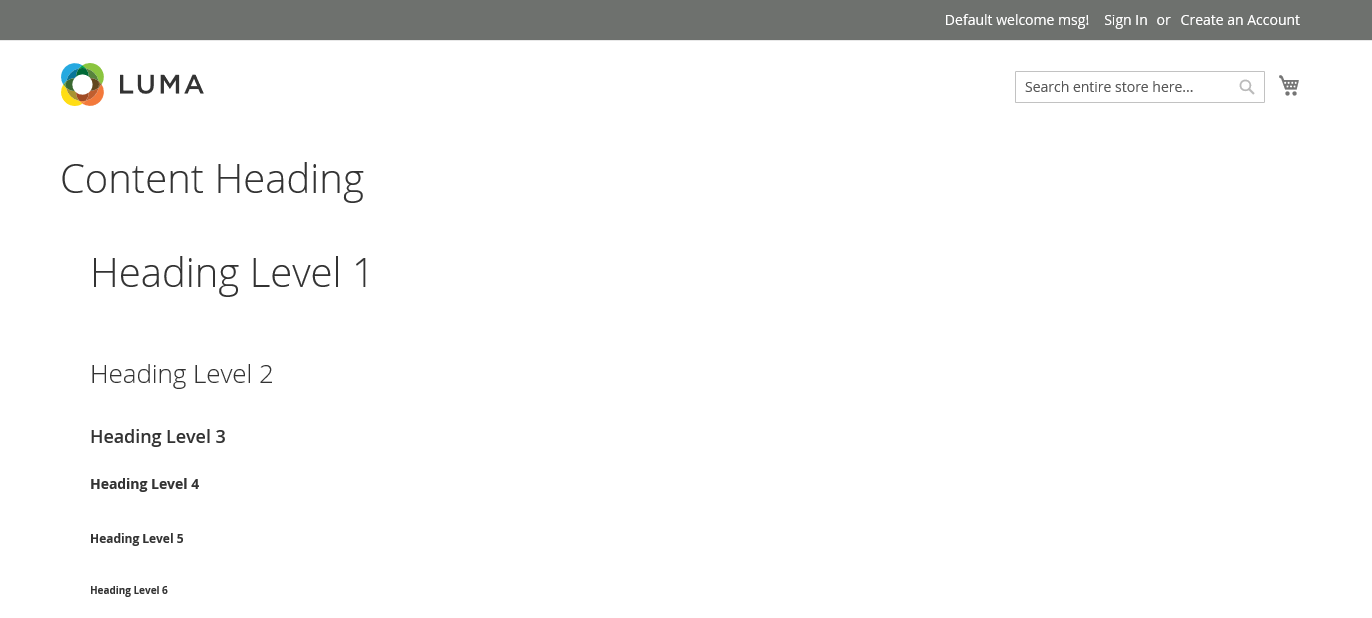
The Content Heading field that appears at the top of the page is a legacy field that supports content that was created with earlier versions of Magento. It is not, however, part of Page Builder. The Content Heading is formatted as an H1 heading according to the style sheet that is associated with the current theme, and positioned just above the active content area that is defined by the Page Builder stage.
For the best control over the positioning and format of headings of all levels, we recommend that you leave the Content Heading field empty, and use the Page Builder Heading content type.
 Content Heading and other headings
Stage
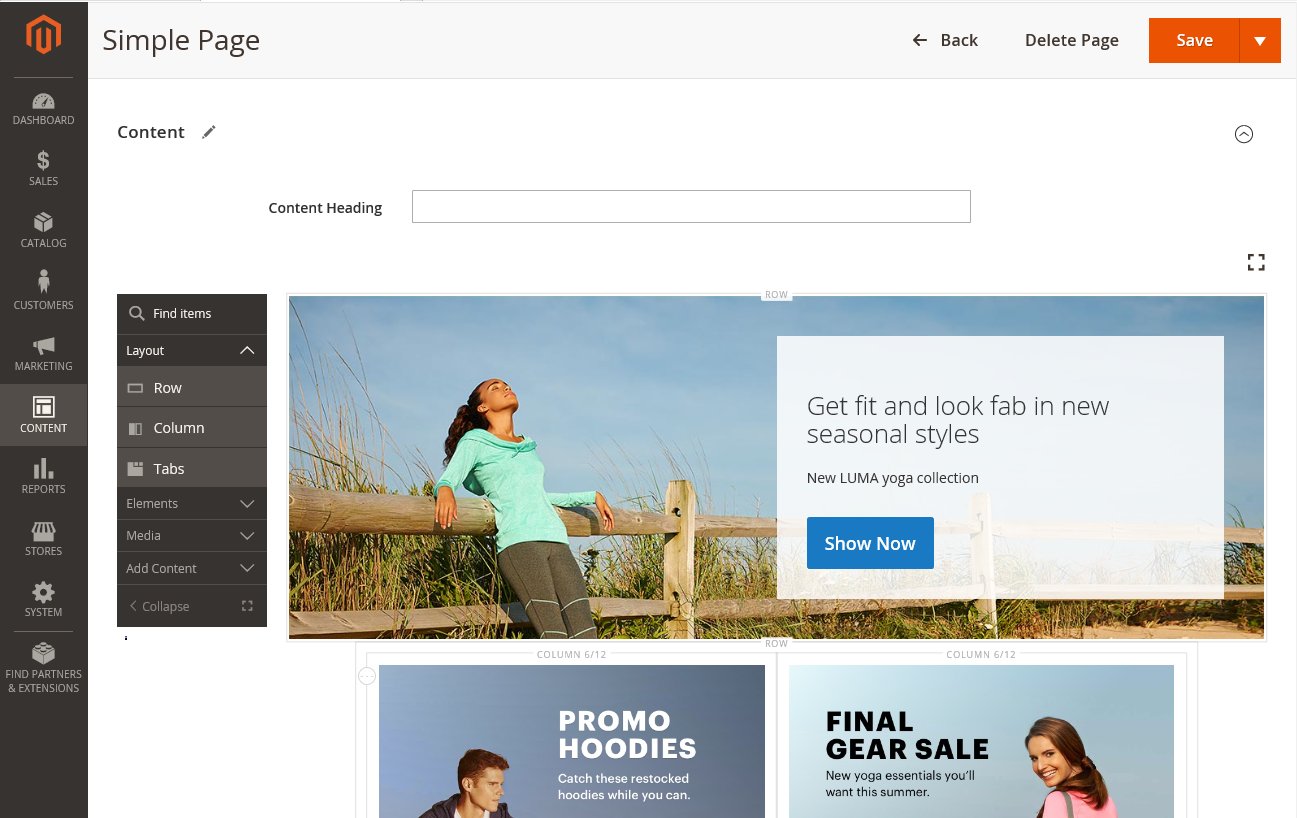
The stage is the primary work area where you can create and format content, and even make quick edits to live content. The stage initially contains a single row. Additional rows can be dragged to the stage from the left panel.
 Stage with simple page
Work in fullscreen mode
-
For a better view of the page, click the Fullscreen (
 ) icon in the upper-right corner of the stage.
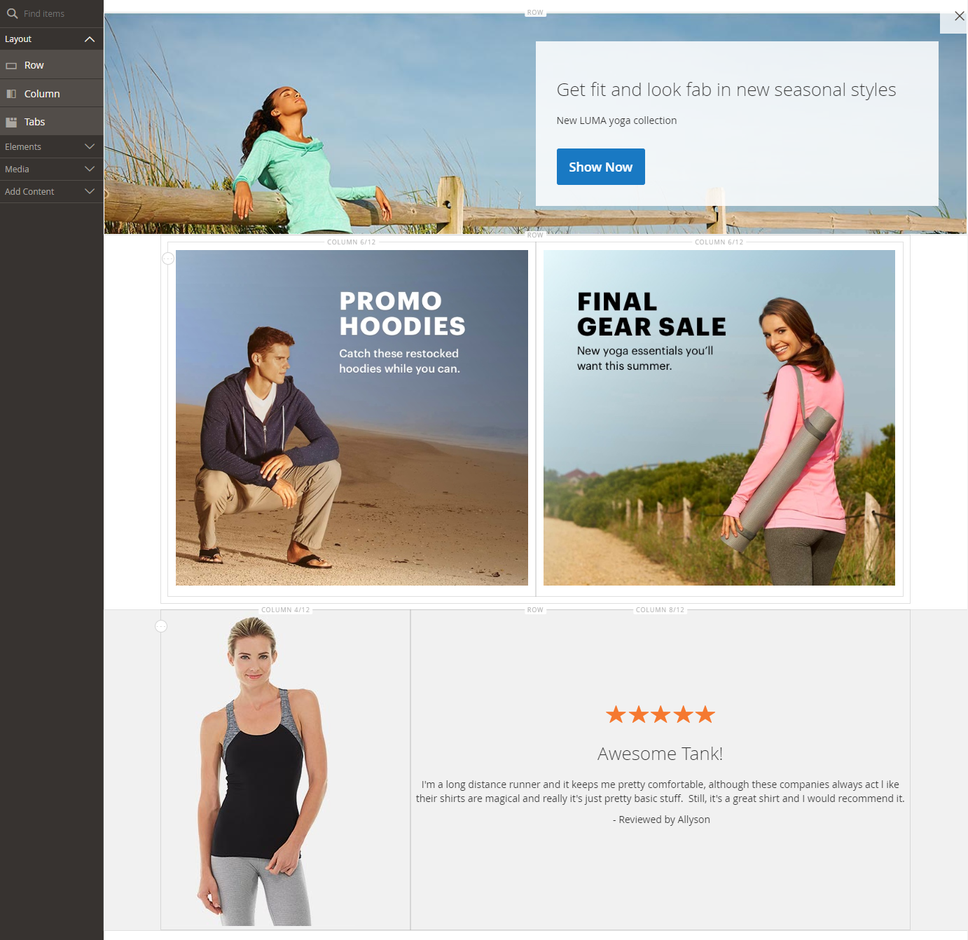
Only the stage and panel are visible when working in fullscreen mode.
-
To return to the Content section, click the Close (
 ) icon.
 Stage with simple page in fullscreen mode
Panel
The Page Builder panel is located to the left of the stage, and contains content types that can be dragged to the stage. A container that is specific to the content type then appears with a toolbox of options. Content types are organized in the panel as follows:
| Layout | Includes rows, columns, and tabs that can be used as containers for other content types. |
| Elements | Includes text, headings, buttons, dividers, and snippets of HTML code that can be dragged to the stage. |
| Media | Includes images, video, banners, sliders, and Google Maps that can be dragged to the stage. |
| Add Content | Adds existing blocks of static or dynamic content, and products from your catalog. |
Toolbox
Each content container on the stage has a toolbox of options. The options vary by content type, but typically include Move, Settings, Hide/Show, Duplicate, and Remove.
Show the toolbox
Hover over the container to display the toolbox and choose an option.
 Row toolbox options
Toolbox options
| Option | Icon | Description |
|---|---|---|
| Move | Moves the current content container to another position on the stage. | |
| Add | Adds children elements such as a button, slide, or tab. | |
| (label) | Row | Identifies the container content type. |
| Settings | Opens the content container properties in edit mode. | |
| Hide | Hides the current content container. | |
| Show | Shows the current content container. | |
| Duplicate | Makes a copy of the current content container. | |
| Remove | Deletes the current content container from the stage. |