
ToggleButton
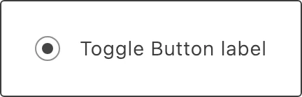
Use ToggleButton to let shoppers select one option from a set of mutually exclusive choices, rendered as a selectable button rather than a plain radio input. It is built on RadioButton and supports an optional leading icon.
Import
Section titled “Import”import { ToggleButton } from '@dropins/tools/components.js';| Prop | Type | Req? | Description |
|---|---|---|---|
label | string | VNode | Yes | Label of the toggle button. |
name | string | Yes | Field name, used for mapping the value in a form. |
value | string | Yes | Field value. |
selected | boolean | No | Whether the toggle button is selected. Defaults to true. |
disabled | boolean | No | Whether the toggle button is disabled. Defaults to false. |
busy | boolean | No | Whether the toggle button is in a loading state. Defaults to false. |
icon | VNode | No | Icon to display before the label (SVG or img element). |
ariaLabel | string | No | Accessible label for the toggle button. |
onChange | (value: string) => void | No | Function called when the toggle button is clicked. |
ToggleButton also accepts standard HTML attributes (for example, onClick, className), except onChange, icon, and label.
Example
Section titled “Example”import { ToggleButton, provider } from '@dropins/tools/components.js';
await provider.render(ToggleButton, { label: 'Gift wrap', name: 'gift-wrap', value: 'yes', selected: false, onChange: (value) => yourUpdateGiftWrap(value),})(document.querySelector('.toggle-button'));Related
Section titled “Related”- Radio Button — the control this button is built on.
- Design tokens — the colors, spacing, and typography the button uses.