
Card
Use Card to group related content, media, and actions into a single container. Pass any content as children, and choose a variant to match the surrounding layout.
Import
Section titled “Import”import { Card } from '@dropins/tools/components.js';| Prop | Type | Req? | Description |
|---|---|---|---|
children | ComponentChildren | ComponentChildren[] | Yes | The content of the card. |
variant | 'primary' | 'secondary' | No | Change the card style. Defaults to primary. |
Card also accepts standard <div> HTML attributes (for example, className and onClick).
Example
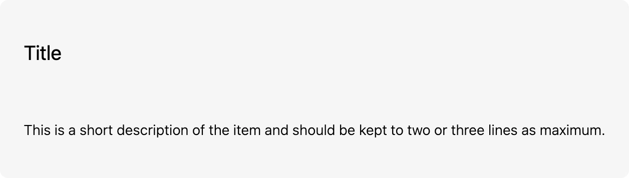
Section titled “Example”Render a card with a heading and a description. Build the children with h.
import { Card, provider } from '@dropins/tools/components.js';import { h } from '@dropins/tools/preact.js';
await provider.render(Card, { variant: 'primary', children: [ h('h2', {}, 'Title'), h('p', {}, 'A short description of the item, kept to two or three lines.'), ],})(document.querySelector('.card'));Related
Section titled “Related”- Accordion — group content into collapsible sections.
- Design tokens — the colors, spacing, and typography the card uses.