Column component
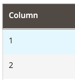
The Column component implements a basic column in Listing.
Configuration options
| Option | Description | Type | Default |
|---|---|---|---|
bodyTmpl |
Path to the template used for rendering column’s fields in the table’s body. | String | ui/grid/cells/text |
class |
The path to the component class. | String | Magento\Ui\Component\Listing\Columns\Column |
component |
The path to the component’s .js file in terms of RequireJS. |
String | Magento_Ui/js/grid/columns/column |
controlVisibility |
Whether a user can control column’s visibility handled by the ColumnsControls component. | Boolean | true |
disableAction |
Disables the action set in the templates.fieldAction property. |
Boolean | false |
draggable |
Defines if a user can change column’s position in the table by grabbing column’s header and dragging it across the table. | Boolean | true |
editor |
String | Object | ||
fieldClass |
Additional CSS classes added to the column’s field elements. | {[name: String]: Boolean} | '' |
filter |
Reference to one of the available filter types defined in the Filters component. If the value represents an object containing the filterType field, this object is considered as an extension of the referenced filter element. If there’s no such field in the value object, it is considered as a definition of a custom filter element. |
String | Object | - |
headerTmpl |
Path to the .html template for the column’s header. |
String | ui/grid/columns/text |
label |
The column label displayed in the header. | String | '' |
sortable |
Whether column’s fields can be used to sort records in a table. | Boolean | true |
sorting |
Column’s sorting order. Can be ascending (asc), descending (desc) or none (false). Setting sorting to false does not disable sorting, which is defined by the sortable option. |
String | Boolean | false |
statefull |
Defined in the parent uiElement class. | Object | {visible: true, sorting: true} |
templates.fieldAction |
The action performed on the column’s field click. | ColumnAction | - |
visible |
Initial component’s visibility. When set to false, the display: none CSS style is added to the component’s DOM block. |
Boolean | true |
ColumnAction interface
| Option | Description | Type | Required |
|---|---|---|---|
params |
A list of arguments that will be passed to the method. | Array | Optional |
provider |
Reference to component. | String | Required |
target |
Name of the component’s method to be invoked. | String | Required |
Source files
Extends UiElement:
Magento/Ui/Component/Listing/Columns/Column.phpMagento/Ui/view/base/web/js/grid/columns/column.jsMagento/Ui/view/base/web/templates/grid/cells/text.htmlMagento/Ui/view/base/web/templates/grid/columns/text.html
Examples
Integrate Column component with Listing component
This is an example of how the Column component integrates with the Listing component:
1
2
3
4
5
6
7
8
9
10
11
12
13
14
15
<listing>
    ...
    <columns>
        ...
        <column name="column" sortOrder="10">
            <settings>
                <filter>text</filter>
                <dataType>text</dataType>
                <label translate="true">Column</label>
            </settings>
        </column>
        ...
    </columns>
    ...
</listing>
Result

Configure Field Action for Column component
This is an example of how the fieldAction option can be configured for the Column component.
1
2
3
4
5
6
7
8
9
10
11
12
13
14
15
16
17
18
19
<column name="column_with_action">
    <argument name="data" xsi:type="array">
        <item name="config" xsi:type="array">
            <item name="fieldAction" xsi:type="array">
                <item name="provider" xsi:type="string">TARGET_NAME</item>
                <item name="target" xsi:type="string">ACTION_NAME</item>
                <item name="params" xsi:type="array">
                    <!-- provide record index as a parameter for target method -->
                    <item name="0" xsi:type="string">${ $.$data.rowIndex }</item>
                </item>
            </item>
        </item>
    </argument>
    <settings>
        <filter>text</filter>
        <dataType>text</dataType>
        <label translate="true">Column</label>
    </settings>
</column>