Customizing RWD illustration
What’s in this topic
This topic features a step-by-step illustration of how to change the number of products displayed in a row on a product page, keeping up with the responsive design approach used by Magento out-of-the-box themes.
The described flow is applicable only for themes that inherit from the out-of-the-box Blank or Luma theme.
Changing the number of products in a row
ExampleCorp wants to make their products more visible by decreasing the quantity of products in a row displayed on a catalog page, so that each product takes more space.
In the basic Blank theme, the number of products in a row for each breakpoint is the following (for the 2-column page layout):
- 1024px and more (desktop): four products
- 768px (tablet): three products
- 640px and less (mobile): two products
In their custom Orange theme, ExampleCorp wants to have the least number of products in a row for the desktop and tablet view, namely:
- Desktop: three products
- Tablet: two products
- Mobile: two products
The Orange theme inherits from the Blank theme.
To change the products quantity, ExampleCorp take the following steps:
- Copy the
/Magento_Catalog/web/css/source/module/_listings.lessfile. - Put it in the corresponding location in their Orange theme directory:
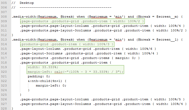
app/design/frontend/ExampleCorp/orange/Magento_Catalog/web/css/source/module/_listings.less - Make the changes in the code. The following image illustrates which section of the file they change, the modified lines are highlighted:

After ExampleCorp applies their theme, the catalog page of their store looks like following:

(compare to the same page for the Blank theme.)