
Creating Drop-In Components
This topic describes how to use the drop-template repository to create drop-in components for Adobe Commerce Storefronts.
What are drop-in component templates?
Section titled “What are drop-in component templates?”Drop-in templates are GitHub Templates that allow you to quickly create drop-in components with the same structure, branches, files, and best practices built in. The dropin-template repository provides the starting point for creating new drop-ins quickly and consistently.
For more information on GitHub Templates, you can refer to the following resource: How to Use GitHub Repository Templates.
How to use the Adobe Commerce drop-in template
Section titled “How to use the Adobe Commerce drop-in template”To create a new drop-in component using the Adobe Commerce drop-in template, follow these steps:
- Navigate to the Template Repository: Go to https://github.com/adobe-commerce/dropin-template.
- Create a New Repository: Click on the Use this template button to create a new repository based on the template. This will generate a new repository with the same directory structure and files as the template.
- Clone Your New Repository: You can now clone the newly created repository to your local machine using
git clone. - Getting Started: Follow the instructions below to install the dependencies, generate a configuration file, update your Mesh endpoint, generate your source files, and launch your development environment.
Troubleshooting:
- If you don’t see the Use this template button, make sure you are logged into GitHub.
- If you get a “Permission denied” error, check your SSH keys or use HTTPS.
Getting started
Section titled “Getting started”Install dependencies
Section titled “Install dependencies”Before you begin, make sure you have all the necessary dependencies installed. Run the following command to install all required packages:
npm installTroubleshooting:
If you see errors about missing Node.js, install it from nodejs.org .
Generate new config
Section titled “Generate new config”Before you can start developing, you need to generate the .elsie.js config file. The Elsie CLI uses this file to generate new components, containers, and API functions in specified directories within your project.
To create a new configuration file, run the following command. Replace <DropInName> with the name of your new drop-in.
npx elsie generate config --name <DropInName>After generating the .elsie.js config, open it and take a look. Below is an annotated version describing the main properties:
module.exports = { name: 'Login', // The name of your frontend. This name can be changed at any time. api: { root: './src/api', // Directory where the CLI will add all your generated API functions. importAliasRoot: '@/login/api', }, components: [ { id: 'Components', root: './src/components', // Directory where the CLI will add all your generated components. importAliasRoot: '@/login/components', cssPrefix: 'elsie', default: true, }, ], containers: { root: './src/containers', // Directory where the CLI will add all your generated containers. importAliasRoot: '@/login/containers', },};Troubleshooting:
If npx is not found, ensure Node.js and npm are installed.
Explore the project structure
Section titled “Explore the project structure”Understand where to find and place your code.
Directory.storybook/ — Best-practice Storybook configurations right out of the box
- …
Directoryexamples/
Directoryhtml-host/ — Preconfigured HTML UI for testing your drop-in components
- example.css
- favicon.ico
- index.html
- styles.css
Directorysrc/
Directoryapi/ — By default, the Elsie CLI adds your API functions here
- …
Directorydata/ — Contains data models and type definitions
- …
Directorydocs/ — Provides an MDX template to document your frontend
- …
Directoryi18n/ — Internationalization setup with starter en_US.json file
- …
Directoryrender/ — Contains rendering utilities and provider functions
- …
Directorytypes/ — TypeScript type definitions and interfaces
- …
Directorytests/ — Unit tests and testing utilities
- …
- elsie.js — Configuration file for creating components, containers and functions
- .env.sample — Preconfigured settings for a development-only mesh endpoint
- .eslintrc.js — Preconfigured linting
- .gitignore
- .jest.config.js — Preconfigured unit testing
- LICENSE — Adobe Drop-in Template License
- package.json — Preconfigured dependencies
- prettier.config.js — Preconfigured formatting
- README.md — Quick instructional overview of frontend development tasks
- storybook-stories.js — Additional storybook settings
- tsconfig.js — Preconfigured for TypeScript
Update mesh/backend endpoint (for development only)
Section titled “Update mesh/backend endpoint (for development only)”For development purposes, you will need to rename your .env.sample file to .env and update the new .env file with the correct mesh/backend endpoint. This file is used to store environment-specific configurations.
ENDPOINT="your-endpoint"Troubleshooting:
If you see network errors when running the dev server, check your endpoint URL.
Start the development server
Section titled “Start the development server”npm run devCongratulations! You just launched your frontend development environment. It’s a preconfigured HTML page (examples > html-host > index.html) that loads your frontend components for testing during development:
Now you’re ready to start building a composable frontend. Stop the server with Ctrl + C and let’s get started.
Generate a new UI component
Section titled “Generate a new UI component”UI components in this codebase are primarily responsible for rendering the UI, handling presentation, and managing styling. To generate a new UI component, use the following command. Replace <MyUIComponent> with the name of your component.
npx elsie generate component --pathname <MyUIComponent>Make sure to use Pascal casing for the component name.
For a login form, you might choose:
npx elsie generate component --pathname LoginFormLet’s take a quick look at the files that are generated for you:
~/composable-login [main] » npx elsie generate component --pathname LoginForm🆕 src/components/LoginForm/LoginForm.css created🆕 src/components/LoginForm/LoginForm.stories.tsx created🆕 src/components/LoginForm/LoginForm.test.tsx created🆕 src/components/LoginForm/LoginForm.tsx created🆕 src/components/LoginForm/index.ts created🆕 src/components/index.ts created~/composable-login [main] »These files were not only generated with the appropriate names, but they are completely preconfigured to work together as a unit. For example, the LoginForm component was automatically imported into src/components/index.ts to let you start referencing the component throughout your project.
And if you run npm run dev again, you’ll see your new component in the Storybook UI, configured with an example and best practices to help you get started with Storybook.
Generate a new frontend container
Section titled “Generate a new frontend container”Containers handle business logic, state management, API calls, and data fetching using the components. They do not contain CSS or styling logic.
To create a new frontend container, use this command. Replace <MyContainer> with the desired name of your frontend container.
Make sure to use Pascal casing for the container name.
npx elsie generate container --pathname <MyContainer>For a login form, you might choose:
npx elsie generate container --pathname LoginContainerGenerate a new API function
Section titled “Generate a new API function”The API layer provides core functionalities like fetching, handling events, and GraphQL operations. This API is primarily consumed by a container.
If you need to add a new API function, run the following command. Replace <myApiFunction> with the desired name for your API function.
Make sure to use camel casing for the API name.
npx elsie generate api --pathname <myApiFunction>For a login form, you might want to add login and logout functions as follows:
npx elsie generate api --pathname loginnpx elsie generate api --pathname logoutLocation:
Generated files will be placed in src/components/, src/containers/, and src/api/ respectively
Adding a shared component to your project
Section titled “Adding a shared component to your project”After creating your drop-in component, let’s add a shared component from the Storefront SDK. These components are designed to be reusable and customizable, making it easier to build consistent and high-quality user interfaces. Follow the steps below to add a shared component to your drop-in component project.
Install the @adobe-commerce/elsie package
Section titled “Install the @adobe-commerce/elsie package”Run the following command to install the Storefront SDK package:
npm install @adobe-commerce/elsieUse a shared component from the SDK
Section titled “Use a shared component from the SDK”In your generated UI component, import a shared component from the Storefront SDK package and render it. For example, you can add the Button component as follows:
import { Button } from '@adobe-commerce/elsie';
function MyUiComponent() { return ( <div> <Button label="Click Me" /> </div> );}Development and testing
Section titled “Development and testing”These development tools help you preview components during your development process and ensure that your code is properly tested.
I. Run unit tests
Section titled “I. Run unit tests”The commands to generate a component, container or an API, also create a .test.tsx file in their respective directories. These files are useful for unit testing.
To ensure your code is working as expected, you should run these unit tests to catch any issues early in the development process:
npm run testThis project is set up to use the Jest testing framework. Here are some useful resources:
II. Build production bundles
Section titled “II. Build production bundles”Once you’re ready to prepare your app for production, run the following command to build the production bundles:
npm run buildA dist/ directory with production-ready assets will be created.
III. Storybook
Section titled “III. Storybook”Storybook is a tool used for developing and testing UI components in isolation. Once a container/component is created using one of the commands above, a .stories.tsx file is also created in the same directory as the component/container to preview the component/container.
Use npm run storybook to spin up the Storybook environment at http://localhost:6006/.
Here is the official Storybook documentation.
IV. Sandbox environment
Section titled “IV. Sandbox environment”The Sandbox is an HTML file with minimal application setup to deploy your drop-in. It is useful for testing and integration between different pieces of your project.
To render your container in the sandbox, update the examples/html-host/index.html file.
Use npm run serve to spin up the Sandbox environment at http://127.0.0.1:3000.
Understanding the drop-in sandbox environment
Section titled “Understanding the drop-in sandbox environment”The following steps help you preview your drop-in in the Sandbox environment (examples/html-host/index.html).
Import map configuration
Section titled “Import map configuration”<script type="importmap"> { "imports": { "@dropins/tools/": "https://cdn.jsdelivr.net/npm/@dropins/tools/", "my-pkg/": "http://localhost:3002/" } }</script>This tells the browser:
- Adobe Commerce tools:
@dropins/tools/(served fromhttps://cdn.jsdelivr.net/npm/@dropins/tools/) - Your drop-in code:
my-pkg/(served fromhttp://localhost:3002/)
Tip: Replace
my-pkg/with your drop-in’s npm name, for example,@dropins/cart/.
Add and edit other imports for your drop-in as needed.
Core imports
Section titled “Core imports”// Import API functions to use with action buttons// Replace `my-pkg` with `@dropins/YourDropin`import * as pkg from 'my-pkg/api.js';// or more specifically:import { myFunction } from 'my-pkg/api.js';// The event bus is a core communication tool for all drop-ins.// They subscribe and publish to events to talk to each other without direct coupling.import { events } from '@dropins/tools/event-bus.js';For Mesh-based Drop-ins (for example, Cart):
// GraphQL Client - For data fetchingimport * as mesh from '@dropins/tools/fetch-graphql.js';
// Initialize GraphQL Client (Mesh)// Replace with your actual endpointmesh.setEndpoint('your-endpoint');For Direct API-based drop-ins (for example, Recommendations):
// Configure API// Replace with your actual endpointpkg.setEndpoint('your-endpoint');Initializers
The initializer is a lifecycle management system that handles the setup, configuration, and coordination of components in the application.
import { initializers } from '@dropins/tools/initializer.js';Drop-in container setup
Section titled “Drop-in container setup”Uncomment and modify these lines to set up your container.
// import { render as provider } from 'my-pkg/render.js';// import <Container> from 'my-pkg/containers/<Container>.js';For example:
import { render as provider } from '@dropins/cart/render.js';import MiniCart from '@dropins/cart/containers/MiniCart.js';Sandbox structure
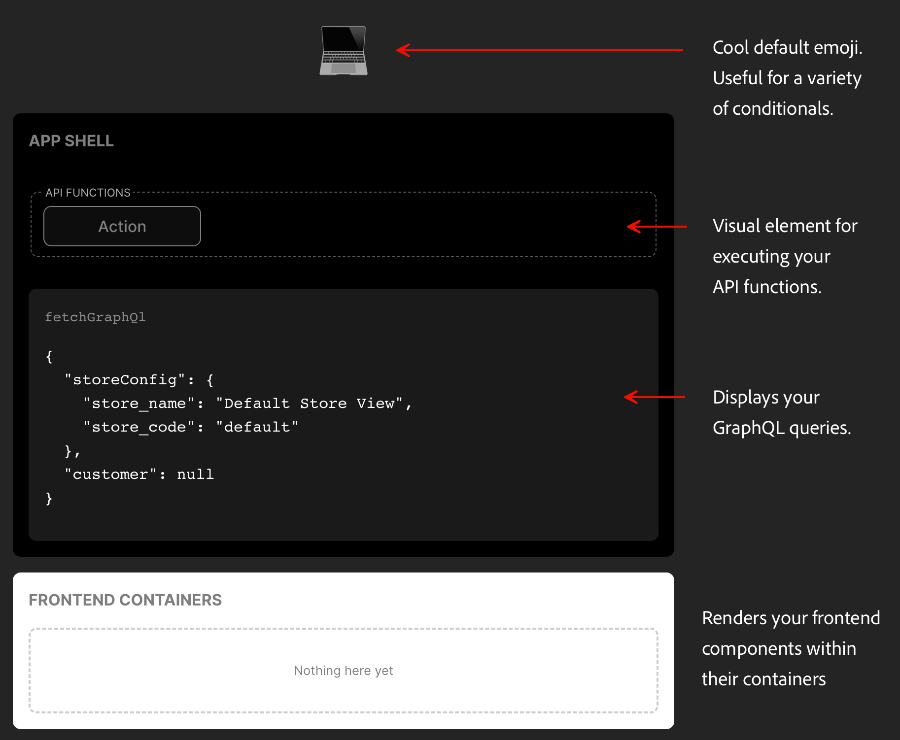
Section titled “Sandbox structure”The sandbox environment is divided into three main sections:
1. Action Controls (Top)
Section titled “1. Action Controls (Top)”Controls for triggering functionality:
<fieldset class="actions"> <legend>API Functions</legend> <button id="action-1" disabled>Action</button></fieldset>Example usage:
const $action_1 = document.getElementById('action-1');$action_1.addEventListener('click', () => { console.log("action-1 has been clicked"); myFunction(); // or pkg.myFunction();});2. Data/debug display (Middle)
Section titled “2. Data/debug display (Middle)”Real-time data and response visualization:
<code data-label="fetchGraphQl"> <pre id="data">⏳ Loading...</pre></code>Example usage:
// Display event dataconst $data = document.getElementById('data');events.on('<eventName>', (data) => { $data.innerText = JSON.stringify(data, null, 2);});
// Update loading state$data.innerText = '⏳ Loading...';3. Container display (Bottom)
Section titled “3. Container display (Bottom)”Where your drop-in components are rendered:
<div class="containers"> <h2 class="heading">Frontend Containers</h2> <div id="my-container" class="container"></div></div>Example usage:
const $my_container = document.getElementById('my-container');provider.render(Container, { // Your container props})($my_container);Styling the sandbox
Section titled “Styling the sandbox”The Sandbox environment is styled using two stylesheets:
style.csswhich is the base styling file that handles root-level styles and variables as well as global element styles.example.csswhich is specifically for styling sandbox UI components.
Best practices and accessibility
Section titled “Best practices and accessibility”- Use meaningful names for components and API functions.
- Write tests for every component and function.
- Keep components small and focused.
- Document your code and update the MDX docs in
src/docs/. - Use Storybook to visually test components.
- Commit early and often; use branches for new features.
- Use clear, simple language in UI and documentation.
- Ensure all components are keyboard accessible.
- Add ARIA labels where appropriate.
- Test with screen readers.
Common pitfalls:
- Forgetting to create and update
.envwith the correct endpoint. - Not running
npm installafter cloning. - Skipping tests before building for production.
Summary and next steps
Section titled “Summary and next steps”You’ve learned how to:
- Set up a drop-in component project
- Generate and configure components, API functions, and containers
- Run and test your frontend locally
- Build for production
Next Steps:
- Explore advanced component patterns
- Integrate with real backend APIs
- Contribute to the drop-in template repo