Magento UI library
The Magento UI library is a flexible Less-based frontend library designed to assist Magento theme developers. It employs a set of mixins for base elements to ease frontend theme development and customization.
This topic describes how the library is organized, and how to use it. For more information, see the Magento UI library documentation that reflects the latest embedded documentation.
Components provided by the UI library
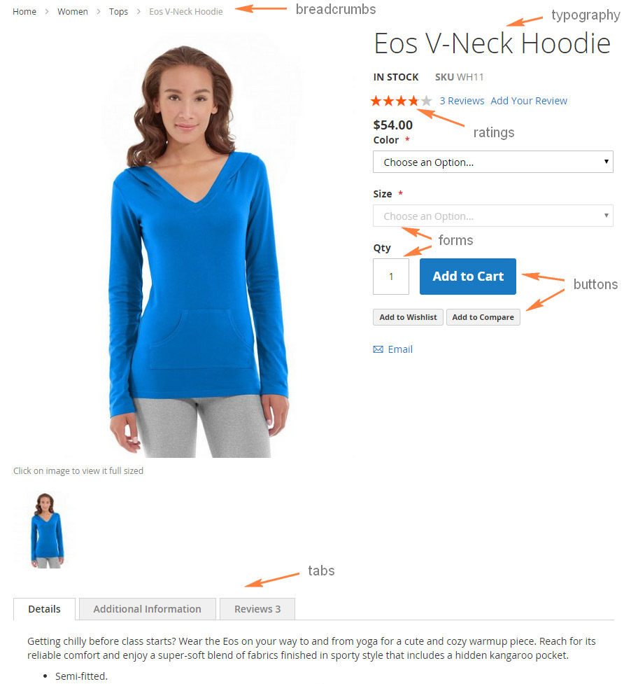
The Magento UI library provides the ability to customize and reuse the following user interface elements and properties:
- actions-toolbar
- breadcrumbs
- buttons
- drop-downs
- forms
- icons
- layout
- loaders
- messages
- pagination
- popups
- ratings
- sections - tabs and accordions
- tables
- tooltips
- typography
- list of theme variables
The following illustration shows a storefront product page containing some of the preceding elements:

Mixin location
You can find the Magento UI library under lib/web/css.
Library source .less files are stored under the source directory, each file contains mixins for configuring a certain element, and in most cases the element coincides with the file name:
lib/web
    ├── css/
    │    ├── docs/ (Library documentation)
    │    ├── source/
    │    │    ├── lib/ (Library source files)
    |    |    |    ├── variables/ (Predefined variables for each mixin)
    │    │    │    ├── _actions-toolbar.less
    │    │    │    ├── _breadcrumbs.less
    │    │    │    ├── _buttons.less
    │    │    │    ├── _dropdowns.less
    │    │    │    ├── _forms.less
    |    |    |    ├── _grids.less
    │    │    │    ├── _icons.less
    │    │    │    ├── _layout.less
    │    │    │    ├── _lib.less
    │    │    │    ├── _loaders.less
    │    │    │    ├── _messages.less
    │    │    │    ├── _navigation.less
    │    │    │    ├── _pages.less
    │    │    │    ├── _popups.less
    │    │    │    ├── _rating.less
    │    │    │    ├── _resets.less
    │    │    │    ├── _responsive.less
    │    │    │    ├── _sections.less
    │    │    │    ├── _tables.less
    │    │    │    ├── _tooltips.less
    │    │    │    ├── _typography.less
    │    │    │    ├── _utilities.less
    │    │    │    └── _variables.less
    │    │    └── _email-variables.less
    │    │    └── _extend.less
    │    │    └── _theme.less
    │    │    └── _variables.less
    │    │    └── _widgets.less
    │    └── styles.less
    ├── fonts/
    │    └── Blank-Theme-Icons/ (Library custom icons font)
    ├── images/
    │    └── blank-theme-icons.png (Library icons sprite)
    └── jquery/ (Library javascript files)
Predefined variables
If your theme inherits from any Magento out-of-the-box theme, for example Blank, you can easily customize any element of a store page without changing any CSS code or templates. Customization can be performed by simply changing in your theme the values of the predefined variables used in the UI library or parent theme mixins.
The complete list of these variables and their default values are stored in lib/web/css/source/lib/variables.
This directory contains a set of files, corresponding to the set of UI library elements, and each of the files lists element-specific variables.
For example, lib/web/css/source/lib/variables/_breadcrumbs.less contains variables used in the breadcrumbs() mixin.
To change the default library variables values, specify the new values for the required variables in the <theme_dir>/web/css/source/_theme.less file.
Please mind, that your <theme_dir>/web/css/source/_theme.less file overrides _theme.less of the parent theme (if your theme has a parent).
So if you want to inherit the parent theme’s variable values additionally to your changes, add the content of parent’s _theme.less to your file as well.
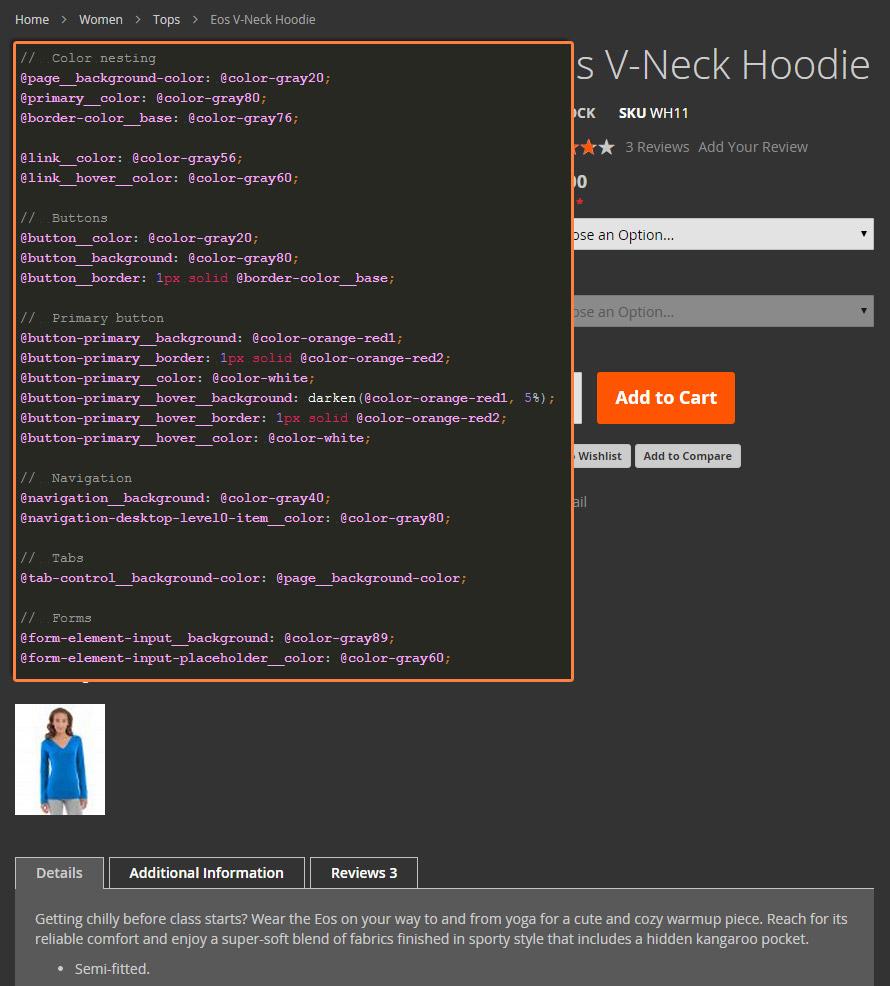
The following figure shows the product page shown earlier in this topic, after a custom theme was applied. The theme customized Blank by redefining variables only.

Your custom variables
When naming custom variables, please follow the Magento naming convention for the Less variables.
Using mixins
You can use a mixin with default variables values, or you can redefine them when calling a mixin. The following paragraphs describe both ways to call a mixin.
To use a mixin with default values, call the mixin without specifying any parameters. For example:
1
2
3
.breadcrumbs {
    .lib-breadcrumbs();
}
To call a mixin with parameter values different from default, set these values when calling the mixin, like in the following example:
1
2
3
4
5
6
7
.example-button {
    .lib-button(
        @_button-padding: @button-padding,
        @_button-color: #fff,
        @_button-color-hover: #ccc
    );
}
Variables starting with @_ are private mixin variables used only in this mixin.
Variables starting with @ (without the underscore) are global, and are listed in lib/web/css/source/lib/variables.
Tabs and accordions set with CSS
Use the accordion style for mobile and tab style for desktop.
To set tabs and accordions using breakpoints, see the following example:
1
2
3
4
5
6
7
8
9
10
11
& when (@media-common = true) {
    .product.data.items {
        .lib-data-accordion();
    }
}

.media-width(@extremum, @break) when (@extremum = 'min') and (@break = @screen__m) {
    .product.data.items {
        .lib-data-tabs();
    }
}
Navigation set with CSS
Use the Navigation style for mobile and tab style for desktop.
To set navigation using breakpoints, see the following example:
1
2
3
4
5
6
7
8
9
10
11
12
13
14
15
//
//  Mobile
//  _____________________________________________

.media-width(@extremum, @break) when (@extremum = 'max') and (@break = @screen__m) {
    .lib-main-navigation();
}

//
//  Desktop
//  _____________________________________________

.media-width(@extremum, @break) when (@extremum = 'min') and (@break = @screen__m) {
    .lib-main-navigation-desktop();
}
Embedded documentation
The detailed information about the Magento UI library is embedded in the code repository:
lib/web/css/docs/source/README.mddescribes the Magento UI library structure, naming conventions, and code style.lib/web/css/docscontains a set of.htmlfiles with detailed information about the library mixins.
Each file is named after the mixin it describes, and contains detailed mixin description and navigation controls to access documentation for other mixins.
The documentation is available in a convenient HTML view in the following location in your Magento installation: pub/static/frontend/Magento/blank/en_US/css/docs/index.html.