Cascading style sheets (CSS)
Overview
Magento 2 incorporates Less, a CSS pre-processor that simplifies the management of complex CSS files. To define styles of a Magento store, you can use both - CSS and Less stylesheets.
Magento application provides a built-in Less UI library, which you can optionally extend.
To customize storefront styles, you need to create a custom design theme. Then you can use one of the following approaches:
- If your theme inherits from the Magento out-of-the-box Blank or Luma theme, you can override the default Less files; for example to change the values of the variables used in the default files.
- Create your own Less files using the built-in Less preprocessor.
- Create your own CSS files, optionally having compiled them using third-party CSS preprocessor.
Things to remember when working with styles
-
Make sure that you set your Magento application to the developer or default mode.
-
If your style changes do not apply after refreshing the page, cleaning the static files cache might help. See the Clean static files cache topic for instructions how to do this.
CSS merging, minification and performance
There are a couple options to help with CSS and site performance.
-
Merge CSS files to decrease the number of HTTP requests required to load the page.
-
Minification of CSS files reduces the file size being sent. It does this by stripping white space within the file.
To enable / disable these settings, go into Admin > Stores > Setting > Configuration > Advanced > Developer > CSS Settings.
Change styles: walkthrough
Here is a simple illustration of changing styles using the first approach: changing the color of the buttons of a certain class.
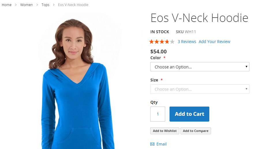
In the Blank theme, the buttons of the .action.primary class, so called primary buttons, are blue. The following image illustrates this:

OrangeCo wants to change the color of the primary buttons to orange. To achieve this, they do the following:
- Create a new Orange theme, which inherits from the Blank theme.
-
In the Orange theme directory add the overriding
app/design/frontend/OrangeCo/orange/web/css/source/_theme.lessfile with the following code:// Primary button @button-primary__color: @color-white; @button-primary__hover__color: @color-white; @button-primary__background: @color-orange-red1; @button-primary__hover__background: @color-orange-red4; @button-primary__border: 1px solid @color-orange-red2; @button-primary__hover__border: 1px solid @color-orange-red2;
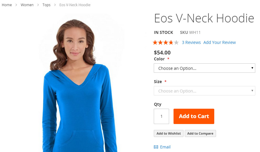
When OrangeCo applies their theme, the primary buttons will look like on the following image:

In this chapter
Other topics of this chapter describe the following:
- Including CSS: how stylesheets are organized and included to be used for store pages in the Magento application.
- CSS Preprocessing: how stylesheets are preprocessed and compiled
- Magento UI Library: how to use the Magento styles library in your custom themes
- Using Custom Fonts: how to add custom fonts
- Customizing styles illustration: how to change a theme’s color scheme using Magento UI library.