
QuickOrderVariantsGrid Container
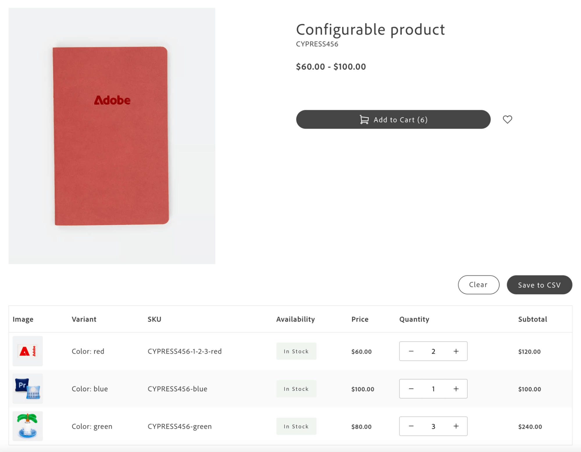
The QuickOrderVariantsGrid container provides a grid-based interface for ordering product variants. It is designed for configurable products on the product detail page (PDP) where B2B customers need to select quantities across multiple variants (sizes, colors, and other attributes) within a single view.
The grid displays all available variants in a structured table with attributes, pricing, and availability. Users enter quantities for multiple variants, review subtotals, and add them to the cart in bulk. The container integrates with the Product Details block when Grid Ordering is enabled.
Configuration
Section titled “Configuration”| Parameter | Type | Req? | Description |
|---|---|---|---|
className | string | No | CSS class applied to the container root. |
initialVariants | ProductVariant[] | No | Initial array of product variants to display. When provided, automatically emits quick-order/grid-ordering-variants. If not provided, the component listens for the event from external sources. |
onVariantsLoaded | (variants: VariantWithQuantity[]) => void | No | Callback invoked when variants are successfully loaded and initialized (all quantities start at 0). |
onSelectedVariantsChange | (data: VariantTableData[]) => void | No | Debounced callback invoked when user changes quantities. Receives only variants with quantity > 0. VariantTableData: { sku: string; name: string; inStock: boolean; attributes: Record<string, {label, value}>; price: number; quantity: number; subtotal: number; image: string }. |
debounceMs | number | No | Debounce delay in milliseconds for onSelectedVariantsChange and event emissions. Default: 300. |
initialLoading | boolean | No | Initial loading state before variants are loaded. Default: true. |
visibleVariantsLimit | number | No | Number of variant rows displayed initially before showing the “Show All” option. Default: 10. Set to a very high number (for example, 1000) to display all variants without collapsing the list. |
columns | Array<{ key: string; label: string; sortBy?: 'asc' | 'desc' | true }> | No | Custom column configuration. Default: [{ key: 'image', label: 'Image' }, { key: 'sku', label: 'SKU' }, { key: 'availability', label: 'Availability' }, { key: 'price', label: 'Price' }, { key: 'quantity', label: 'Quantity' }, { key: 'subtotal', label: 'Subtotal' }]. When using custom columns, provide corresponding slot implementations for custom column keys. |
slots | object | No | Slots for Actions, ImageCell, SKUCell, AvailabilityCell, PriceCell, QuantityCell, SubtotalCell, and custom column keys. See Slots. |
Architecture
Section titled “Architecture”Grid Ordering replaces standard PDP interactions such as quantity selection and configurable product option selection. Because Grid Ordering allows selecting multiple variants at once, the standard PDP add-to-cart flow (single product with selected options) no longer applies. The grid provides a bulk-selection interface. The container handles variant selection and UI; the PDP integration layer (Product Details block) processes selections and executes the bulk add-to-cart operation.
The Product Details block integrates QuickOrderVariantsGrid when Grid Ordering is enabled for configurable products. The example below shows the pattern; the block provides readBlockConfig, product, and gridOrderingContainer:
import { render as quickOrderProvider } from '@dropins/storefront-quick-order/render.js';import QuickOrderVariantsGrid from '@dropins/storefront-quick-order/containers/QuickOrderVariantsGrid.js';
// Identify whether this feature is enabled based on the block configconst { 'grid-ordering-enabled': gridOrderingEnabledString = 'false' } = readBlockConfig(block);const gridOrderingEnabled = gridOrderingEnabledString === 'true';
// Based on product data, identify whether the feature should be enabled for a specific product// The Grid Ordering B2B feature (Quick Order drop-in) is enabled only for configurable productsconst isGridOrderingView = gridOrderingEnabled && product?.productType === 'complex' && !product?.isBundle;let gridOrderingSelectedVariants = [];
// Conditionally render Grid Ordering containerisGridOrderingView ? quickOrderProvider.render(QuickOrderVariantsGrid, { className: 'quick-order-variants-grid', columns: [ { key: 'image', label: 'Image' }, { key: 'variantOptionAttributes', label: 'Variant' }, { key: 'sku', label: 'SKU' }, { key: 'availability', label: 'Availability' }, { key: 'price', label: 'Price' }, { key: 'quantity', label: 'Quantity' }, { key: 'subtotal', label: 'Subtotal' }, ], slots: { VariantOptionAttributesCell: (ctx) => { const { variant } = ctx; const { variantOptionAttributes } = variant.product;
const cellWrapper = document.createElement('div');
variantOptionAttributes.forEach((attr) => { const attributeWrapper = document.createElement('div'); attributeWrapper.classList.add('product-details__variants-grid-attribute'); const label = document.createElement('strong'); label.textContent = `${attr.label}:`; const value = document.createElement('span'); value.textContent = attr.value; attributeWrapper.appendChild(label); attributeWrapper.appendChild(value); cellWrapper.appendChild(attributeWrapper); }); ctx.appendChild(cellWrapper); }, }, })($gridOrderingContainer) : null;| Slot | Context | Description |
|---|---|---|
Actions | { onClear: () => void; onSaveToCsv: () => void; onCollectData: () => VariantTableData[]; isDisabled: boolean; variantsCount: number } | Replace the entire action bar (Clear, Save to CSV, Collect Data buttons). |
ImageCell | { variant: ProductVariant; quantity: number; onQuantityChange: (sku, qty) => void } | Customize image cell rendering for each variant row. |
SKUCell | { variant: ProductVariant; quantity: number; onQuantityChange: (sku, qty) => void } | Customize SKU cell rendering. |
AvailabilityCell | { variant: ProductVariant; quantity: number; onQuantityChange: (sku, qty) => void } | Customize availability/stock status cell. |
PriceCell | { variant: ProductVariant; quantity: number; onQuantityChange: (sku, qty) => void } | Customize price display. |
QuantityCell | { variant: ProductVariant; quantity: number; onQuantityChange: (sku, qty) => void } | Replace the quantity input/incrementer with custom controls. |
SubtotalCell | { variant: ProductVariant; quantity: number; onQuantityChange: (sku, qty) => void } | Customize subtotal calculation and display. |
[CustomColumnKey]Cell | { variant: ProductVariant; quantity: number; onQuantityChange: (sku, qty) => void } | Custom rendering for any custom column defined in columns. The slot name should match the column key value with the Cell suffix. |
Events
Section titled “Events”- Listens:
quick-order/grid-ordering-variants(variant data from PDP integration),quick-order/grid-ordering-reset-selected-variants(resets all quantities when emitted by integration layer, for example, after successful add-to-cart). - Emits:
quick-order/grid-ordering-variants(wheninitialVariantsis provided),quick-order/grid-ordering-selected-variants(when selection changes; debounced).
Admin panel
Section titled “Admin panel”No container-specific settings. Grid Ordering is enabled via the Product Details block configuration. See the product-details block for setup.