ToggleAdvanced widget
Use the ToggleAdvanced widget to toggle the HTML class for selectors by clicking on a toggle element.
The widget also allows toggling a clicked element class and clicked element text if an element is toggled.
The ToggleAdvanced widget source is lib/web/mage/toggle.js.
Initialize the ToggleAdvanced widget
For information about how to initialize a widget in a JS component or .phtml template, see the Initialize JavaScript topic.
To instantiate the ToggleAdvanced widget:
1
$("#element").toggleAdvanced();
Where:
#elementis the selector of the element for which ToggleAdvanced is initialized.
The following example shows a PHTML file using the script:
1
2
3
4
5
6
7
8
9
10
<script>
    require([
        'jquery',
        'toggleAdvanced'
    ], function ($) {
        'use strict';

        $("#element").toggleAdvanced();
    });
</script>
Options
The ToggleAdvanced widget has the following options:
baseToggleClass
The class used to toggle on a clicked element.
Type: String
Default value: active
selectorsToggleClass
The class that will be toggled (added/removed) for selected DOM elements.
Type: String
Default value: hidden
toggleContainers
The selectors of DOM elements that will be toggled.
Type: String
Default value: null
newLabel
Text of the new label to be used on toggle.
Type: String
Default value: null
curLabel
Text of the old label to be used on toggle.
Type: String
Default value: null
currentLabelElement
Container element of the current label.
Type: String
Default value: null
Methods
The ToggleAdvanced widget has the following methods:
beforeCreate
beforeCreate() method used to inject 3rd party functionality before creating.
afterCreate
afterCreate() method used to inject 3rd party functionality after creating.
Code sample
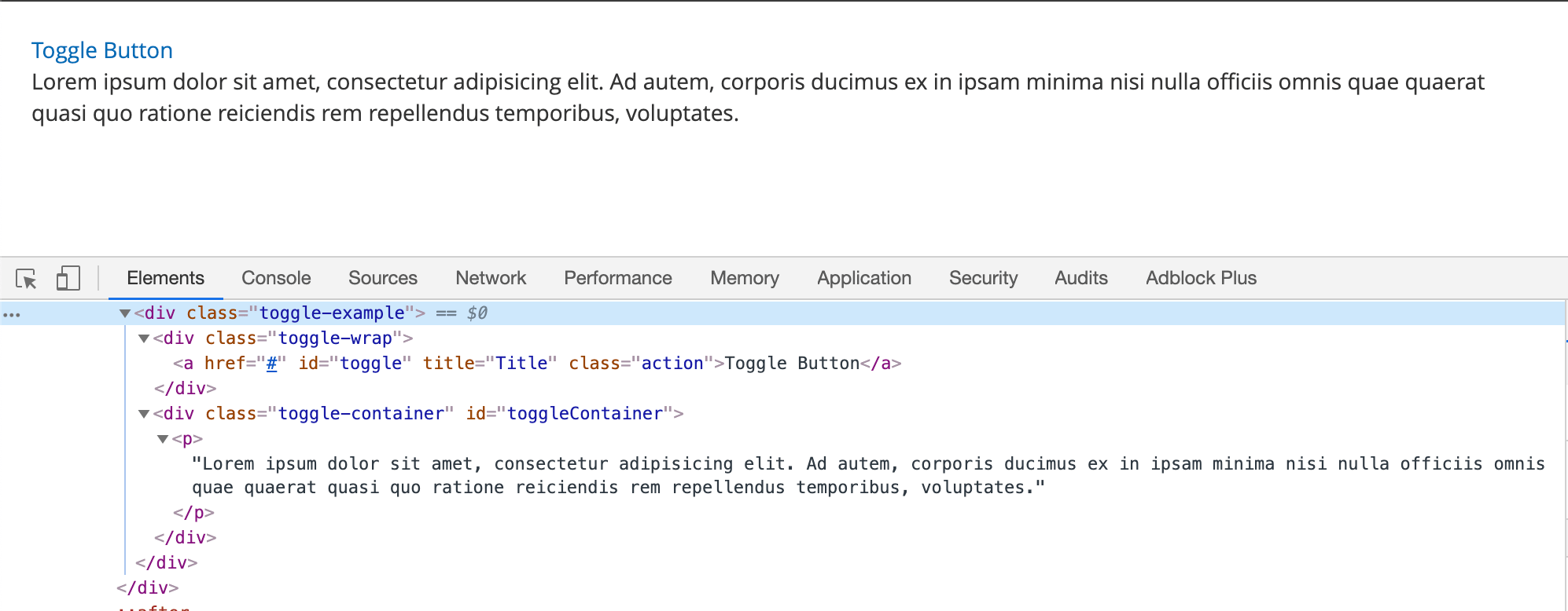
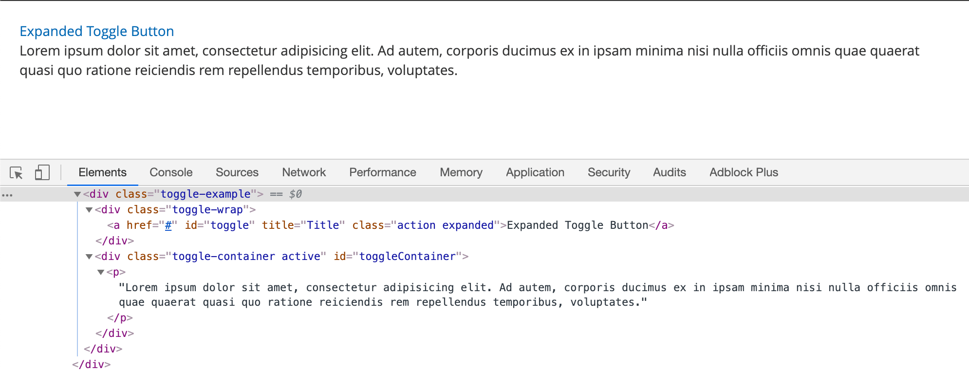
The following example shows how to initialize the ToggleAdvanced widget.
1
2
3
4
5
6
7
8
9
10
11
12
<div class="toggle-example">
    <div class="toggle-wrap">
        <a href="#"
           data-mage-init='{"toggleAdvanced": {"selectorsToggleClass": "active", "baseToggleClass": "expanded", "toggleContainers": "#toggleContainer", "newLabel": "Expanded Toggle Button"}}'
           id="toggle"
           title="Title"
           class="action">Toggle Button</a>
    </div>
    <div class="toggle-container" id="toggleContainer">
        <p>Lorem ipsum dolor sit amet, consectetur adipisicing elit. Ad autem, corporis ducimus ex in ipsam minima nisi nulla officiis omnis quae quaerat quasi quo ratione reiciendis rem repellendus temporibus, voluptates.</p>
    </div>
</div>
Result
The result is two sections with initial content and toggled content.

