Accordion widget
Magento accordion widget is an extension of the Magento Tabs widget.
Accordions are generally used to break content into multiple sections that can be swapped to save space.
The accordion widget source is lib/web/mage/accordion.js.
Initialize the accordion widget
Initialize accordion in JS components
Initialize accordion with data-* attributes specified
Generally the accordion widget is instantiated like following:
1
$("#element").accordion();
Where:
#elementis the selector of the element for accordion is initialized.-
#elementhas children with the following attributes specified:data-role="title"data-role="content"
Optionally, you can specify the following:
- If you want the trigger to be different from the title, add the
data-role="content"attribute for the element - To have the content updated using Ajax, add the
data-ajax="true"attribute for the element containing the URL for request.
Accordions support arbitrary markup, but the following requirements should be kept:
- Titles and contents are specified in the same order in DOM: first title, then contents.
- The header, trigger and content are specified, either by adding the
data-*attributes for the corresponding children elements or by specifying these elements with selectors as options.
Mark-up examples:
1
2
3
4
5
6
7
8
9
10
11
12
13
14
15
16
17
18
19
20
21
22
23
24
25
26
27
28
29
30
<div id="element">
    <div data-role="collapsible">
        <div data-role="trigger">
            <span>Title 1</span>
        </div>
    </div>
    <div data-role="content">Content 1</div>

    <div data-role="collapsible">
        <div data-role="trigger">
            <span>Title 2</span>
        </div>
    </div>
    <div data-role="content">Content 2</div>

    <div data-role="collapsible">
        <div data-role="trigger">
            <span>Title 3</span>
        </div>
    </div>
    <div data-role="content">Content 3</div>
</div>

<script>
    require([
        'jquery',
        'accordion'], function ($) {
        $("#element").accordion();
    });
</script>
Initialize accordion with option
You can specify the header, content, trigger as options when you initialize the widget. For example:
1
2
3
4
5
6
$("#element").accordion({
    header : "#title-1",
    content : "#content-1",
    trigger : "#trigger-1",
    ajaxUrlElement: "a"
 });
Initialize accordion in a template
The accordion widget can be initialized using the data-mage-init attribute or <script> element, as described in JavaScript initialization.
Options
Accordion options coincide with Magento Tabs options, plus the following custom ones:
active
Defines which tab is active when the widget gets instantiated.
Type: Array, String
Default value: [0]
Example of the accordion initialization with the active option specified:
1
2
$("#element").accordion({ active: "0 1" });
$("#element").accordion({ active: [0,1] });
multipleCollapsible
Defines if multiple panels can be expanded at the same time.
Type: Boolean
Default value: false
Example of the accordion initialization with the multipleCollapsible option specified:
1
$("#element").accordion({ multipleCollapsible: false });
Get or set the multipleCollapsible option, after initialization:
1
2
3
4
5
//getter
var multipleCollapsible = $("#element").accordion("option", "multipleCollapsible");

//setter
$("#element").tabs("option", "multipleCollapsible", false);
openOnFocus
For keyboard navigation defines if the accordion expands when the title gets in focus.
Type: Boolean
Default value: false
Methods
Accordion widget options and keyboard interaction mostly coincide with the Magento tabs widget methods.
The custom accordion methods are the following:
activate(index)
Activate a tab with the specified index.
Type: Number, Array.
If no index is passed, all panels are activated.
Code examples:
1
2
3
$( "#element" ).accordion("activate");
$( "#element" ).accordion("activate", 1);
$( "#element" ).accordion("activate", [0,1]);
deactivate(index)
Deactivate a tab with the specified index.
Type: Number, Array.
If no index is passed, all panels are deactivated.
Code examples:
1
2
3
$( "#element" ).accordion("deactivate");
$( "#element" ).accordion("deactivate", 1);
$( "#element" ).accordion("deactivate", [0,1]);
Events
The accordion widget subscribes to the same events as the Tabs widget:
beforeOpen callback
Called before the content is opened.
Example of adding a callback to beforeOpen events:
1
2
3
$("#element").on("beforeOpen", function () {
    // do something before opening the content
});
dimensionsChanged
Called after content is opened or closed.
Example of adding a callback to dimensionsChanged events:
1
2
3
4
5
6
7
8
9
$("#element").on("dimensionsChanged", function (event, data) {
    var opened = data.opened;

    if (opened) {
        // do something when the content is opened
        return;
    }
    // do something when the content is closed
});
Code sample
The following example shows how to initialize the accordion widget and pass options during the initialization.
1
2
3
4
5
6
7
8
9
10
11
12
13
14
15
16
17
18
19
20
21
22
23
24
25
26
27
28
<div id="accordion" data-mage-init='{
        "accordion":{
            "active": [1, 2],
            "collapsible": true,
            "openedState": "active",
            "multipleCollapsible": true
        }}'>
    <div data-role="collapsible">
        <div data-role="trigger">
            <h4>Title 1</h4>
        </div>
    </div>
    <div data-role="content">Lorem Ipsum is simply dummy text of the printing and typesetting industry. Lorem Ipsum has been the industry's standard dummy text ever since the 1500s</div>

    <div data-role="collapsible">
        <div data-role="trigger">
            <h4>Title 2</h4>
        </div>
    </div>
    <div data-role="content"> It was popularised in the 1960s with the release of Letraset sheets containing Lorem Ipsum passages, and more recently with desktop publishing software like Aldus PageMaker including versions of Lorem Ipsum.</div>

    <div data-role="collapsible">
        <div data-role="trigger">
            <h4>Title 3</h4>
        </div>
    </div>
    <div data-role="content">Contrary to popular belief, Lorem Ipsum is not simply random text. It has roots in a piece of classical Latin literature from 45 BC, making it over 2000 years old.</div>
</div>
Result
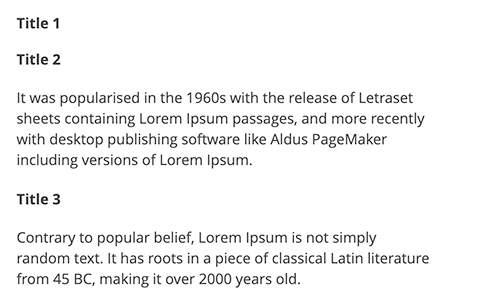
The result is three sections with separate swapped content.
