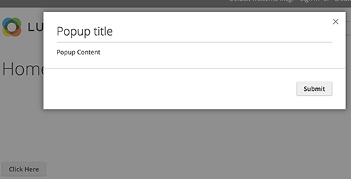
Modal widget
The Magento modal widget implements a secondary window that opens on top of the main window. It contains the overlay and modal content. The modal widget configuration enables the following:
- Configuring as popup or slide
- Controlling stack of modal widgets
- Setting buttons for action bar
The modal widget source is <Magento_Ui_module_dir>/view/base/web/js/modal/modal.js.
The widget uses the following templates:
<Magento_Ui_module_dir>/view/base/web/templates/modal/modal-popup.htmlpopup type template.<Magento_Ui_module_dir>/view/base/web/templates/modal/modal-slide.htmlslide type template.
The design patterns for the modal pop-up windows in the Admin are described in the Magento Admin Pattern Library, the Slide-out Panels, Modal Windows, and Overlays topic.
Initialize the modal widget
To initialize the widget in your script, use the following general notation:
1
2
3
4
5
$('#modal_content').modal({
    <option1>: <value1>,
    <option2>: <value2>,
    ...
});
For details about how to initialize the widget in a.phtml template, refer to the JavaScript initialization topic.
Options
The modal widget has the following options:
- appendTo
- autoOpen
- buttons
- closeText
- customTpl
- clickableOverlay
- focus
- innerScroll
- modalAction
- modalClass
- modalCloseBtn
- modalContent
- modalLeftMargin
- modalSubTitle
- modalTitle
- modalVisibleClass
- parentModalClass
- popupTpl
- responsive
- slideTpl
- subTitle
- title
- trigger
- type
appendTo
The element where the modal should be added.
Type: String
Default value: body
autoOpen
Automatically open the modal window when the widget is initialized.
Type: Boolean
Default value: false
buttons
Array of buttons for action pane.
Type: Array
Structure:
1
2
3
4
5
buttons: [{
    text: '',
    class: '',
    click: function () {} //handler on button click
}]
Default value:
1
2
3
4
5
6
7
buttons: [{
    text: $.mage.__('Ok'),
    class: '',
    click: function () {
        this.closeModal();
    }
}]
clickableOverlay
Close the modal window when a user clicks on the overlay.
Type: Boolean
Default value: true
closeText
The close button text.
Type: String
Default value: $.mage.__('Close')
customTpl
The template file that is used as content for the custom modal type.
Type: String
Default value: ui/template/modal/modal-custom.html
focus
Selector to focusing when a modal window opens or ‘none’ if focusing is not necessary.
Type: String
Default value: [data-role="closeBtn"]
innerScroll
Modal scroll position.
Type: Boolean
Default value: false
modalClass
Custom classes for modal window.
Type: String
Default value: empty
modalAction
The selector for all the custom action buttons.
Type: String
Default value: [data-role="action"]
modalCloseBtn
The selector for all the elements that can close the modal.
Type: String
Default value: [data-role="closeBtn"]
modalContent
The selector for element that is used for the modal’s content.
Type: String
Default value: [data-role="content"]
modalLeftMargin
Sets a margin between slide modal windows.
Type: Number
Default value: 45
modalSubTitle
The modal subtitle element selector.
Type: String
Default value: [data-role="subTitle"]
modalTitle
The modal title element selector.
Type: String
Default value: [data-role="title"]
modalVisibleClass
The class that is assigned to an opened modal.
Type: String
Default value: _show
parentModalClass
The class that is assigned to parent when the modal is opened.
Type: String
Default value: _has-modal
popupTpl
The template file that is used as content for the popup modal type.
Type: String
Default value: ui/template/modal/modal-popup.html
responsive
Turn popup modal window to slide panel on small screens. Available if the type option is set to ‘popup’.
Type: Boolean
Default value: false
slideTpl
The template file that is used as content for the slide modal type.
Type: String
Default value: ui/template/modal/modal-slide.html
subTitle
Translated subTitle for the popup window that will be appended to the title.
Type: String
Default value: empty
title
Translated title for popup window.
Type: String
Default value: empty
trigger
The element that triggers the modal.
Type: String
Default value: empty
type
The type of window: ‘popup’ or ‘slide’.
Type: String
Default value: popup
Methods
The modal widget has the following methods:
openModal()
Open the modal window.
closeModal()
Close the modal window.
keyEventSwitcher()
Listens for key events and calls handler function if it exists.
toggleModal()
Toggles the modal window.
Events
The modal widget is subscribed to the following events:
You can listen to these events in two ways:
Use jQuery’s on function:
1
2
3
4
var modal = $('#modal_content').modal({...});
modal.on('modalclosed', function () {
    // Do some action when modal closed
});
Or assign a callback as a property when creating a modal instance:
1
2
3
4
5
6
$('#modal_content').modal({
    ...
    closed: function (){
       // Do some action when modal closed
    }
});
closed
Called when the modal window is closed.
opened
Called when the modal window is opened.
Keyboard navigation
- the ESC key: close the current modal window
- the TAB key: set focus to the next focusable element (looped inside the modal window)
- the SHIFT+TAB keys combination: set focus to the previous focusable element (looped inside the modal window)
Code sample
The following example shows how to initialize the modal widget and pass options during the initialization.
1
2
3
4
5
6
7
8
9
10
11
12
13
14
15
16
17
18
<button type="button" class="action" data-trigger="trigger">
    <span data-bind="i18n: 'Click Here'"></span>
</button>
<div data-bind="mageInit: {
        'Magento_Ui/js/modal/modal':{
            'type': 'popup',
            'title': 'Popup title',
            'trigger': '[data-trigger=trigger]',
            'responsive': true,
            'buttons': [{
                text: $.mage.__('Submit'),
                class: 'action'
            }]
        }}">
    <div class="content">
        Popup Content
    </div>
</div>
Result
The result is a modal and a button (Click Here) that opens the modal.
